Two-Color Photo and Hand-Drawn Observation Poster
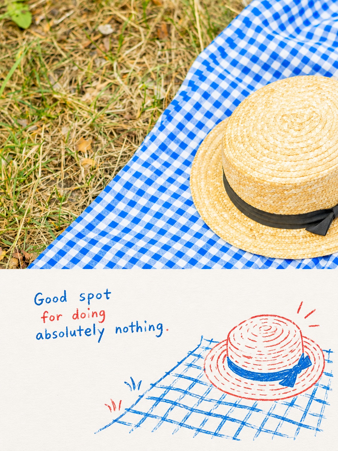
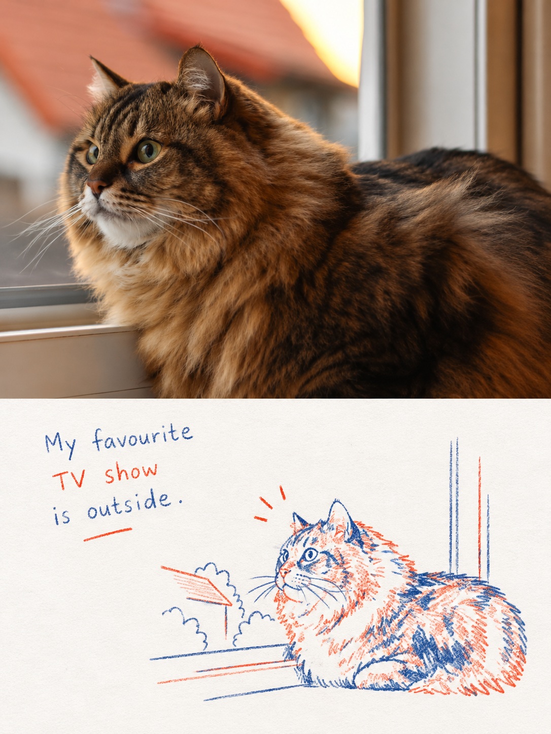
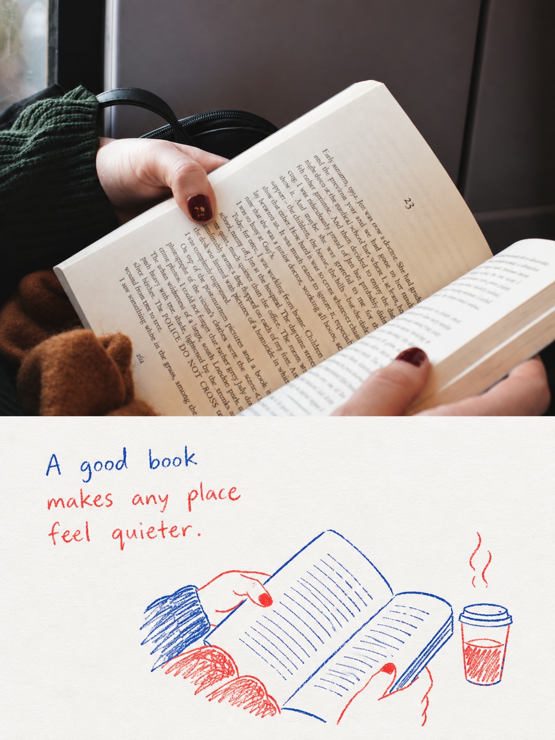
Turn one photo into a vertical editorial poster pairing the original photograph with a sparse, humorous red-and-blue pen drawing and handwritten remark.
Example outputs
Prompt template
- Format
- Text
- Inputs
- Photo (image) · Required
- Outputs
- Finished_vertical_poster (image)
Turn the single photo I upload into one vertical poster, following the rules below. Do not stitch several photos together or build a collage. One uploaded photo gives one output image.

FRAME
- The canvas is 3:4 vertical.
- Split it into an exact top half and bottom half. The border is a straight horizontal line at 50 percent of the canvas height, never tilted and never blurred.
- The top half is the photo, filling the canvas from edge to edge. No margin, no border, no rounded corners around it.
- The bottom half is paper.
- Do not place a frame line or a thick divider between the two areas.

TOP HALF, THE UPLOADED PHOTO
- Use the photo I uploaded as a photograph. Do not turn it into a drawing, do not shift its colours much, and do not add anything that was not there.
- Keep the subject's build, pose, real texture, natural light, and original colour mood.
- Apply only the very light correction a magazine would apply.
- Extending the sky or ground a little to fit the ratio is fine, but never stretch or squash the subject.

BOTTOM HALF, A TWO-COLOUR PEN DRAWING
- Pull out only the most recognisable subject, pose, and relationship from the photo above.
- Do not trace the photo. Keep one centre and a few necessary clues, and drop the rest without hesitation.
- Redraw it minimally and clumsily, the way a child draws, while leaving the original instantly recognisable.
- At the same time, invent one piece of humour or everyday observation that the photo does not contain. This is not an illustration explaining the photo; it is a note about what came to mind while looking at it.
- Do not fill the bottom half. Wide empty paper is part of the drawing. The subject may sit off to one side or sit small.
- Add only the few small elements the story actually needs: an arrow, a short line, or a motion mark. Do not scatter decoration.

COLOUR
- Use only two hand-drawn ink colours: red and blue.
- The blue is a retro ballpoint or crayon blue. The red is a warm red leaning towards vermilion or tomato.
- Use nothing beyond those two colours and the very light paper tone.
- Let the two colours alternate naturally through lines, partial fills, marks, and letters. Do not lay down a wide, even, flat fill.

LINE
- Lines are thin, loose, and a little crooked. Wobble, breaks, redrawn strokes, slightly exaggerated proportions, and outlines that do not close are all fine.
- Shapes are simple and direct, but the key outline, pose, and relationship must be correct.
- Do not use smooth vector lines, ruled strokes, or an overly cute cartoon style.

PAPER
- Use very light, near-white paper. It carries only the faintest warm or cool cast, matched to the colour temperature of the photo above.
- Leave only a very faint paper-fibre grain.
- Do not make it yellowed or aged.

LETTERING
- Write one short handwritten remark. It can come from the mood, motion, relationship, a sound, or a memory in the photo. An exclamation, a thought said out loud, or one short sentence is enough.
- Keep the lettering inside the paper half only. Letters crossing onto the photo above are a failure.
- Place the lettering in the upper left or the middle left of the paper half. Do not push it to the right edge.
- The whole block of lettering is no wider than half the canvas width.
- Use no more than four words per line and no more than three lines. Longer than that is a failure.
- The handwriting is small and loose. An uneven baseline and ragged letter spacing are fine.
- Each individual letter shape must still be correct. Do not drop a stroke, smudge a letter, or swap one letter for another. The wobble belongs to the placement of the letters, not to the spelling.
- If you are not confident of a spelling, drop that word and use a shorter remark instead.

LETTERING: WHAT IS NOT ALLOWED
- Every letter in the image must be English. Never place Hangul, Chinese characters, or Japanese in it.
- If the photo contains a Hangul or Chinese character sign, treat it in the drawing below as a blank colour field or an empty shape. Do not copy the characters across.
- No digits anywhere. No dates, years, numbers, or times.
- No brackets and no section names in the image. Do not use words like canvas, paper, line, colour, or lettering as labels.
- Do not write the same remark twice.
- No signature, watermark, logo, or page number.

AVOID
Busy backgrounds, redrawing the whole scene as it is, piling up detail, any colour beyond red and blue, a sticker look, commercial cartoon style, cute templates, slick digital lines, and the feel of a shopping page.

OVERALL
It should read as a carefully kept personal observation note, not a children's picture book.
Clumsy, unhurried, humorous, and mild. It should carry the sense of editorial design that knows what to leave empty.
Return only the finished image.
What you'll create
An edge-to-edge photograph fills the upper half of a vertical poster. A paper-based lower section creates a quiet, humorous observation-note aesthetic with deliberate empty space.
Frequently asked questions
How is the center divided?
A crisp horizontal split occurs at exactly half the canvas height.
Is a children’s storybook look intended?
No. The tone is a carefully kept personal observation note with restrained editorial design.


Comments
Tried this prompt? Share what you made, compare results, or ask a question