Photo-to-Travel Poster Split Design
Turn each uploaded photo into its own polished 3:4 poster, pairing a lightly refined original photograph with a custom minimalist vector travel illustration.
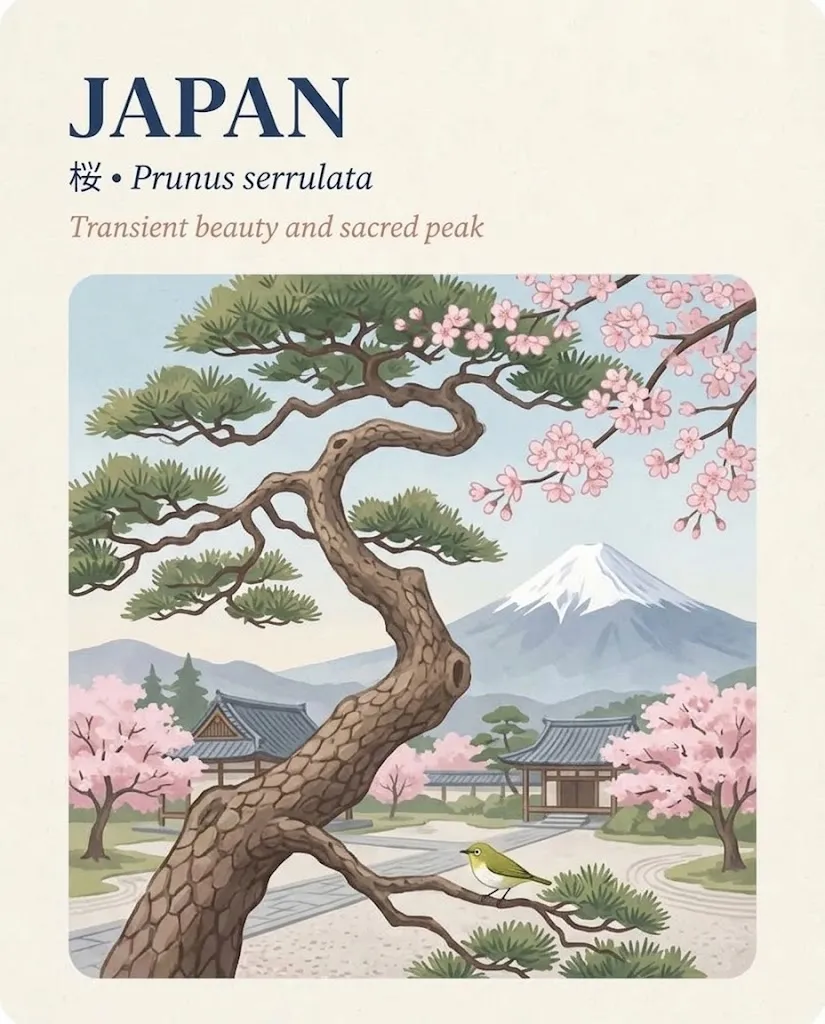
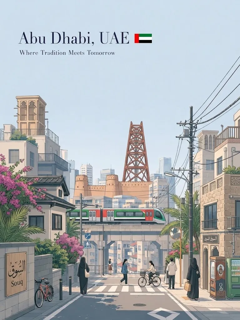
Example outputs
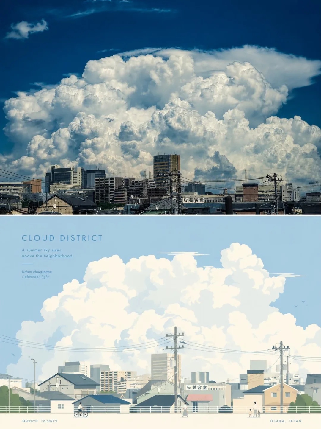
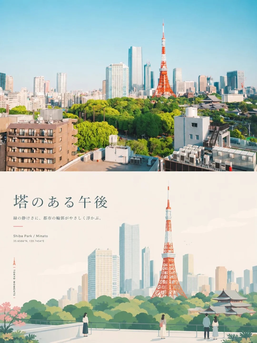
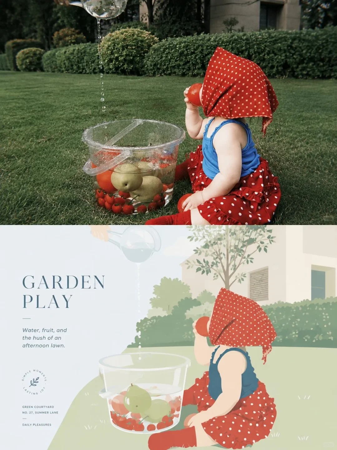
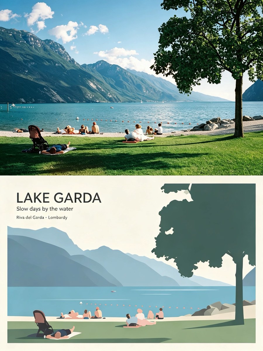
Prompt template
- Format
- Text
- Inputs
- Uploaded_photo (image) · Required
- Outputs
- Split_photo_and_vector_travel_poster (image)
Create a separate, premium-designed poster from each uploaded photo. Do not combine multiple photos into a collage; output one poster for each photo.

Use a vertical 3:4 composition divided into two equal-height sections, with each section occupying exactly 50% of the image.

In the upper half, preserve the original photograph, including the subject’s identity, structure, pose, realistic texture, natural lighting, and original color mood. Apply only subtle, refined photographic color grading to evoke an art magazine, independent publication, or exhibition photography. You may naturally extend the sky, ground, or surrounding background to fit the composition, but do not stretch, distort, or alter the subject.

In the lower half, reinterpret the photograph’s most recognizable subject, silhouette, pose, and narrative relationships as a scene-based illustration in a premium minimalist flat-vector travel-poster style. Do not mechanically trace the photo. Instead, identify its distinctive visual character, distill its most representative focal point, and add 2–4 supporting elements that best convey the atmosphere of the setting, everyday life, local character, or way of living. Whether the original depicts a city, building, person, animal, plant, object, vehicle, or natural landscape, make the lower half feel like a bespoke premium travel visual for that subject—not a fixed template.

Reorganize the composition to suit the subject rather than repeating the same layout. Establish the image with one clear focal point, distinct foreground and background layers, generous negative space, and a calm, orderly visual rhythm. Depending on the source photo, the scene may become a street, plaza, waterfront, courtyard, passageway, platform, plant-filled setting, interior corner, open landscape, or environmental vignette with traces of everyday life. Keep the subject as the primary visual focus; use other elements only to reinforce what is distinctive about the place, object, or situation. Avoid collages of landmarks, postcard-like lists of attractions, and excessive storytelling. If people are needed, include only 3–6 small-scale figures, naturally integrated into the setting, with no single person as the main character.

Use a premium minimalist flat-vector illustration style with the feel of Japanese stationery, boutique sticker illustration, and modern editorial travel branding. Use simple geometric forms, soft contours, consistent line weight, flat areas of color, and restrained detail. Keep the result fresh, quiet, refined, and contemporary. Avoid realism, heavy shadows, watercolor texture, paper texture, complex brushwork, gradients, crowded backgrounds, and excessive detail.

Use a soft, luminous, slightly desaturated premium palette. You may draw on the overall color temperature of the original photo, but keep the palette light and cohesive. Build the main atmosphere with pale pink-blue, misty blue, sky blue, and airy cool blues; balance these with ivory, cream, light beige, soft gray-green, and architectural neutrals. Use only small touches of dusty rose or muted blush—for example, in flowers, clothing, small signs, awnings, or local decorative details—to add subtle layers without losing the sense of openness.

Make the typography part of the same visual language. Do not apply a generic city-name template. Derive a short title from the photo’s location, object name, theme, state, or atmosphere, and place it in the upper-left area or another generously open space. Pair it with a brief, restrained, characterful tagline. Keep the typography understated, editorial, spacious, and premium; it must not overpower the image. If useful, add a small amount of supporting text, coordinate-style annotation, or a miniature caption, integrated naturally as visual identity for a premium travel brand or boutique postcard—not as a title bar pasted on afterward.

The final result should feel like a bespoke premium travel poster or boutique lifestyle postcard: fresh, elegant, quiet, modern, refined, spacious, and relaxed. Give the lower half its own distinct visual identity for every photo. Do not simply change the name while reusing the same composition, foreground, or object arrangement. Avoid templated or repetitive layouts, generic travel-poster formulas, and copycat compositions.
What you'll create
One source photo supplies both halves of a refined vertical design. Subtle magazine-style grading and natural scene extension maintain recognizable context without repetitive travel-poster layouts.
Frequently asked questions
Can the source subject be stretched?
No. Proportional photographic structure remains.
Should every input use the same object arrangement?
No. Repetitive template layouts are avoided.





Comments
Tried this prompt? Share what you made, compare results, or ask a question