Semantic Typography Sculpture Diptych Poster
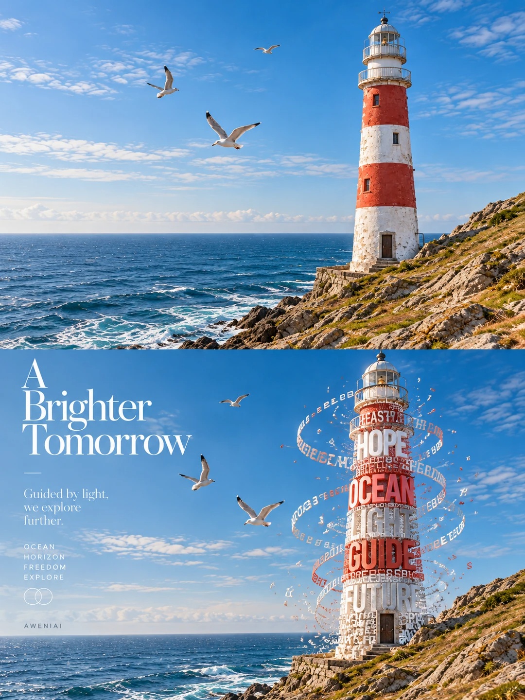
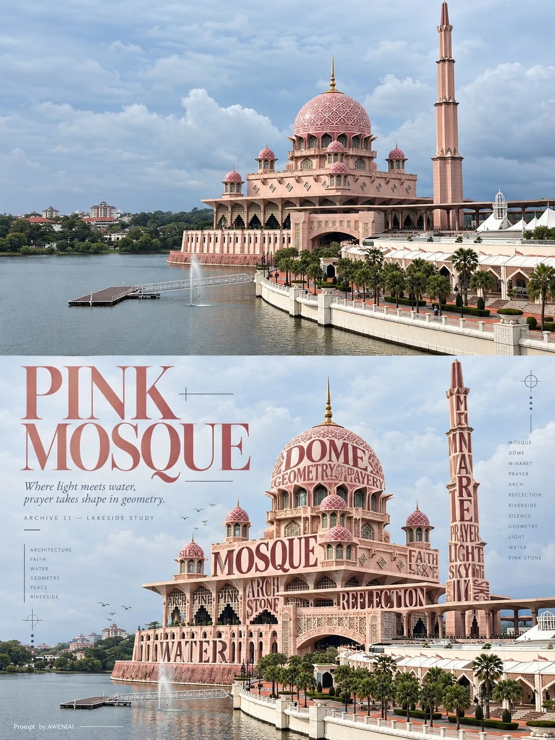
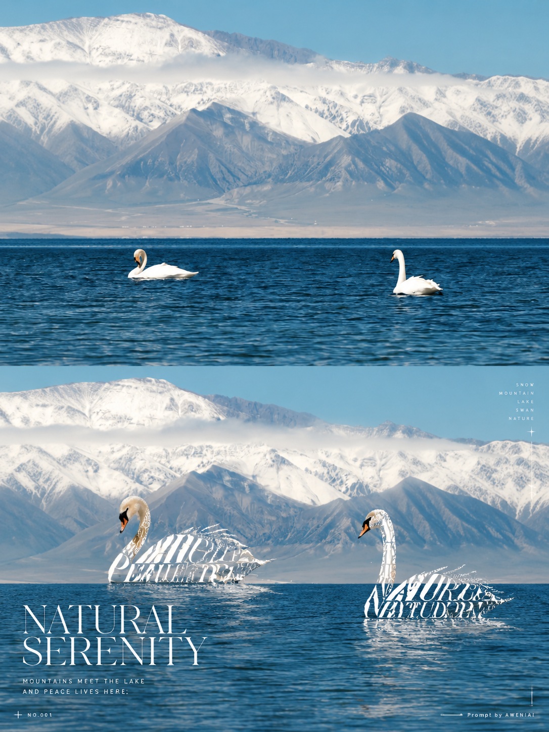
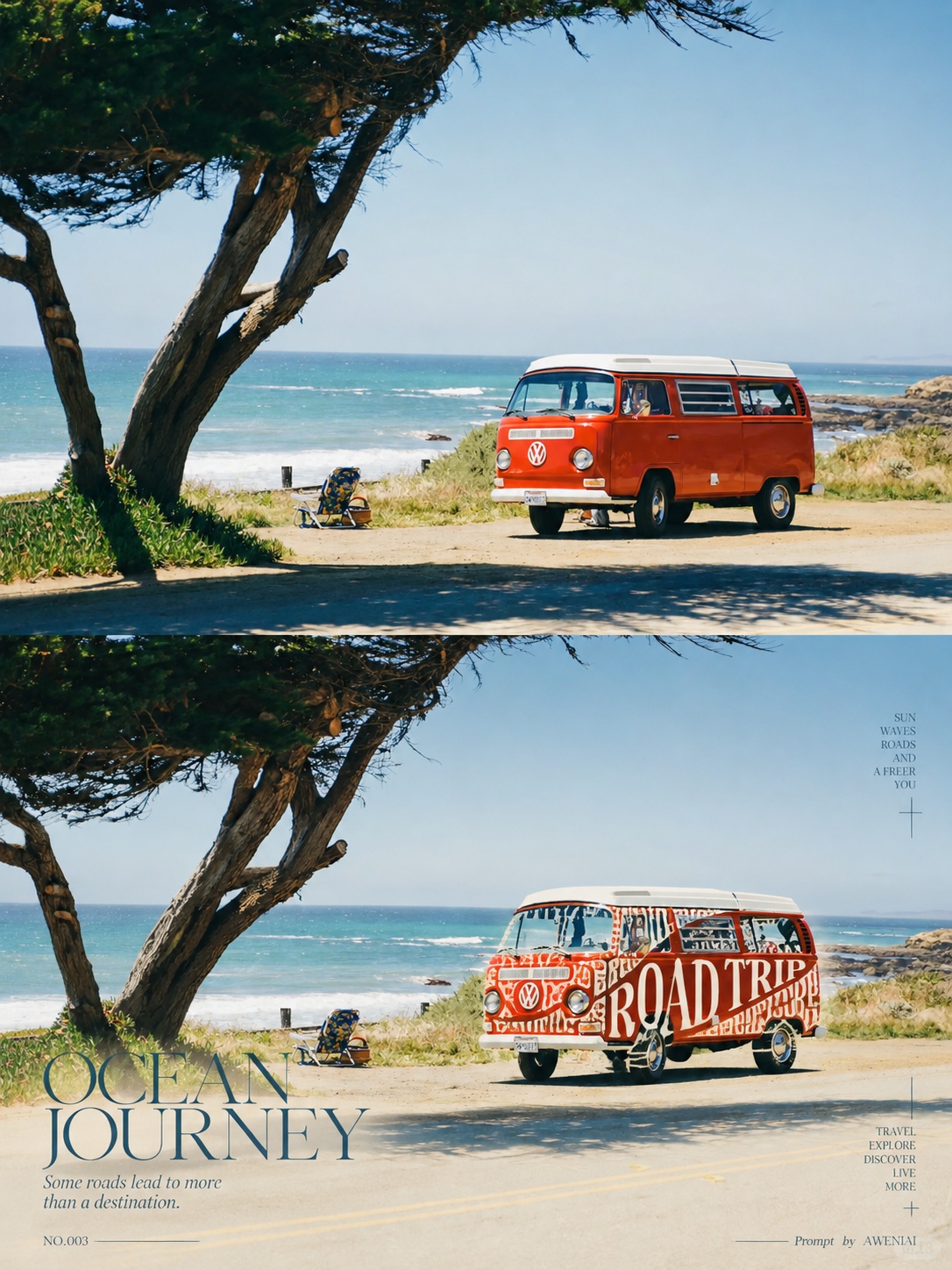
Turn each uploaded photo into a 3:4 editorial diptych, pairing the faithfully preserved original photograph with a matching scene whose subject is partly sculpted from themed typography.
Example outputs
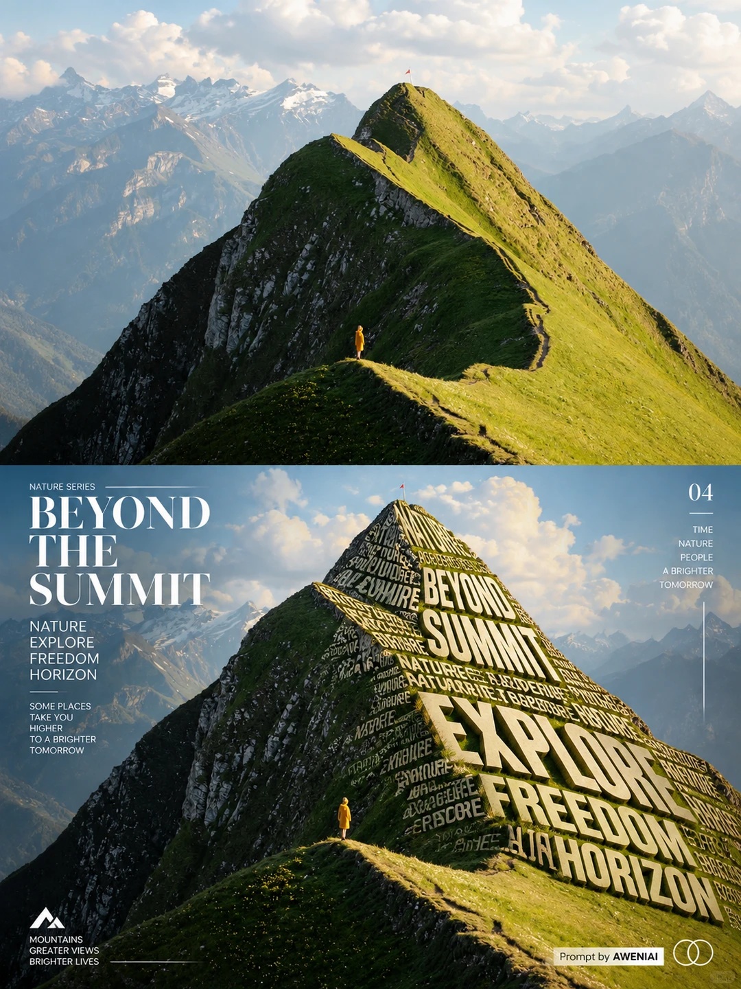
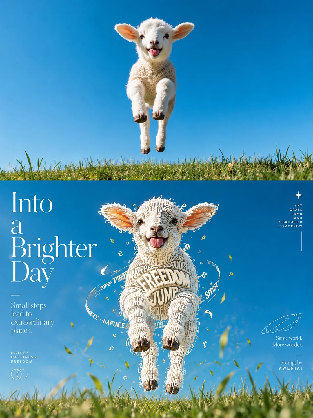
Prompt template
- Format
- Text
- Inputs
- Uploaded_photo (image) · Required
- Outputs
- Diptych_poster (image)
Create one separate experimental typographic-art diptych poster for each real photo the user uploads. Do not combine photos. Use a 3:4 portrait canvas divided exactly in half along the horizontal centerline, with each section occupying 50%. Use no border, card, or transition band. Keep all new design elements out of the upper half.

Upper half — original photograph:
Preserve the original photo’s subject identity and number of subjects, outlines, facial features, poses, actions, materials, composition, perspective, background, original colors, and lighting. Allow only subtle photographic color grading and natural extension of the background where needed. Do not crop key parts of the subject, redraw anything, or add objects. The photo must cover the full top section, reaching the top and side edges and the center dividing line. Add no text to this section.

Lower half — semantic typography sculpture:
Recreate the same scene, precisely matching the upper section’s subject placement, pose, proportions, spatial relationships, and original background. Analyze the subject’s structure and negative space, then select suitable areas to remove approximately 25–60% of the subject’s photographic material so the original background shows through the gaps. Fill the missing contours with English words, short phrases, or letters related to the photo’s subject. The typography must become part of the object itself, not appear printed on an intact surface. Depending on the photo, this may involve clothing, animal fur, flower petals or leaves, a hillside, a building façade, a cup, or a vehicle body. Decide what works for the actual photo rather than applying a fixed template. Preserve key identifying features and natural connections between forms.

Shape the typography along the original form’s curves and perspective. Use variations in type size, weight, spacing, bending, rotation, layering, and partial occlusion to create convincing volume. Treat the letter strokes as solid forms, with the spaces between letters revealing the original background. Use 2–3 coordinated type styles, chosen from delicate high-contrast serifs, condensed sans serifs, or elegant italics. Make the central word accurate, clear, and legible. Keep the background photographic, allowing only slight background softening. Derive the typography’s colors from the photo’s main palette while maintaining clear contrast. Avoid plastic-looking 3D lettering, neon, heavy shadows, and garbled text.

Art direction — lower half only:
Design a masterful Swiss experimental editorial layout that responds to the subject and available negative space. Use an asymmetric grid and five levels of visual hierarchy: the sculpted subject is the primary focal point, accompanied by a prominent English art title, a 1–2 sentence poetic description, a miniature archive number, and refined ornamentation. You may use ultra-fine lines, dots, crosshair markers, tiny arrows, vertical text, and restrained geometric symbols. Balance bold composition with clear readability and generous breathing room; do not obscure the subject. Place the exact signature “Prompt  by AWENIAI  ” only once, along the bottom or edge of the lower section, small but legible.

Final checks:
Ensure the canvas is exactly 3:4, with the upper and lower sections each occupying exactly 50%. Keep the original photo fully faithful and free of layout elements in the upper half. The lower half must remain the same photographic scene, with genuinely removed parts of the subject replaced by semantic typography. Make the outline, perspective, and front-to-back relationships convincing. Keep the title, description, symbols, and signature within the lower section. Do not create a separate new scene, turn the whole image into an illustration, scatter random text, or add a small original-photo thumbnail in the lower-right corner.
What you'll create
A clean equal split preserves the upper source while experimental lettering occupies only the lower design area. Natural photo colors and minimal framing create restrained editorial contrast.
Frequently asked questions
Can new design cover the upper photo?
No. New elements stay in the lower half.
Should photos be combined?
No. Each upload receives a separate poster.
Comments
Tried this prompt? Share what you made, compare results, or ask a question