Creating a minimalistic poster of your favorite city
Create a minimalistic ultra-high-resolution online art travel poster about [TOKYO], depicting the city as a stylish everyday urban scene rather than a tourist postcard.
Example outputs
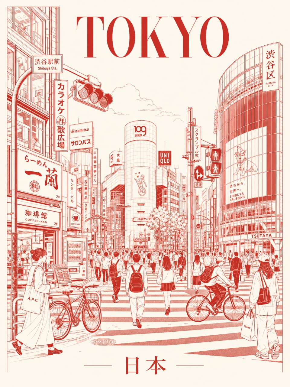
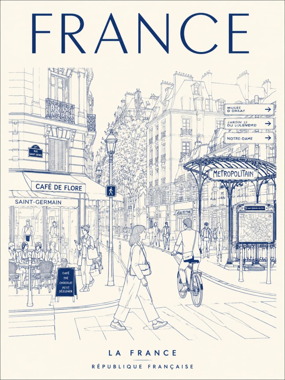
Prompt template
- Format
- Text
- Outputs
- result (image)
Create a minimalistic ultra-high-resolution online art travel poster about [TOKYO], depicting the city as a stylish everyday urban scene rather than a tourist postcard.

THE MAIN COMPOSITION:
- The central composition shows the most iconic street, intersection, alley, tram or pedestrian alley of the city.
- In the foreground - locals, commuters, cyclists, travelers, shoppers, students, cafe patrons
- People should naturally reflect the local lifestyle and fashionable culture of the city
- A background filled with realistic local signage, cafes, restaurants, transport signs, shop windows and architectural details
- Sights should fit seamlessly into everyday life, and not be exaggerated.
- Use authentic typography in the local language and culturally recognizable visual elements.
- Large font at the top in the center:
“TOKYO”
- Subtitle at the bottom:
examples of country names in the local language

style:
ultra clean vector illustration, Swiss Art Nouveau travel poster, minimalistic linear drawing, monolinear drawing, mid-century editorial aesthetics, architectural illustration, Japanese graphic poster style,
clear geometric perspective, extremely clean negative space,
premium travel brand aesthetics

LINEAR STYLE:
- monochrome linear illustration only
- fine and high-precision lines
- minimum number of fill areas
- complex detail, like on a city map
- rhythmic arrangement of signage, buildings, windows, and street objects
- visually dense, but at the same time highly organized composition

THE COLOR SYSTEM IS VERY IMPORTANT:
- use only ONE primary color + ONE background color
- automatically select the color that best conveys the atmosphere of the city
- aesthetics of a monochrome silkscreen poster
- no rainbow palettes
- no excessive amount of neon
- the color should reflect the architecture, climate, nightlife and cultural identity of the city.

Examples:
Tokyo → bright red on a warm ivory background
Paris → dark blue on cream background
New York → jet black on light gray
Kyoto → muted burgundy on a warm cream background
Hong Kong → turquoise on pale ivory
Santorini → Mediterranean blue on white
Cairo → sepia desert on sandy beige

composition:
- vertical poster layout
- frontal perspective at street level
- pedestrians cross the streets or move naturally
- balanced urban rhythm and visual flow
- it should look like an advertising poster of a premium urban brand

Mood:
stylish city life,
calm but lively,
the cover of a travel magazine,
the timeless identity of the city,
the visual range of the premium tourism campaign,
minimalistic but very detailed

THE QUALITY OF THE TEXT IS EXTREMELY IMPORTANT:
- all fonts should be readable and neat.
- no random characters
- no broken or distorted letters
- local signage should look authentic and natural
- professional typographic design

Output:
- vertical poster composition
- ultra-detailed 8K format
- ready to print
- Ultra-precise vector quality
What you'll create
Locals, commuters and small shops occupy a recognizable intersection or alley without oversized tourist landmarks. One primary color and one background color support detailed monoline architecture, clean negative space and large TOKYO lettering.
Frequently asked questions
How many main colors should be used?
Only one primary drawing color plus one background color.


Comments
Tried this prompt? Share what you made, compare results, or ask a question