- Category
- Design & Image
Crochet and Paper-Cut Travel Poster
Create a premium, handcrafted miniature travel poster that combines intricate crochet landmarks with layered paper-cut scenery tailored to a destination.
By Threads — Published on
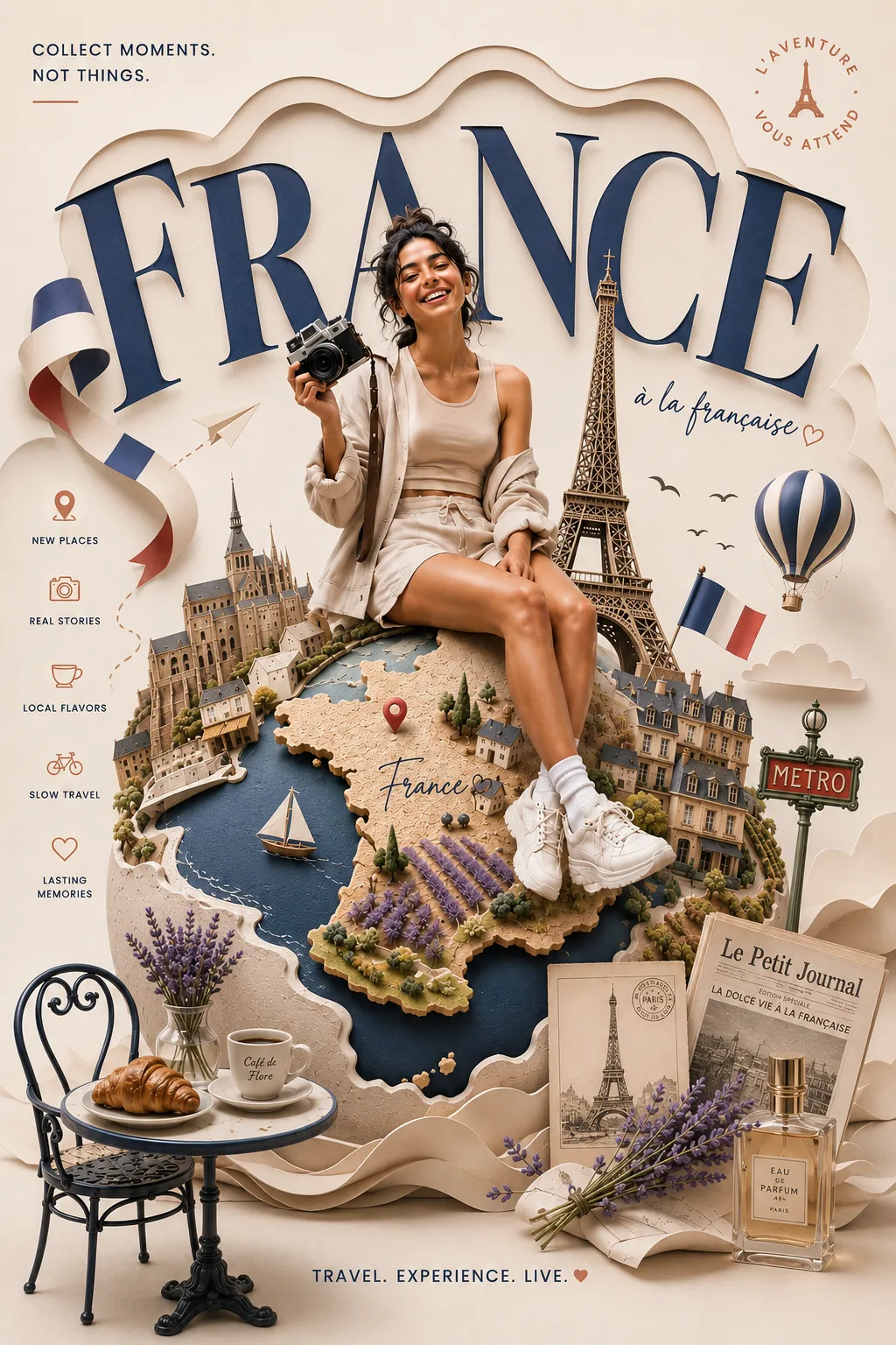
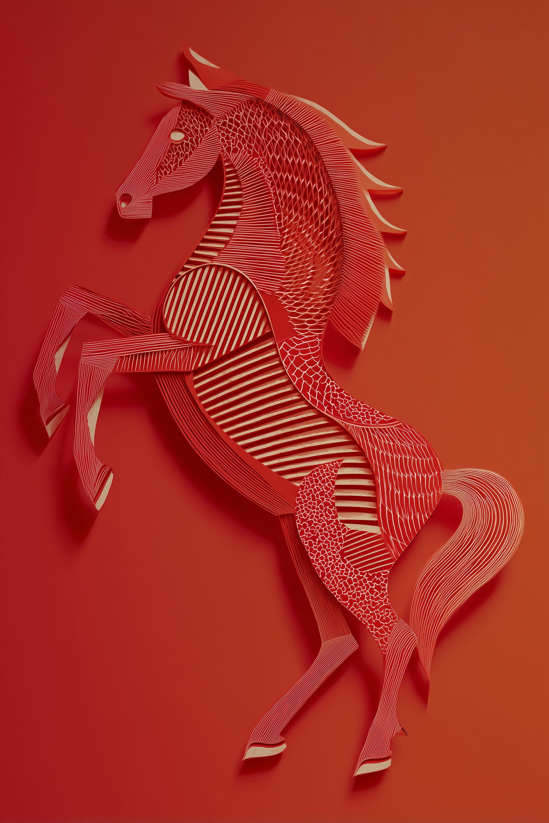
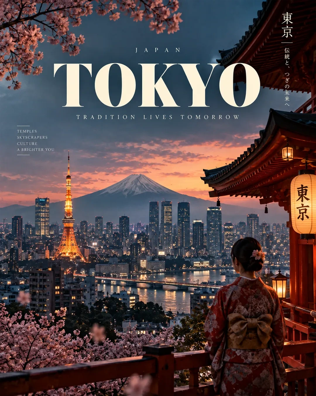
Example images


Prompt template
- Format
- Text Parameterized
- Inputs
- location (text) · Required location_name (text) · Required
- Outputs
- travel_poster (image)
Replace the ${…} placeholders with your values
before using this prompt. See parameters
and defaults below.
Create a premium 4:5 vertical travel poster featuring ${location}, blending intricate crochet craftsmanship with sculptural layered paper-cut art. The image should feel like a real, handcrafted miniature world photographed in a professional studio.

1. DESTINATION INTERPRETATION

Identify the most recognizable architectural landmark, natural landscape, and visual cultural elements associated with ${location}. Translate them into an artistic, geographically recognizable destination scene.

Select only 3–5 essential visual elements. Prioritize one iconic architectural focal point, one defining landscape feature, and a few complementary details. Avoid generic tourist imagery or mixing unrelated locations.

2. COMPOSITION

Build one continuous, borderless landscape that extends naturally to all four edges.

- Foreground: a distinctive local architectural landmark or handcrafted structure.
- Middle ground: a recognizable bridge, pathway, waterway, garden, street, or terrain appropriate to the location.
- Background: iconic mountains, coastline, skyline, desert, countryside, or other defining scenery.
- Atmosphere: restrained environmental details such as blossoms, clouds, foliage, sunlight, or drifting particles, selected to suit the destination.

Use a clear focal point, layered depth, balanced asymmetry, and generous negative space. Keep the upper portion sufficiently open for poster typography without obscuring the destination.

3. SIGNATURE MIXED-MEDIA STYLE

Crochet and yarn craftsmanship: Render the main architectural landmark and selected secondary elements as intricate three-dimensional crochet miniatures. Show individual yarn fibers, visible stitches, knitted roof tiles, textured columns, woven surfaces, and carefully crafted details.

Layered paper-cut scenery: Construct the surrounding landscape from broad, overlapping paper shapes. Mountains, hills, clouds, water, terrain, and selected vegetation should have crisp cut edges, subtle paper grain, dimensional layers, and natural cast shadows.

Material contrast: Crochet must look tactile, raised, and fibrous. Paper must look sculptural, clean-edged, and layered. Both should coexist naturally within one coherent miniature environment.

The destination itself must express the mixed-media technique. Do not place the artwork inside a frame, decorative border, paper window, or enclosed diorama.

4. LOCATION-SPECIFIC ART DIRECTION

Adapt the architecture, vegetation, terrain, local objects, cultural motifs, and color palette to ${location}. Respect its recognizable visual identity and architectural character.

Choose a restrained palette inspired by the actual destination, balanced with warm neutrals. Keep the materials and lighting consistent across the series while allowing each location to have its own distinctive atmosphere.

Avoid arbitrary cultural symbols, inaccurate landmark combinations, and decorative details that do not serve the composition.

5. LIGHTING AND FINISH

Use soft, directional natural studio lighting to reveal the contrast between yarn fibers and layered paper edges. Add subtle contact shadows, realistic miniature-scale depth, and gentle atmospheric perspective.

Aim for a premium editorial travel-poster aesthetic: tactile, sophisticated, warm, visually distinctive, and beautifully crafted. Keep the scene detailed enough to reward close viewing but uncluttered enough to read instantly on a phone screen.

6. POSTER TYPOGRAPHY

Integrate refined editorial typography into the open sky or another naturally quiet area of the composition.

Small uppercase eyebrow: “DESTINATION”

Main title: “${location-name}”

Optional tagline: “WHERE CRAFT MEETS WONDER”

Use elegant serif typography, restrained letter spacing, consistent alignment, and a deep neutral or location-appropriate ink color. Keep the title clearly legible without competing with the artwork. If accurate text rendering is uncertain, prioritize the composition and leave clean negative space for typography to be added afterward.

7. SERIES CONSISTENCY

Maintain the same 4:5 portrait format, borderless composition, crochet-versus-paper material contrast, lighting approach, typography hierarchy, and overall visual restraint for every destination.

Each image should feel like part of the same collectible world-destination art series while remaining visually unique to its location.

8. OUTPUT REQUIREMENTS

Vertical 4:5 composition, Instagram-ready, high detail, tactile material realism, clean visual hierarchy, recognizable destination, naturally integrated mixed media, refined color harmony, and professional editorial finish.

AVOID: borders, frames, clutter, excessive decorative objects, oversaturated colors, heavy glow, flat digital illustration, indistinguishable materials, inaccurate landmarks, unrelated cultural motifs, distorted architecture, illegible typography, watermarks, and logos.
Parameters
Replace each placeholder with your own value, or use its default when one is provided.
${location}
location
Required
${location-name}
location-name
Required





Comments — 0