- Category
- Design & Image
- Models
- openai-gpt-2-5 openai-gpt
Graphite Portrait with Cobalt Photo Collage and Red Newspaper Markings
Create a tactile editorial portrait that combines a monochrome graphite drawing, torn cobalt-blue photo prints of the same person, and scarlet-red annotations on a newspaper background.
By Threads — Published on — Modified on
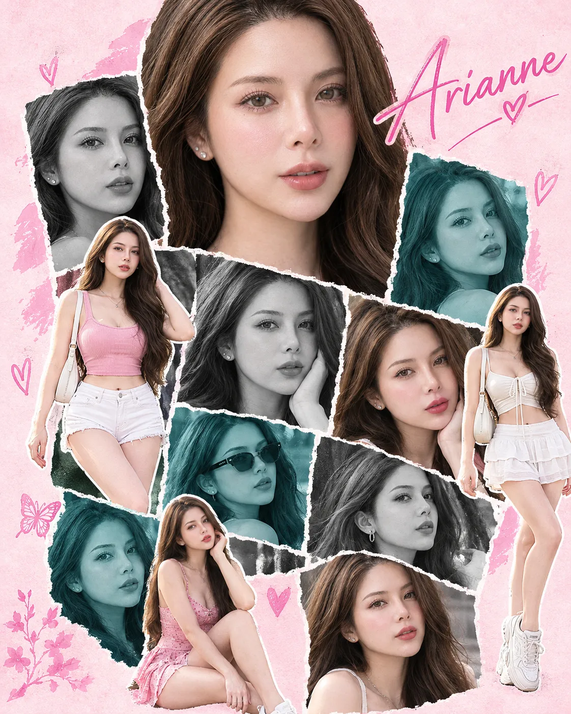
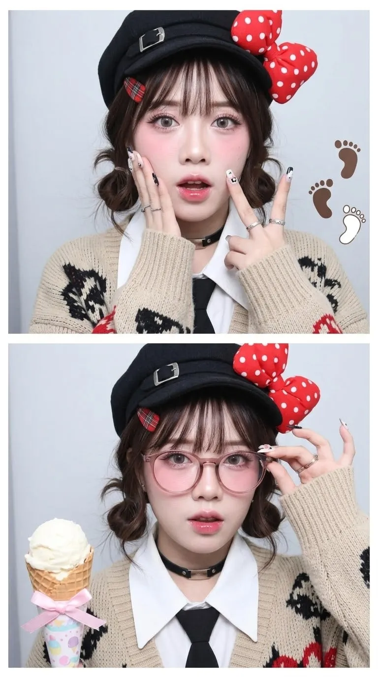
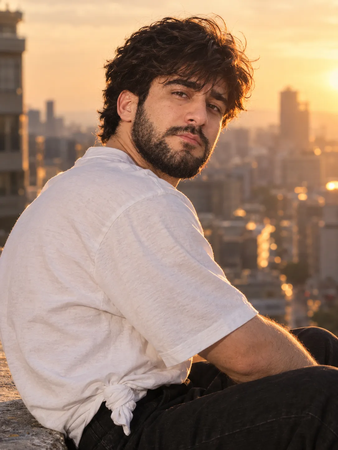
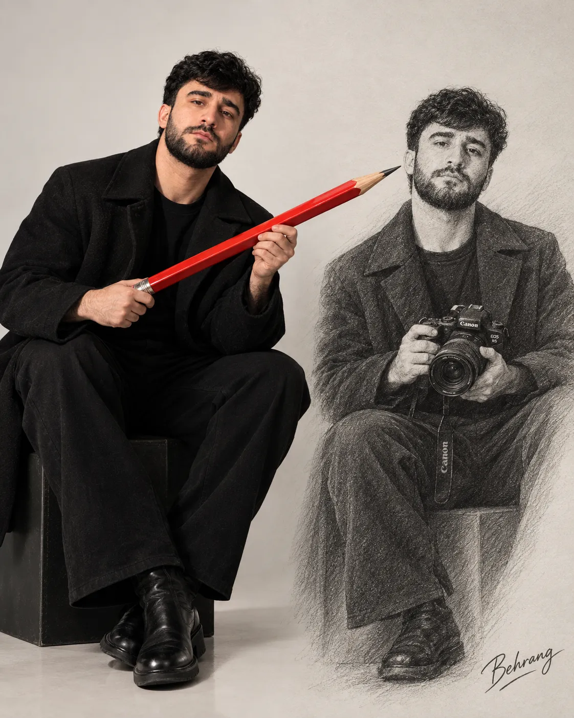
Example images


Prompt template
- Format
- Text Parameterized
- Inputs
- theme (text) · Required aspect_ratio (text) · Optional · Default: 4:5 subject_identity_image (image) · Required drawing_style_background_image (image) · Required photo_collage_reference_image (image) · Required
- Outputs
- editorial_mixed_media_portrait (image)
Replace the ${…} placeholders with your values
before using this prompt. See parameters
and defaults below.
Use dailyprompts.ru/studio with the GPT 2.5 model.

THEME: ${theme}
ASPECT_RATIO: ${aspect-ratio:4:5}

Create an original editorial portrait in exactly the specified ASPECT_RATIO. Replace the THEME value before generating. THEME guides the newspaper imagery and red marker drawings; it is not text to print in the image.

TOP VISUAL PRIORITIES: (1) The drawn face and every blue photograph show the EXACT SAME PERSON in the EXACT SAME POSE, using one shared facial landmark map. (2) The blue pieces look like real PHOTOGRAPHIC PAPER torn from prints and physically taped onto the pencil portrait, never like blue-tinted skin. Keep the close, one-sided face-collage composition described below. Solve paper material with visible thickness, edges, tape, and shadows; never solve it by shifting or changing facial features.

INPUT IMAGE 1 — SUBJECT AND SOLE IDENTITY SOURCE. Preserve this person's exact facial proportions, hairstyle, expression, head angle, gaze, distinctive details, accessories, and clothing silhouette. Both the graphite portrait and all blue prints derive from THIS ONE source face. Do not invent a second photographic face or a different expression for the blue pieces.

INPUT IMAGE 2 — DRAWING STYLE AND BACKGROUND. Use its strong graphic contours, angular grayscale value structure, and newspaper setting as style guidance, but render the illustrated portrait with natural graphite pencil marks. Do not imitate its dense etched linework. Do not copy its person, lettering, yellow highlight, leaves, or exact layout.

INPUT IMAGE 3 — PHOTO-COLLAGE CONSTRUCTION. Use its idea of physical photographic prints reconstructing part of a face. Do not copy its historical person, symbols, text, or branding.

PORTRAIT: Make one coherent portrait with the face as the strongest focal point. Render the illustrated portions of the head and ALL clothing as a monochrome graphite-pencil drawing: black, white, and neutral gray only. Shade with broad, loose, irregular pencil strokes of varied length and pressure, plus softly rubbed graphite midtones. Follow the planes of the face and the folds of the clothing; leave some paper showing between strokes. Keep facial skin relatively smooth, using a few visible directional strokes around shadows and features rather than filling every area with tiny lines. Preserve the original garment shapes and materials, but completely remove their original colors and all colored lighting or warm tint from the drawn subject. Keep clothing opaque; suggest fabric through folds and value changes, not a repeated weave texture. Newspaper print belongs only behind the person.

PHOTO-COLLAGE COMPOSITION: Keep one cohesive portrait with the familiar collage arrangement: about 40–45% of ONE SIDE of the face is reconstructed by four close-together electric-cobalt-blue photographic scraps of the same person. Arrange them in a loose diagonal cascade across the hair/forehead, eye/cheek, mouth/jaw, and one smaller offset facial detail. Their widths and torn shapes vary, but the scraps stay close enough to read as one side of the face, with slight overlaps where useful. Preserve the single face's precise landmark positions: exactly two eyes TOTAL, one nose, and one mouth. The blue eye occupies the position of the corresponding eye in the original subject; the other eye is graphite. Pupils share the original gaze, both eyes sit on the same eye line, and the photo nose bridge, nostril, mouth corner, jawline, and hairline register with the graphite portions. Do not shift, enlarge, re-pose, or change the age or expression of the blue face. Do not draw a gray duplicate eye or mouth beside a blue one. Do not scatter the scraps across both sides of the face, turn them into isolated jigsaw islands, or move them away from the original one-sided composition. Keep them mainly on the head, with at most a slight extension onto the collar.

IDENTITY CHECK: Treat the portrait as ONE face split between two rendering materials, not as two portraits combined. First establish the exact head and facial landmarks from INPUT IMAGE 1; then apply graphite drawing to the uncovered areas and same-pose blue photographic crops to the covered areas; finally add torn paper borders, tape, and shadows. If the blue half would look like another person, if an extra eye appears, or if the lips or nose do not meet at the correct positions, correct the face before adding any newspaper decoration.

VISIBLE PASTED-PHOTO MATERIAL — ESSENTIAL: Each blue face piece is a separate continuous-tone photographic PRINT with realistic photographed skin and hair, never a pencil drawing recolored blue. The blue image is printed inside a clearly visible, unprinted off-white paper margin; the torn fibrous edge cuts through this white margin, not through bare blue pixels. Show a noticeable white deckled rim around the full perimeter of each scrap, especially the long boundary against the graphite face and the outer edge near the hair or cheek. Make the print look slightly raised: a thin dark contact shadow falls from its paper edge onto the graphite drawing, and one or two tiny corners curl upward with a longer soft shadow. A few short matte tape tabs must cross from the photo paper onto the graphite surface, visibly fastening it. The photo may overlap the drawing; its printed facial features visually form that portion of the portrait. Keep the photographed continuous-tone surface distinct from the visible pencil strokes outside the paper. No blue tint spilling beyond a paper edge, no soft gradient, translucent overlay, airbrushed blend, or seamless skin-to-blue transition. At thumbnail size, the first impression must be torn photos glued onto a drawing. Every scrap contains a matching photographed feature of THIS SAME PERSON; no equations, diagrams, newsprint, blank blue blocks, or abstract marks inside the photo scraps.

GRAPHITE TEXTURE: The person must read as a hand-drawn pencil sketch at a glance, with visible freehand stroke edges and natural variations in pressure. Avoid mechanically repeated micro-lines or decorative surface patterns anywhere on the person: no swirls, fingerprint-like curves, concentric arcs, moire, stippling, engraved etching, dense uniform crosshatching, embossed texture, or crackle. Restrict paper grain and print texture to the newspaper background and torn photo borders.

PHOTO COLOR LOCK: Give ALL four photographic fragments the same single-color print treatment. Use vivid electric cobalt blue as the shared base hue, with midtones anchored near #046BE0; create shadows and highlights only by darkening or lightening that same blue. Match hue, saturation, and contrast across every fragment as though they were developed in the same print batch. No separate cyan, teal, turquoise, violet, muted slate-blue, or leftover pink lighting from the source photo.

NEWSPAPER: Build a layered warm off-white newspaper background with clear page edges, orderly narrow columns of tiny, visually subdued charcoal print, and one or two small grayscale halftone photos related to THEME. Newspaper words are background texture: keep ALL type small, with no legible display-size sentences anywhere. Keep it lighter and quieter than the face. No newsprint on skin, hair, clothes, or photo fragments. No large readable headlines, slogans, display words, poster-like quotations, or random black blocks.

RED MARKER: Use one saturated scarlet-red chisel-tip marker, with broad strokes about three times thicker than a fine pen line. Make the annotations look hand-drawn directly on the newspaper. Use EXACTLY THREE discrete underlines in total, each under a different selected newspaper passage; avoid stacked or repeated underline strokes. Add one large loose circle around a theme-relevant newspaper detail and one large curved arrow that guides the eye toward the portrait. Add THREE distinct, recognizable marker drawings or symbols related specifically to THEME: one prominent large drawing, one medium-sized drawing, and one smaller symbol. Give each a different silhouette and a clear connection to the topic; these drawings take visual priority over the underlines. Avoid generic stars, Xs, or checks unless the theme specifically calls for them. Group the marks in two or three areas around the outer newspaper margins, leaving calm space beside the eyes and mouth. Do not draw square brackets, braces, or bracket-shaped marks. No red marker on the person's face, hair, clothing, tape, or blue photographs.

OUTLINE: With the same red marker, trace the complete outer silhouette on the newspaper side only, from one shoulder over the hair and down the other shoulder. The inner edge of the red stroke touches the actual silhouette with no gap, including the outer edges of any protruding photo paper. Keep the contour close, never a detached halo or broad background frame.

LAYOUT: For 4:5 or other vertical ratios, use a large centered chest-up portrait. For 16:9 or another wide ratio, place the portrait slightly off-center and use the wider newspaper area for the theme-related drawings and annotations, while keeping the face large and uncropped. Adapt the composition to the specified ratio without stretching or letterboxing.

Overall: tactile mixed-media poster art. The illustrated person is strictly black-and-white graphite, including the entire outfit; only the photographic face fragments use the locked electric-cobalt-blue hue and only the newspaper annotations are scarlet-red. The newspaper may retain a subtle aged off-white paper tone. The face leads, the blue photo mosaic adds contrast, the scarlet marker supports the story, and the newspaper stays secondary. No yellow, foliage, lightning, neon, extra people, arbitrary title text, logos, or watermarks.
Parameters
Replace each placeholder with your own value, or use its default when one is provided.
${theme}
theme
Required
${aspect-ratio:4:5}
aspect-ratio
Default: 4:5




Comments — 0