- Category
- Art & Illustration
- Model
- google-imagen
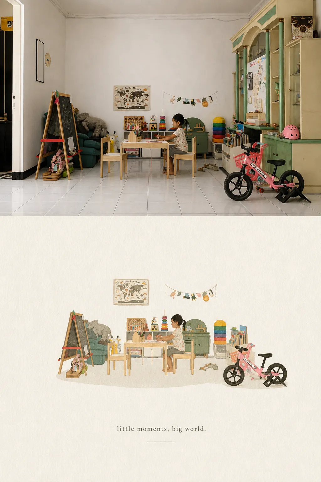
Minimalist Hand-Drawn Editorial Cover from a Photo
Turn a reference photo into a refined, handmade-feeling editorial cover illustration, with a tiny recognizable subject, generous negative space, and an optional title.
By Threads — Published on
Example images


Prompt template
- Format
- Text Parameterized
- Inputs
- Reference_photo (image) · Required title (text) · Required
- Outputs
- Illustrated_cover (image)
Replace the ${…} placeholders with your values
before using this prompt. See parameters
and defaults below.
Transform the attached photograph into a minimalist, hand-drawn illustration with the feel of an independent art-publication cover.

Use the photograph only as a reference for the subject, its visual identity, pose, and colors. Preserve the most recognizable subject, essential silhouette and proportions, main pose or gesture, important objects, key relationships between people and objects, and any features, clothing, or accessories needed for recognition. Simplify heavily: retain only the visual information needed to recognize the subject immediately. Suggest the setting with a few lines or small areas of color rather than reproducing the full background.

Create one vertical 3:4 composition on a single, continuous paper background. Show only the illustration—no photo fragments, panels, split layouts, or before-and-after comparisons. Keep the illustrated scene small, centered horizontally, and slightly below the canvas center, occupying approximately 10–20% of the image. Leave abundant negative space; do not enlarge the illustration to fill the canvas.

Use delicate, slightly imperfect hand-drawn lines, a small number of defined flat shapes with an acrylic-paint appearance, visible handmade brushstrokes, organic irregular edges, subtle imperfections, and a light rough-paper texture. Combine linework with small painted areas; do not use outlines alone.

Use a uniform pale warm-white, cream, or natural paper background, like cardstock for an editorial cover. Keep its grain subtle, with no decorative stains or strong aging effects. Derive the dominant colors from the photograph and limit the illustration to at most four main colors besides the paper tone. Keep the palette restrained, sophisticated, and harmonious, with controlled, flat color blocks that retain handmade brush texture.

Optional title: ${title}. If a title is provided, reproduce it exactly, preserving spelling, accents, and capitalization, and omit any brackets. If the title is blank or is still the placeholder text, include no typography. Do not invent a title, subtitle, date, or other words. Place the title centered near the top, with wide margins and generous separation from the illustration. Use small, refined, minimal lettering—preferably a light-weight sans serif with slightly open letter spacing. Let it sit quietly in the negative space rather than dominate the composition. Use one legible text color drawn from the illustration’s palette.

The result should feel serene, poetic, refined, minimalist, innocent, relaxed, artistic, reflective, and immediately recognizable: a small subject surrounded by abundant empty space. Create a single carefully composed illustrated cover that feels like a small visual poem on paper.

Avoid photographs or photo fragments, split compositions or panels, colored-pencil or crayon effects, blurred or blotchy watercolor, linework-only illustration, complex realism, excessive detail, heavy oil-paint effects, overly polished digital rendering, 3D rendering or glossy surfaces, commercial caricature or excessively cute characters, advertising aesthetics, generic poster templates, unnecessary decoration, clutter, oversized or heavy typography, frames, logos, and watermarks.

Prioritize subject recognition, simplification, negative space, material texture, subtle imperfections, and editorial sophistication.
Parameters
Replace each placeholder with your own value, or use its default when one is provided.
${title}
title
Required


Comments — 0