- Category
- Design & Image
Original Photo and Cel-Shaded Anime Comparison
Create a vertical 3:4 comparison image pairing the unchanged reference photo with a faithful cel-shaded anime illustration of the same moment.
By Threads — Published on — Modified on
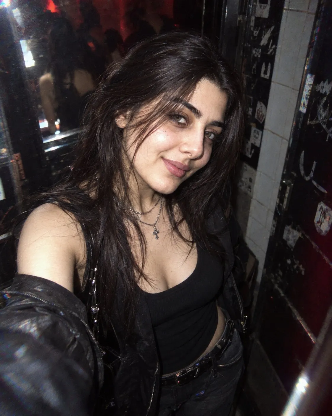
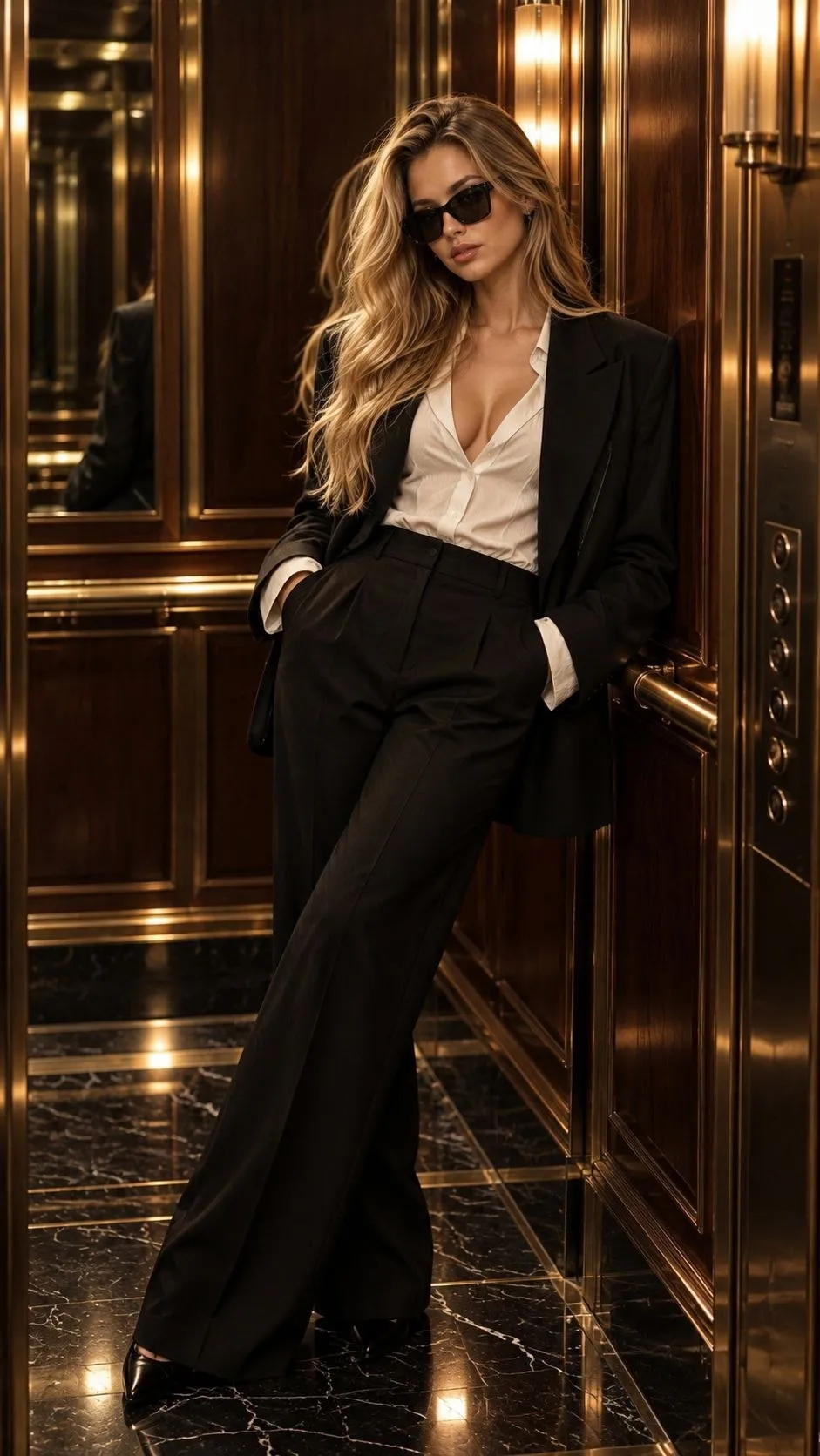
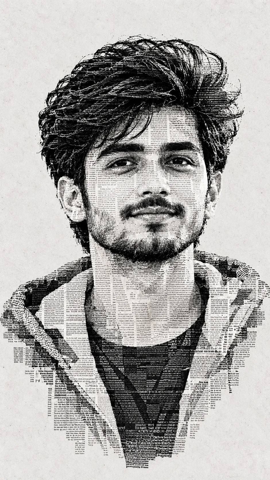
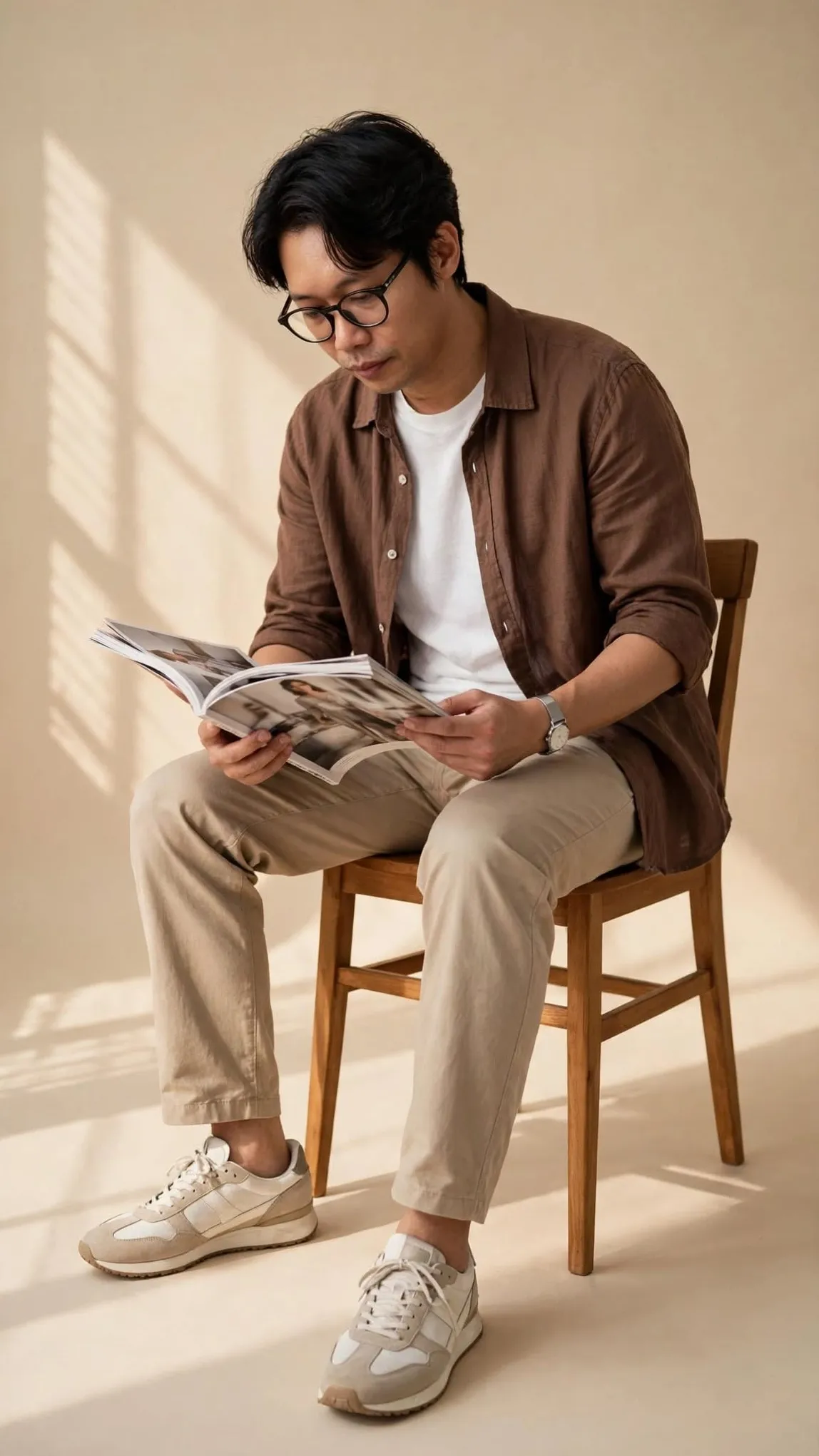
Example images


Prompt template
0 copies
- Format
- Text
- Inputs
- Reference_photo (image) · Required
- Outputs
- Comparison_image (image)
Using only the single uploaded photo as the visual reference, create one 3:4 portrait comparison image with two stacked panels. Do not mix images, create a collage from multiple photos, or reference characters or scenes from other sources.

Layout:
- Divide the image into two equal-height panels, each occupying exactly 50% of the canvas.
- Make both panels the same width and place them directly together, with no gap or frame.
- Keep all content within its panel; nothing may cross the center line.

Top panel — original photo:
- Fill the entire top panel with the original photo, extending to all four edges.
- Only enlarge the photo proportionally and crop nonessential outer background as needed.
- Keep the people, their number, poses, expressions, hairstyles, clothing, accessories, objects, spatial relationships, natural lighting, and original colors completely unchanged.
- Do not redraw, beautify, add, remove, or place text over anything in this panel.

Bottom panel — cel-shaded anime illustration:
- Create a 2D animated-comic illustration based on the same moment shown in the photo.
- Faithfully preserve the people’s face shapes, hairstyles, apparent ages, body types, clothing, actions, expressions, gaze directions, and relationships to key objects.
- Keep proportions natural. Avoid oversized eyes, pointed chins, or making the people look childlike.
- Use crisp, fine linework with darker outlines and slightly more defined outer contours. Apply a base color, one clear layer of shadows, and a small amount of highlights.
- Follow the original photo’s light direction for shadows, and derive the colors from the photo while preserving its main color relationships.
- Do not use watercolor, gouache, colored-pencil texture, heavy brushstrokes, airbrushed gradients, or 3D effects.
- Simplify the background while retaining only key elements needed to convey the setting. Use a consistent warm-white, finely textured art-paper background, with a subtle, clean paper grain. Make the illustration appear naturally drawn on the paper and leave a moderate amount of visible paper around it.
- Keep the people and main subject from appearing too large: they should occupy approximately 55%–70% of the bottom panel’s width. Show the full action and keep proportions natural.

Final effect: a clean, detailed, polished 2D cel-shaded anime comic with a sense of everyday storytelling.

Do not add extra people, unrelated elements, text, dialogue bubbles, logos, or watermarks. Avoid a photographic-filter look, plastic-looking skin, random noise, and dirty or heavily marked paper texture.




Comments — 0