- Category
- Design & Image
- Model
- openai-gpt-image
Photo-to-Scrapbook Design Poster
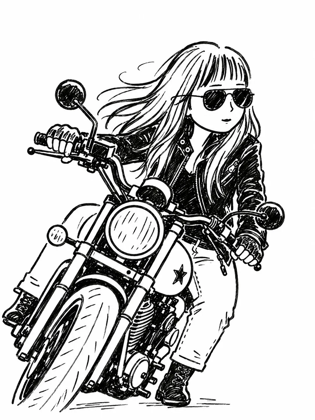
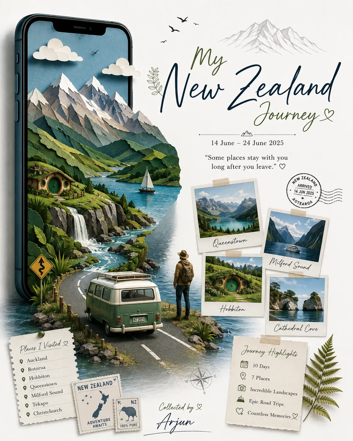
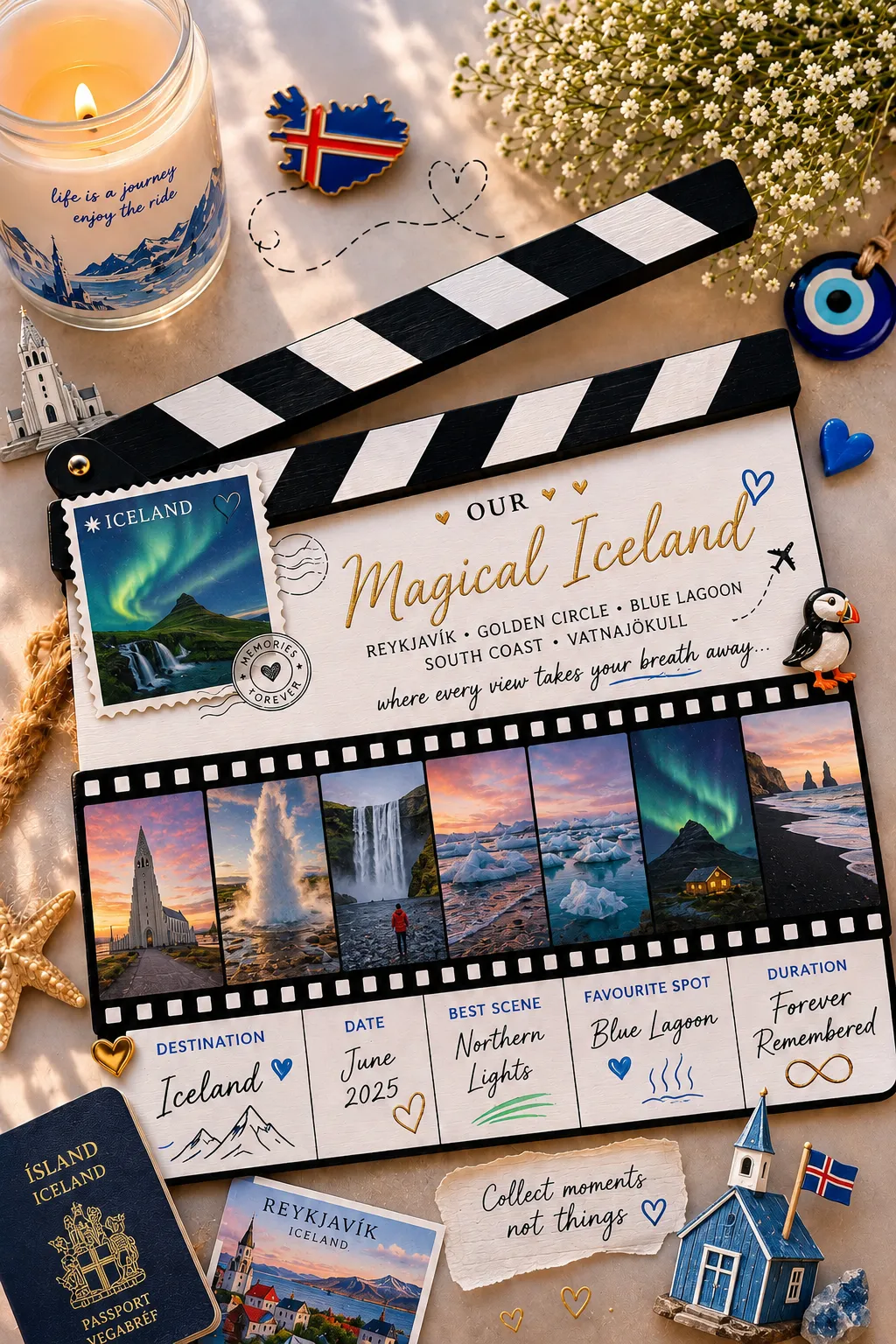
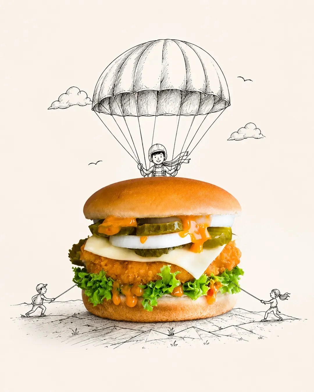
Turn an uploaded photo into a premium vertical poster pairing the original image with a loose grid of hand-drawn visual memories.
By Threads — Published on
Example images

Prompt template
- Format
- Text
- Inputs
- reference_image (image) · Required
- Outputs
- design_poster (image)
Turn the photo I upload into a separate, standalone premium design poster.

The overall composition must use a 3:4 vertical format. Divide the canvas into upper and lower sections with a strict 1:1 height ratio, each occupying exactly 50% of the canvas.

Upper section:
Keep the original photo intact, preserving the subject’s identity, structure, pose, realistic texture, natural lighting and shadows, and original color atmosphere. Apply only subtle, sophisticated color grading to give the image the feel of an art magazine, independent publication, or exhibition photograph. The surrounding environmental background may be naturally extended to fit the format, but do not stretch, distort, or alter the main subject.

Lower section:
Extract the most recognizable subject, partial elements, action cues, object details, and narrative relationships from the photo. Reconstruct them as a visual system combining a 3×3 modular icon grid, naïve hand-drawn doodle illustrations, crayon or colored-pencil grain texture, and handwritten text.

Do not fully trace the original image or create a realistic illustration. Instead, compress its complex visual information into nine memorable visual units. These may include the subject itself, distinctive details, personal belongings, plants, food, modes of transportation, poses, emotional symbols, or small memorable details from the scene.

Each unit should be a semantic extension of the same image above, so that at first glance the units feel as though they belong to the same photo—like a “memory list” extracted from it.

Use a subtle, implicit 3×3 loose grid. The nine-grid structure should serve only as an underlying organizational system and must not look overly precise or rigid. Slightly vary each icon’s position, size, angle, and placement to create a loose, organic grid that feels structured but not mechanical.

At the top, you may add a short handwritten title with a few light, playful elements such as small waves, stars, dots, or symbols. At the bottom, you may add a very small handwritten caption. The overall result should feel like a page from a personal scrapbook, visual diary, or collection sheet.

Leave generous negative space. Keep the layout relaxed, cute, restrained, and intentional rather than cluttered.

Visual style:
Use a naïve hand-drawn doodle illustration style: simple forms with a slightly childlike, imperfect quality; subtly shaky outlines; varied line thickness; partially open contours; and intentional imperfections.

Do not fill the shapes too heavily. Let the paper texture, white grain, and slightly rough edges remain visible. You may combine fine black linework, colored-pencil or crayon fills, and small areas of solid color. Do not rely on realistic lighting or shading; instead, establish visual relationships using flat color or spot color.

If grid guide lines appear, make them extremely subtle, as if lightly sketched in pencil as an underlying draft rather than drawn as a precise digital table.




Comments — 0