World Veil: World Within Me — Editorial Cover
Create a photorealistic luxury magazine cover that preserves a character’s identity and embeds a character-responsive, two-color natural world inside a black veil.
By Threads — Published on
Screenshots
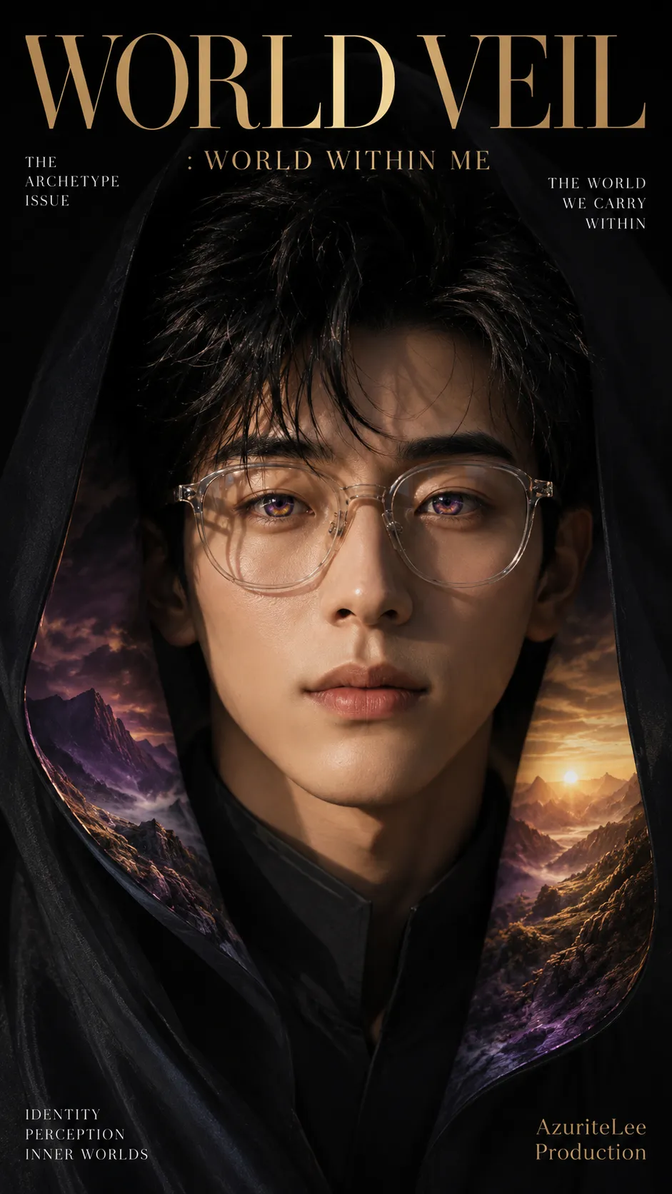
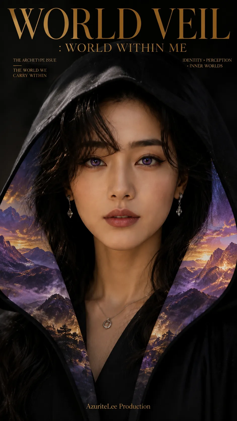
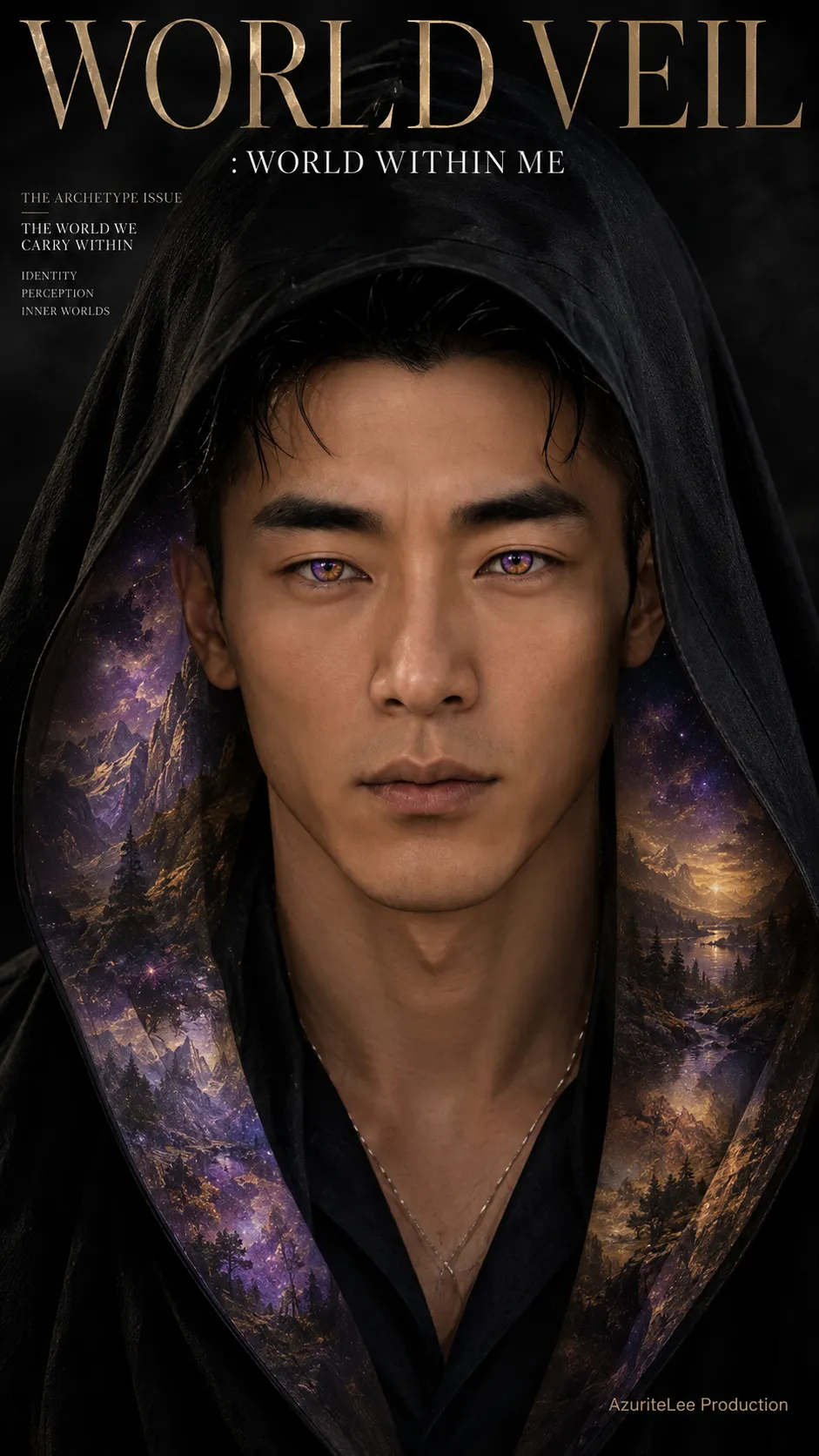
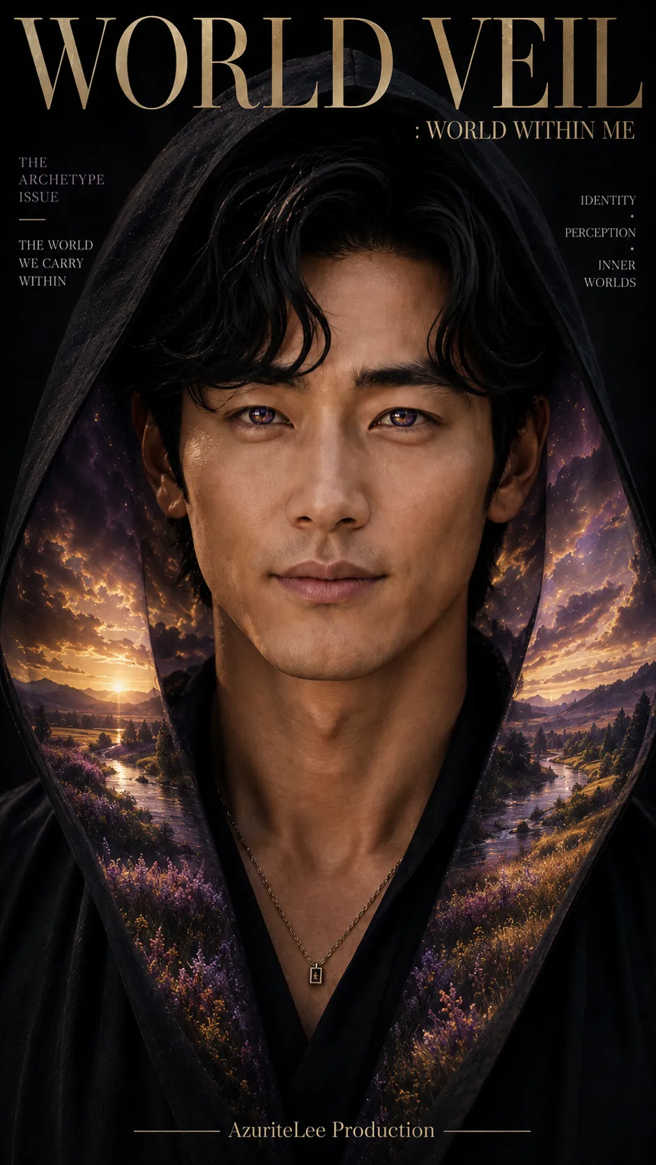
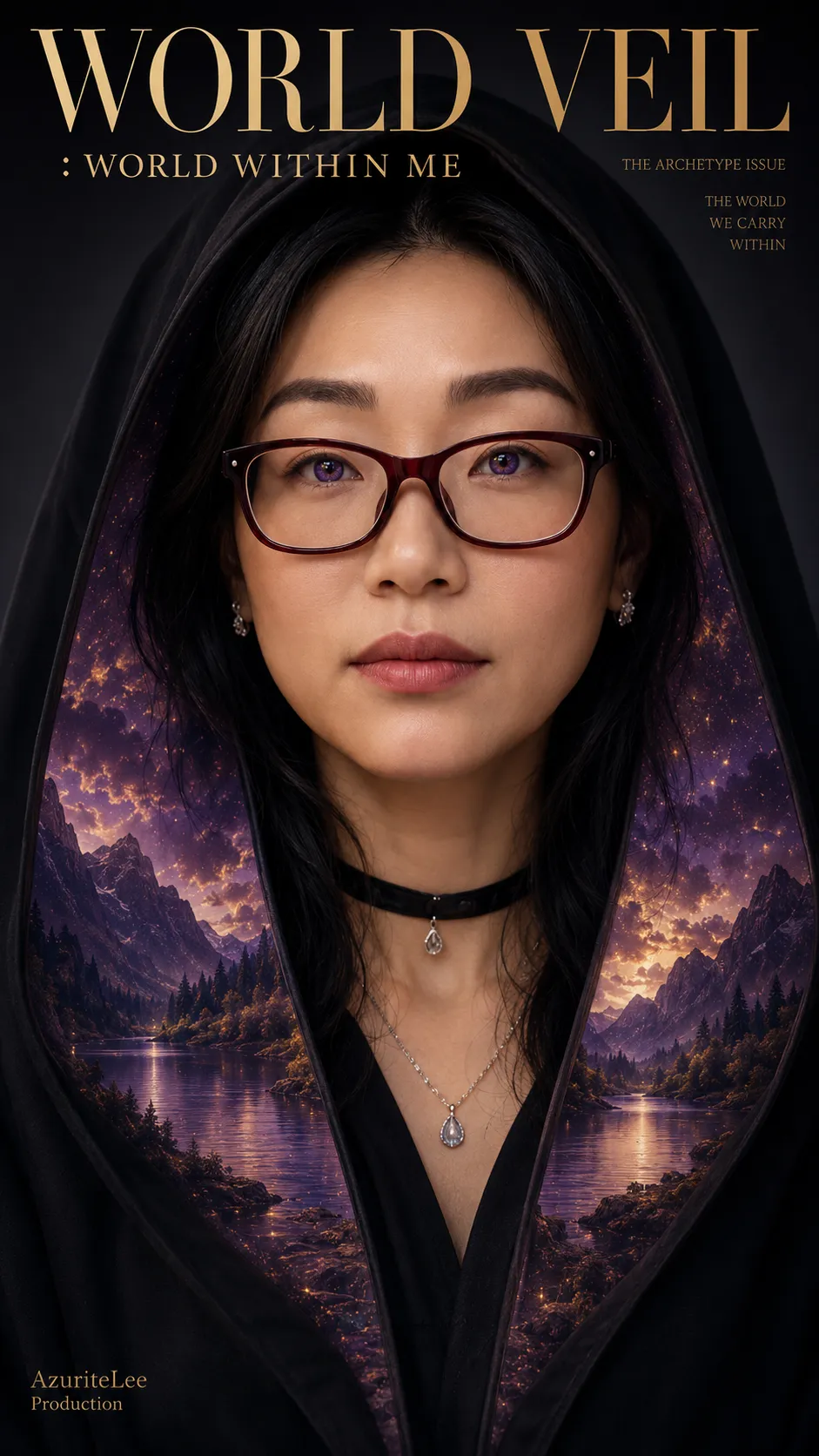
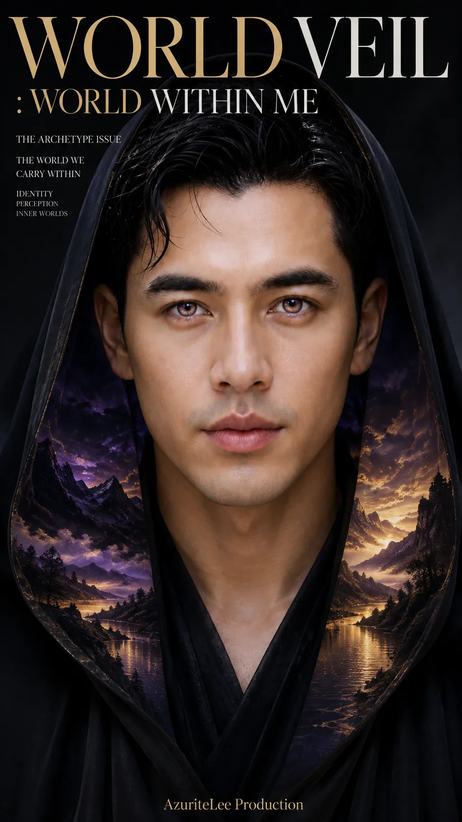
Prompt template
Create a premium, photorealistic fashion-and-art magazine cover using the uploaded character image as the primary identity reference.

## Preserve identity
Keep the person recognizable and faithful to the reference: preserve facial identity and proportions, eyes, nose, lips, brows, cheekbones, jaw, skin tone and texture, hairstyle, hairline, apparent age, distinctive features, natural asymmetry, and body proportions. Do not redesign, beautify, age, de-age, or replace the person. Any additional references may guide garment construction, hood position, pose, framing, or composition only; they must never override identity.

## Composition and veil
Create a 9:16 vertical, extreme-close-up professional editorial portrait, photographed as if with a full-frame DSLR and an 85mm portrait lens at f/1.8–f/2.0. Use a straight-on, eye-level view with direct eye contact. The face should occupy about 75–85% of the frame, with only minimal neck, a small portion of the inner outfit, and the veil visible. Leave controlled negative space for cover typography. This is a professional photoshoot, not a selfie.

Frame the face with a soft black textile hooded veil—not a conventional hoodie or jacket. It has one raised hood and two open front sections, with a completely open center showing a dark inner outfit. The hood follows the crown, temples, sides of the face, and jawline without obscuring any part of the face. The two sections open in a restrained, gradual A-line: close, moderate, soft, and organic. Keep the lower center open. Use realistic folds and draping; do not create wings, a cape, a fan or circular spread, an oversized robe, or dramatic lateral expansion.

## Character-responsive color and landscape process
Follow this order; do not let later choices determine earlier ones:

1. First, perform an artistic visual interpretation of color resonance based only on visible qualities: facial geometry, eye depth and structure, feature sharpness or softness, facial contrast, visual weight, luminosity, warmth or coolness, gaze, structural refinement, tonal harmony of skin, hair, and features, and overall visual presence. This is an artistic interpretation, not a claim to detect a literal supernatural aura.
2. Consider violet, gold, blue, green, red, white, and orange. Rank their resonance for this individual and select one strongest two-color combination from the archetype library below. Let the individual’s visible qualities guide the choice; do not assign colors randomly or force similar-looking people to receive the same pair.
3. Lock the selected colors: COLOR 1 is dominant and COLOR 2 is secondary. Use these exact colors for both the iris and the landscape.
4. After locking the iris colors, select a natural landscape based on the character’s visual resonance, the chosen archetype, and the exact color relationship. Consider several plausible real-world options internally and choose the strongest, not the most stereotypical. Weigh facial resonance 40%, color relationship 30%, archetypal character 20%, and compatibility with a subtle landscape embedded in fabric 10%.
5. Place that landscape only on the inner-facing surfaces of the hood and the inner left and right veil sections, including subtle inner fabric around the opening.

Archetype library (the landscape listed is only a starting anchor, never a fixed assignment):
- Violet × Gold — refined, visionary, majestic; anchor: mountain range at golden sunrise.
- Blue × Violet — deep, mysterious, contemplative; anchor: still alpine lake at twilight.
- Green × Gold — organic, grounded, luminous; anchor: lush forest meadow in warm sunlight.
- Red × Gold — powerful, intense, commanding; anchor: autumn mountain valley at golden sunset.
- Blue × Green — calm, harmonious, balanced; anchor: turquoise coastline with lush vegetation.
- Violet × White — ethereal, refined, delicate; anchor: mist-covered mountain valley at pale dawn.
- Gold × Orange — warm, vibrant, expressive; anchor: expansive grassland at golden-orange sunset.
- Red × Violet — rugged, resilient, transformative; anchor: rocky wilderness at crimson-violet dusk.

The landscape may instead use any appropriate terrain, environment, season, weather, time of day, atmosphere, vegetation, water, or geological character, including mountains, forests, meadows, fields, lakes, rivers, coastlines, cliffs, deserts, valleys, wetlands, plains, rocky wilderness, tropical settings, or alpine settings. The same archetype can yield different landscapes for different characters. Express the selected colors naturally through phenomena such as sunlight, twilight, reflections, vegetation, flowers, water, rock, earth, sky, haze, seasonal color, and natural shadow. Natural supporting colors may remain visible, but the selected pair must dominate. Do not force unnatural colors into nature, use a fixed archetype-to-landscape lookup, default automatically to mountains or sunset, or repeat scenery without reason.

The iris must visibly use COLOR 1 as its dominant pigmentation and COLOR 2 in secondary fibers, gradients, or highlights. Preserve believable pupils, iris fibers, radial structure, limbal rings, corneal depth, reflections, catchlights, and biological variation. The result should resemble unusual but plausible natural pigmentation, not colored contacts. Do not choose eye colors independently of the selected pair; do not use glowing pupils, neon, or supernatural eye effects.

## Integrate the hidden world
Keep the landscape faint, translucent, atmospheric, low-contrast, and integrated with the three-dimensional fabric’s curvature, folds, perspective, and shadows—as if a hidden world exists within the material. Aim for 30–40% landscape visibility and 60–70% black-fabric visibility. Use soft opacity falloff, haze, gradients, color diffusion, and fabric shadows. The landscape must not appear on the outer veil, face, inner outfit, or studio background. Avoid hard edges, rectangular image regions, visible masks, wallpaper, printed scenery, flat panels, or obvious digital overlays.

## Expression, lighting, and background
Use a focused, calm, composed, quietly intense expression: direct eye contact, neutral mouth, relaxed facial muscles, no smile, and no exaggerated anger or theatricality. Let the intensity come from stillness and eye contact.

Use luxury low-key editorial studio lighting: a large soft key, restrained fill, subtle neutral edge separation, deep but detailed blacks, natural facial shadows, realistic skin highlights, and controlled catchlights. The eyes are the sharpest point; the landscape is softer and lower in contrast than the face. No colored light beams or artificial glow. Keep the background dark, dimensional, and strictly neutral—black, charcoal, or gray—with subtle tonal gradient, natural falloff, gentle shadows, and faint neutral haze. No colored background or ambient lighting. The archetypal colors belong only in the irises and inner-veil landscape.

## Magazine cover typography
Create a minimal, sophisticated, cinematic, mysterious, intelligent, collectible fashion, art, culture, and photography magazine cover. Set the primary title exactly as “${cover-title:WORLD VEIL : WORLD WITHIN ME}” in refined high-fashion serif or elegant modern editorial typography. Make “WORLD VEIL” dominant and integrate “: WORLD WITHIN ME” at a smaller size. Never obscure the eyes, eyebrows, nose, or mouth. Include the small, refined, clearly readable production imprint “${production-credit:AzuriteLee Production}” discreetly in the lower portion, a corner, or beneath the masthead; it must not compete with the headline. Use very little optional editorial text, if any; choose at most one of: “THE ARCHETYPE ISSUE,” “THE WORLD WE CARRY WITHIN,” or “IDENTITY • PERCEPTION • INNER WORLDS.” Keep the layout uncluttered and spell all text correctly.

## Photographic finish and exclusions
The final image should look like an actual high-end professional DSLR editorial photoshoot, with natural pores, eyelashes, hair strands, textile fibers, optical depth, highlight roll-off, dynamic range, and subtle photographic grain. Prioritize identity, color interpretation, eyes, landscape, veil, lighting, and typography, in that order.

Avoid: conventional hoodie, sweatshirt, closed or zipped hoodie, jacket, prominent zipper, jacket pockets, cape, wings, wing-like fabric, circular or fan-shaped veil, dramatic lateral spread, oversized robe, landscape background, landscape outside the veil, landscape on exterior fabric, face, or inner outfit, independently selected eye or landscape colors, fixed archetype-to-landscape mapping, automatic mountain or sunset defaults, repetitive scenery, fantasy landscape, supernatural aura or halo, mystical particles, colored energy field, neon glow, magical effects, holographic fabric, glowing clothing, colored background or ambient lighting, artificial contact lenses, glowing pupils, supernatural eyes, CGI, 3D render, illustration, painting, anime, plastic skin, excessive beauty retouching, altered identity or hairstyle, distorted anatomy, excessive HDR, excessive bloom, oversharpening, excessive blur, warped fabric, unrealistic textile physics, cluttered magazine layout, random text, misspelled title, or distorted typography.
Parameters
${cover-title:WORLD VEIL : WORLD WITHIN ME}
cover-title
Default: WORLD VEIL : WORLD WITHIN ME
${production-credit:AzuriteLee Production}
production-credit
Default: AzuriteLee Production





Comments — 0