Japanese Watercolor Travel Editorial Poster
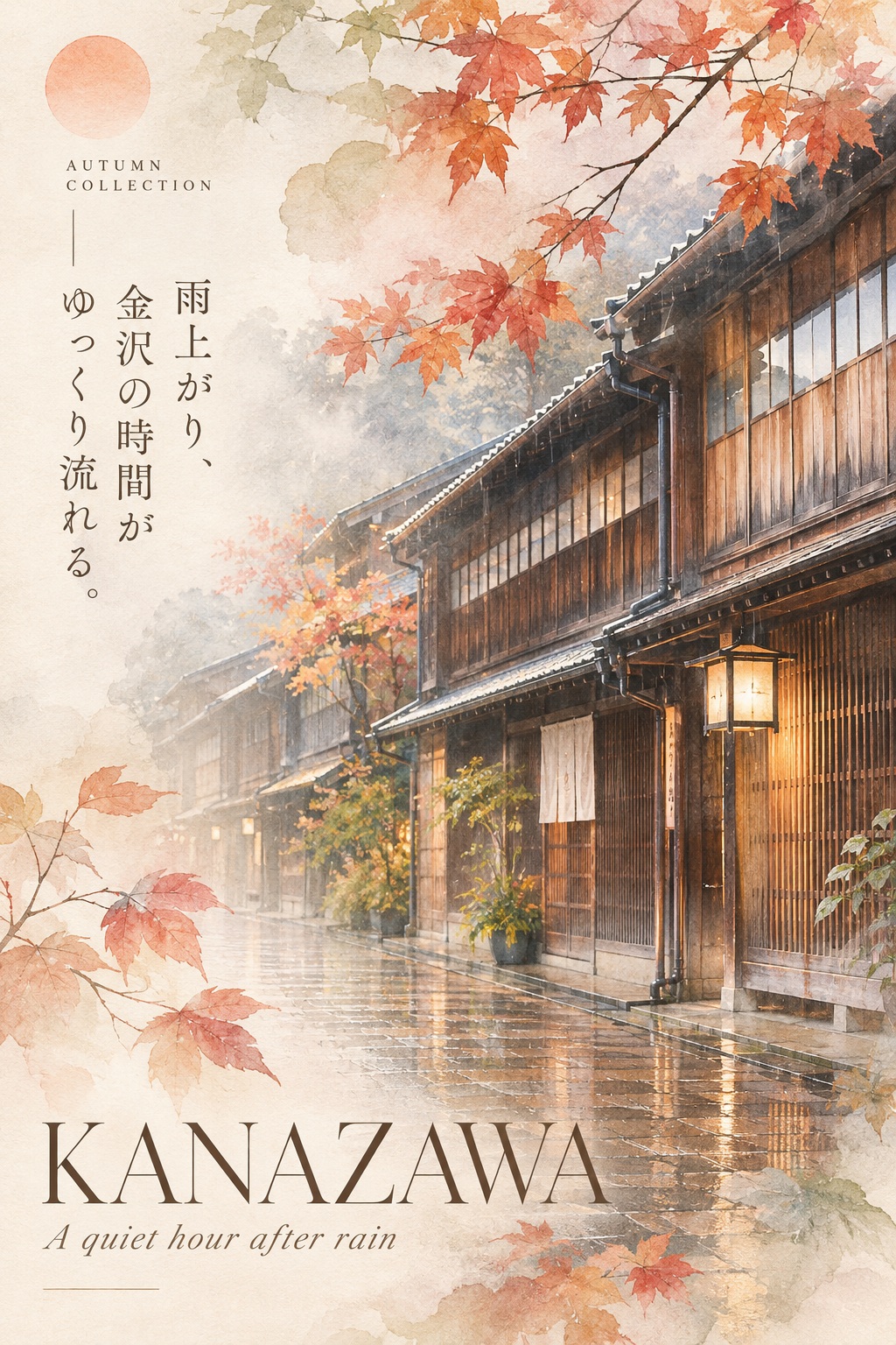
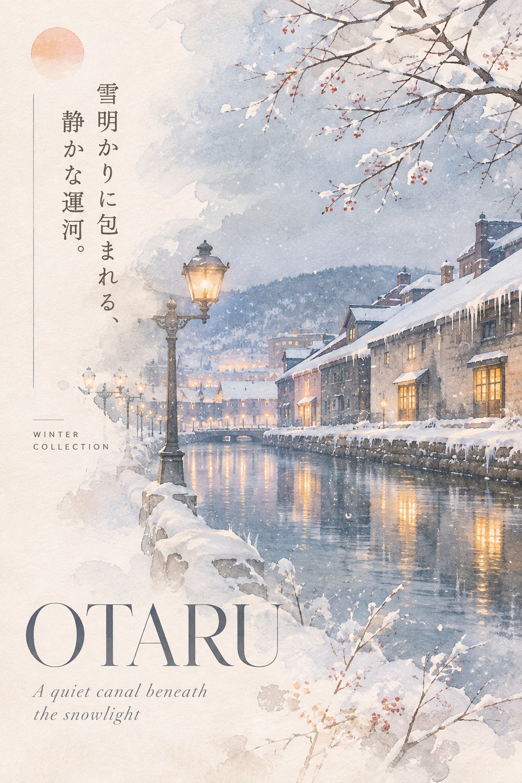
Create a poetic destination poster combining architectural photography, translucent botanical watercolor, and refined Japanese editorial typography.
Example outputs
Prompt template
- Format
- Text
- Inputs
- Destination (text) · Required
- Outputs
- Travel_poster (image)
JAPANESE ETHEREAL EDITORIAL — [DESTINATION]

Create a museum-quality poetic travel poster of [DESTINATION], blending Japanese luxury editorial design, atmospheric fine-art photography, translucent botanical watercolor, and understated contemporary elegance.

FORMAT & COMPOSITION

Vertical 2:3 poster on luminous warm-ivory paper.

Use an asymmetrical editorial composition with generous negative space on the left and a large, recognizable architectural landmark or iconic landscape occupying the right half to two-thirds.

Select the most visually evocative landmark of [DESTINATION], preserving its authentic architectural silhouette, proportions, and distinctive details.

Compose the scene with natural depth, a softly receding foreground, and delicate atmospheric perspective. Avoid conventional tourist-postcard compositions.

VISUAL TREATMENT

Blend realistic architectural photography with delicate watercolor illustration.

Soft diffused sunlight, gentle backlighting, subtle morning mist, creamy highlights, muted shadows, and an almost weightless atmosphere.

Let architectural edges gradually dissolve into translucent watercolor washes and textured ivory paper.

The image should feel like a cherished memory rather than a literal photograph.

BOTANICAL OVERLAYS

Introduce delicate botanical elements associated with the destination and its most evocative season.

Use translucent flowers, fine branches, softly colored leaves, or seasonal foliage.

Allow botanical illustrations to overlap the architecture naturally, creating an elegant double-exposure effect.

Keep the botanical elements airy, irregular, and restrained rather than decorative or symmetrical.

COLOR PALETTE

Warm ivory, pearl white, dusty sage, muted peach, pale blue-gray, soft sand, and subtle destination-inspired accents.

Maintain luminous, low-saturation colors with gentle tonal transitions.

Avoid harsh contrast and overly saturated colors.

EDITORIAL TYPOGRAPHY

Place “[DESTINATION]” in large, elegant, high-contrast Didone-style serif typography near the lower left.

Add a short, poetic English subtitle beneath it in delicate italic serif lettering, inspired by the destination's atmosphere.

In the upper-left area, include a brief, meaningful Japanese poetic phrase arranged vertically in refined Mincho typography.

Add a tiny seasonal label such as “SPRING / SUMMER COLLECTION” or “AUTUMN COLLECTION” in widely tracked uppercase sans-serif.

Introduce a small muted peach sun disk near the upper-left corner and a few exceptionally thin editorial divider lines.

Maintain generous spacing and sophisticated typographic hierarchy.

ART DIRECTION

Japanese independent art magazine, luxury travel editorial, botanical fine-art photography, delicate watercolor transparency, subtle film grain, tactile handmade paper, poetic minimalism, quiet nostalgia.

The result should feel collectible, intimate, sophisticated, and emotionally evocative.

STRICTLY AVOID

People, portraits, cartoon aesthetics, flat vector graphics, exaggerated fantasy architecture, cluttered compositions, excessive flowers, heavy outlines, strong gradients, saturated colors, thick borders, logos, signatures, watermarks, and generic travel advertising.

FINAL IMPRESSION

A breathtakingly delicate travel poster where architecture, nature, light, and typography dissolve into one harmonious visual poem.

Quietly luxurious. Dreamlike yet authentic. Beautiful enough to belong in a Japanese art book.
What you'll create
A recognizable destination landmark occupies the right side of an asymmetric poster. Open left space, atmospheric photographic depth and delicate watercolor treatment form a quiet refined travel composition.
Usage instructions
Provide the destination whose landmark or landscape should anchor the poster. The prompt combines atmospheric architectural photography, watercolor botanicals, and a structured editorial layout; choosing a specific destination helps ground the landmark and seasonal details.
Frequently asked questions
Is the page densely filled across both sides?
No. Generous negative space remains on the left.
Are saturated advertising effects intended?
No. The source excludes saturated colors and generic travel-ad styling.





Comments
Tried this prompt? Share what you made, compare results, or ask a question