Minimalist Split-Layout Gouache Poster
Create a refined vertical poster that pairs an uploaded photograph with a flat, hand-painted gouache reinterpretation of its subject.
Example outputs
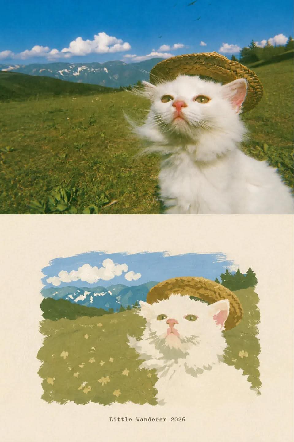
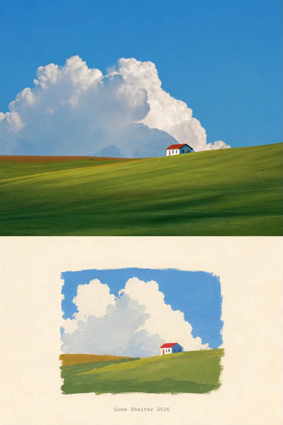
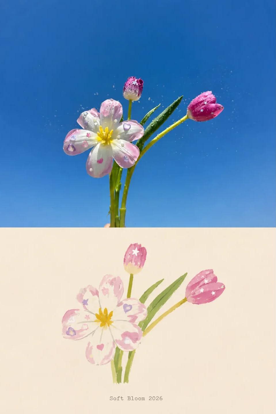
Prompt template
- Format
- Text
- Inputs
- Uploaded_photo (image) · Required
- Outputs
- Poster (image)
Using the uploaded photo, create a high-end minimalist poster in a 3:4 vertical format.

For a landscape photo, use a horizontal 50:50 split, with the photo on top and the graphic section below. For a portrait photo, use an asymmetric vertical split, with the photo occupying the left 40% and the graphic section occupying the right 60%.

Include the entire original subject within its designated photo area. Preserve its original proportions, composition, scale, texture, lighting, colors, and atmosphere. Do not enlarge, crop, distort, or scale up the subject to fill the area. If needed, extend only the surrounding background to fit the layout.

In the graphic section, reinterpret the same subject as a flat, hand-painted gouache composition. Preserve its overall silhouette, proportions, main structures, and recognizable features.

Keep the opaque painted subject moderately sized and visually distinct, occupying about 50–55% of the available width or height, whichever limit is reached first. Center it precisely, with balanced negative space on all sides. Do not crop it or place it near an edge.

Use only 4 to 12 key colors extracted from the original photo. Give each visible plane a single flat base color; define structure only through shapes and overlaps.

Create an opaque, matte gouache effect with visible brushstrokes, slightly uneven pigment density, dry-brush areas exposing the paper, subtle feathered edges, broken contours, and natural hand-painted irregularities.

Do not use gradients, highlights, reflected light, volumetric shading, realistic depth, or cast shadows in the graphic section. Use only a warm beige, soft ivory, or similar light neutral background in that section.

If appropriate, add an English title of 1–3 words inspired by the subject’s form, material, function, action, or atmosphere, followed by a four-digit year. Use a very small vintage typewriter-style serif font.

Keep the overall composition quiet, spacious, refined, and editorial. Avoid commercial-template layouts, cartoonish or vector rendering, excessive decoration, and visual clutter.
What you'll create
The preserved subject shares space with a quiet graphic reinterpretation. A small typewriter-like title and year may accompany the spacious painted design.
Frequently asked questions
How does a portrait source divide the layout?
The photo uses the left forty percent and art the right sixty percent.
How does a landscape source divide it?
It uses equal top-photo and lower-graphic sections.



Comments
Tried this prompt? Share what you made, compare results, or ask a question