Photo and Crayon Doodle Split Poster
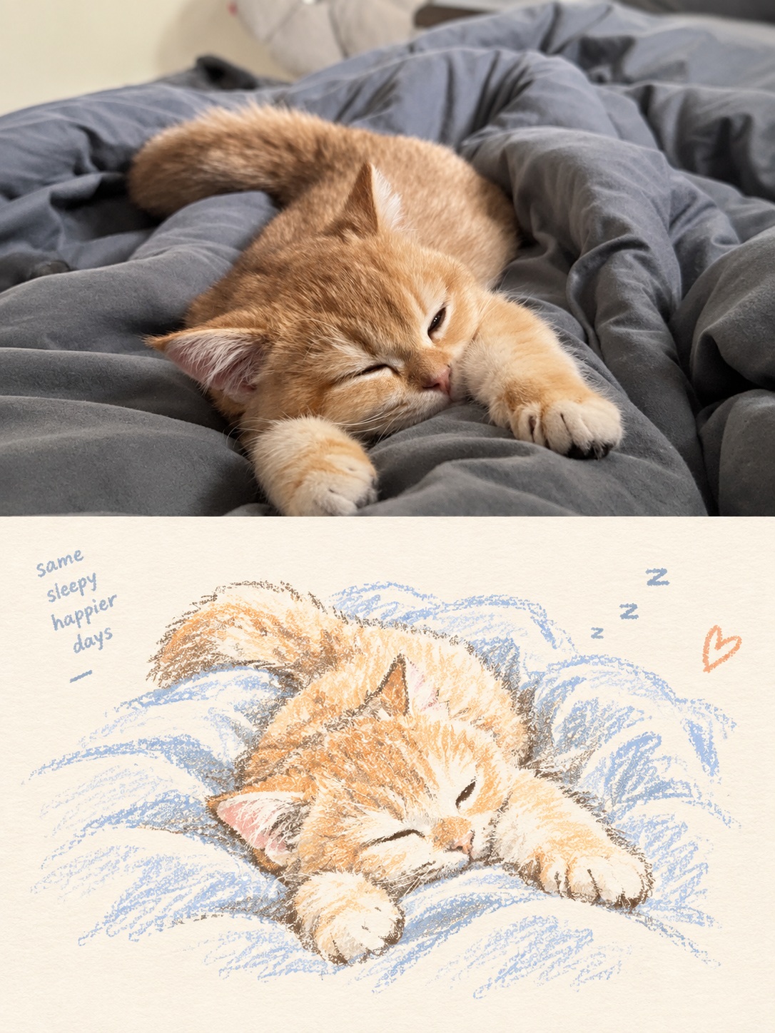
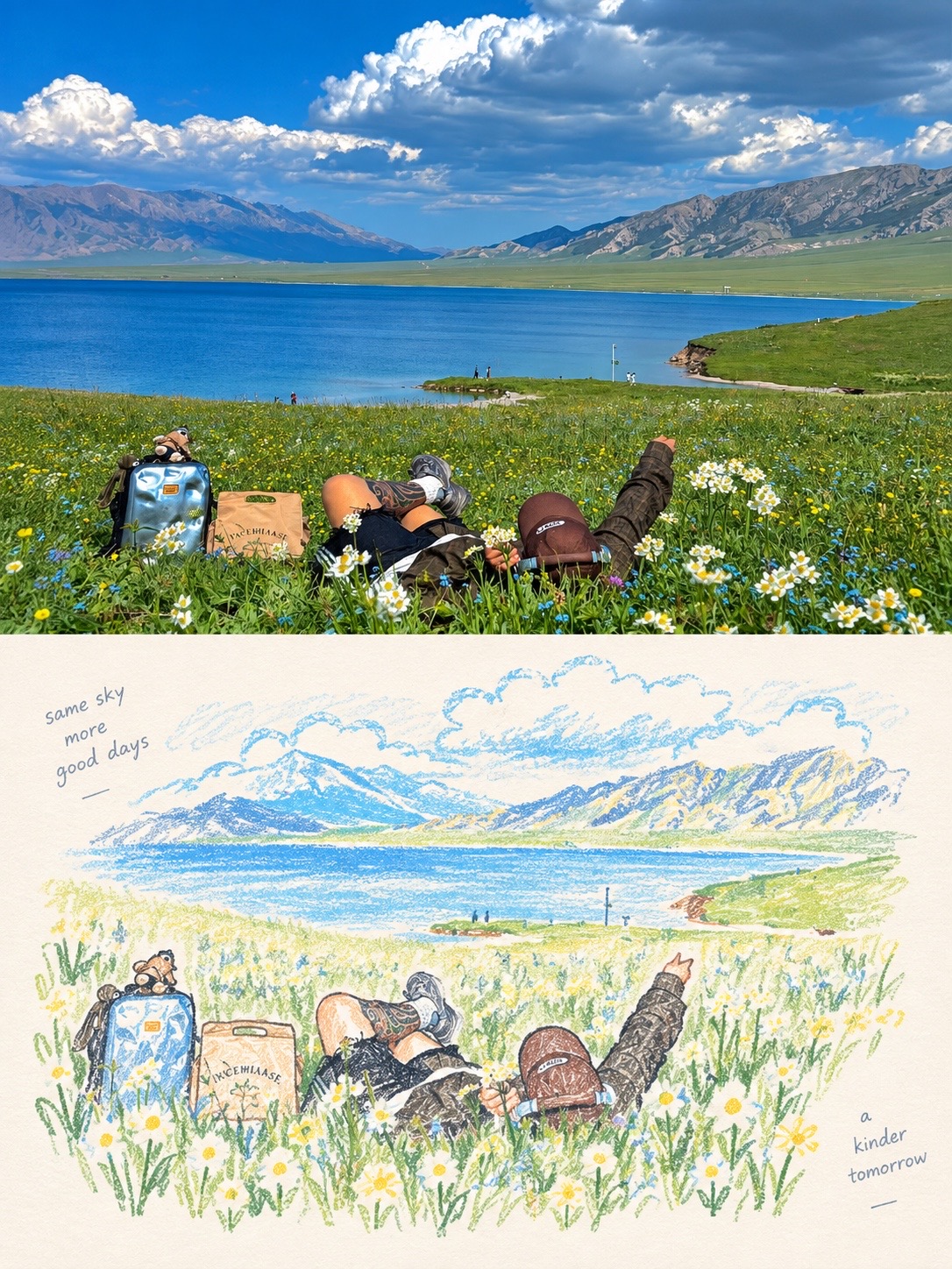
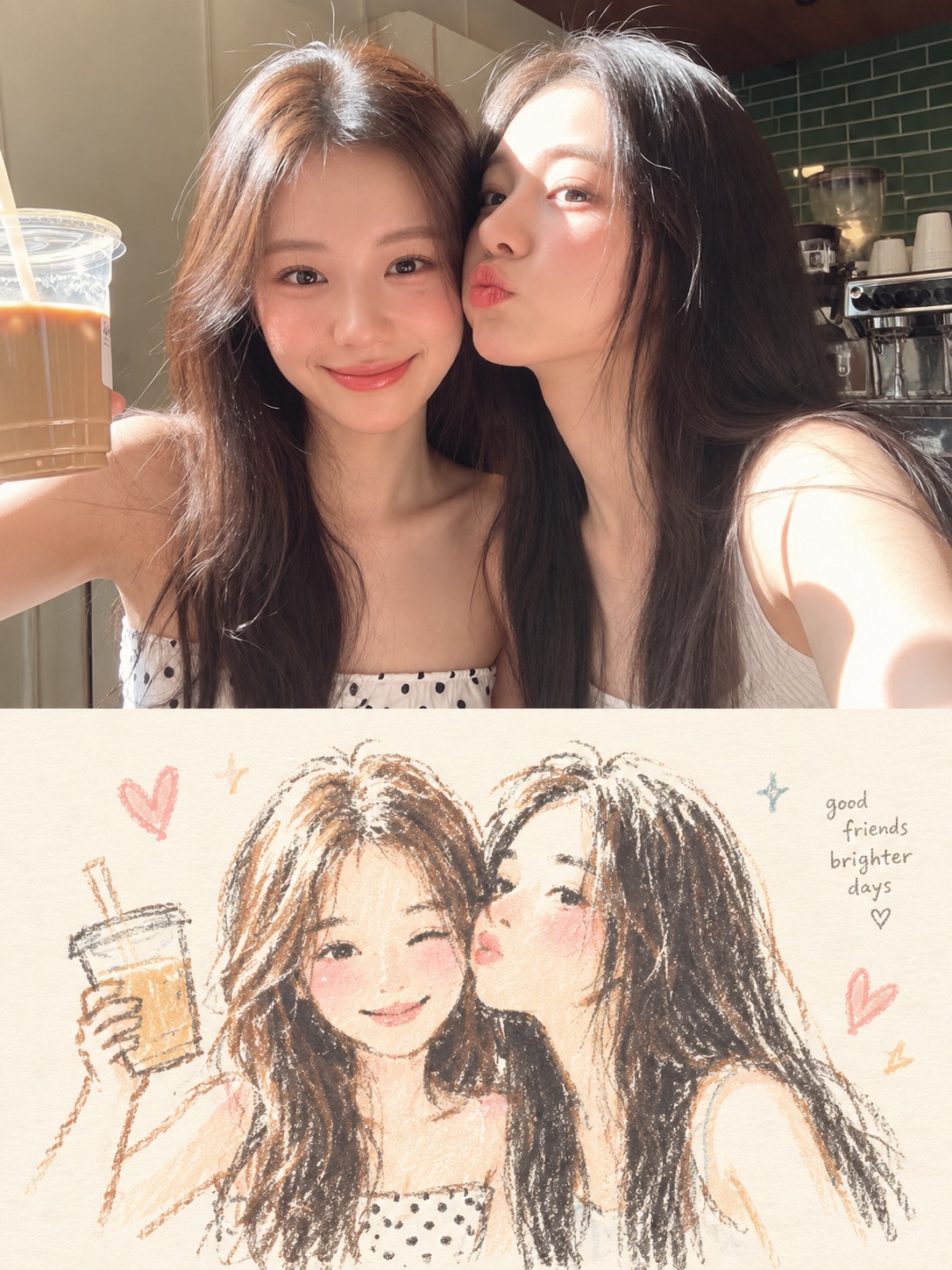
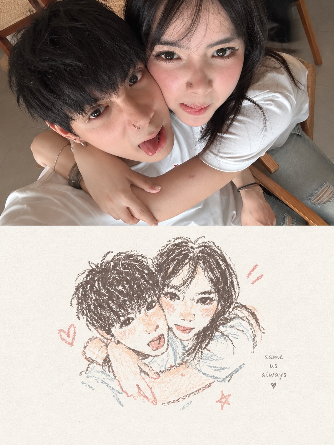
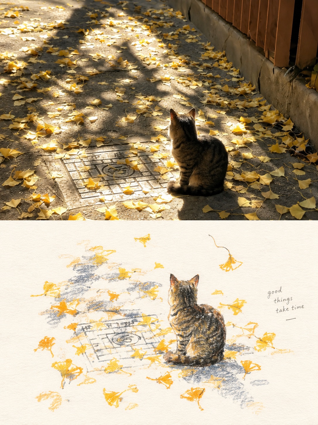
Turn each uploaded photo into a separate editorial poster, pairing the original photograph with a spacious, pastel-crayon interpretation of its most memorable elements
Example outputs
Prompt template
- Format
- Text
- Inputs
- Uploaded_photo (image) · Required
- Outputs
- Split_photo_and_crayon_poster (image)
For each uploaded photo, create one independent premium poster and output each poster separately. Never combine photos.

Format: Use a vertical 3:4 canvas split into two strictly equal horizontal halves, with a precise 1:1 division.

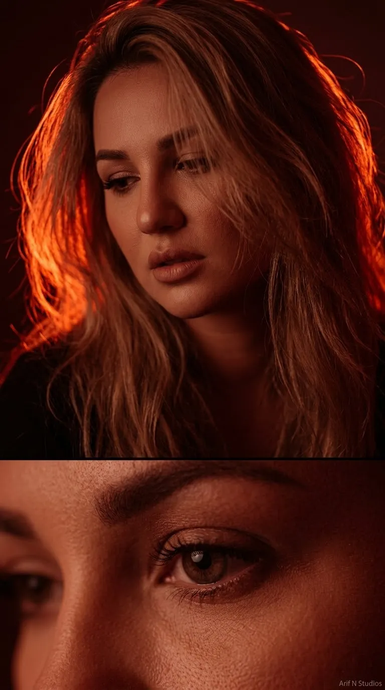
Upper half: Keep the uploaded photo photographic. Preserve the subject’s identity, structure, pose, real texture, natural light, and original color mood. Apply only subtle grading so it feels like an exhibition print. You may extend minor background areas to fit the layout, but never stretch, distort, mirror, replace, or redesign the subject.

Lower half: Identify the most memorable part of the photo: its core theme, structure, emotion, and visual metaphor. Reinterpret it as a pastel-crayon doodle on pale paper. Do not copy every object or fully redraw the whole scene. Keep only key contours, poses, directions, and memory points so the lower image is instantly linked to the photo above. Use simplification, gentle exaggeration, and recombination to create a distilled memory.

Main subject drawing: Use coarse, powdery chalk-and-crayon outlines. The lines should be slightly thick, loose, dry, and hand-drawn, with visible grain, broken color loss, minor wobble, and edges that are not fully closed. Stroke ends should feel blunt and soft. Inside the subject, add only a small amount of pastel color blocks, stripes, dots, or rubbed marks. Use the minimum information needed to suggest structure. Do not render realistic volume or full detail.

Small elements: Stars, flowers, plants, objects, environmental hints, and abstract signs must use the same line language, but be reduced to one-stroke or few-stroke doodles. They should feel naive and incomplete, mostly line-based with almost no fill. Never turn them into icons or stickers.

Composition: Keep the lower half spacious and editorial. Build one small visual cluster from the main subject and a few tiny doodle marks, then leave most of the remaining space empty. The cluster may sit off-center, touch an edge, hover, or be partly cropped. White space is a major compositional element.

Background: Use a very pale, bright, clean paper tone matched to the source photo’s warmth. Show only subtle paper fiber and fine grain. The background must stay clearly brighter than the subject lines and color blocks.

Color: Extract two to four lively, representative colors from the photo and remix them into soft, bright pastel-crayon tones. Use clearer coral, soft blue, teal, warm orange, or gentle violet for key outlines and accents.

Overall feeling: A refined memory study, with real photography above and a distilled crayon doodle below. Calm, airy, modern, and premium. If text appears, keep it tiny, English only, and secondary.

Negative: No collage, no unequal split, no literal full redraw, no dense filling, no dark or dirty paper, no muddy palette, no sticker look, no refined icons, no polished digital illustration, no realistic shading, no 3D, no glossy rendering, no loud scrapbook clutter, no gibberish text, no watermark, no logo, no UI.
What you'll create
Each poster keeps the uploaded photograph in its upper half and reimagines its memorable theme as a loose pastel-crayon doodle in the lower half. The result has a precise equal split, a small airy drawing cluster, and generous pale paper space
Generation settings
ChatGPT
Advanced settings
- Negative prompt
- No collage, no unequal split, no literal full redraw, no dense filling, no dark or dirty paper, no muddy palette, no sticker look, no refined icons, no polished digital illustration, no realistic shading, no 3D, no glossy rendering, no loud scrapbook clutter, no gibberish text, no watermark, no logo, no UI.
Usage instructions
Upload each photo you want transformed; each one produces its own poster, and separate photos are never combined. The photo supplies the upper half and guides the lower doodle’s subject and colors. For a simpler result, keep the lower-half cluster small and leave most of its space empty
Frequently asked questions
How does the source photo affect the doodle?
The lower half should distill the photo’s theme, structure, emotion, and visual metaphor, using only a few key contours and memory points
How are the doodle colors chosen?
Extract two to four representative colors from the photo and reinterpret them as soft, bright pastel-crayon tones




Comments
Tried this prompt? Share what you made, compare results, or ask a question