Turn a Photo into an Abstract Print-Texture Identity Poster
Transform an uploaded photo into a restrained, high-end poster that pairs an edited photograph with an abstract symbol derived from its subject. The lower half develops that symbol into a distinctive brand identity with subtle print-inspired texture.
Example outputs
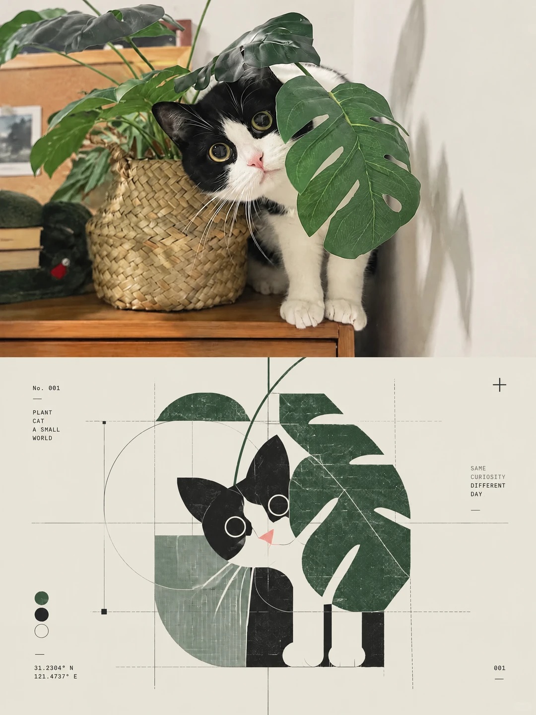
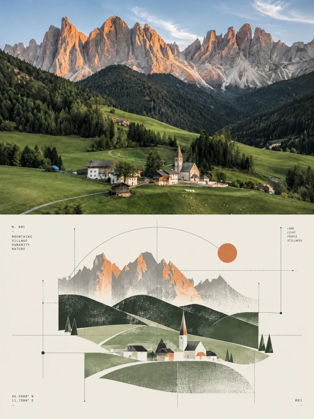
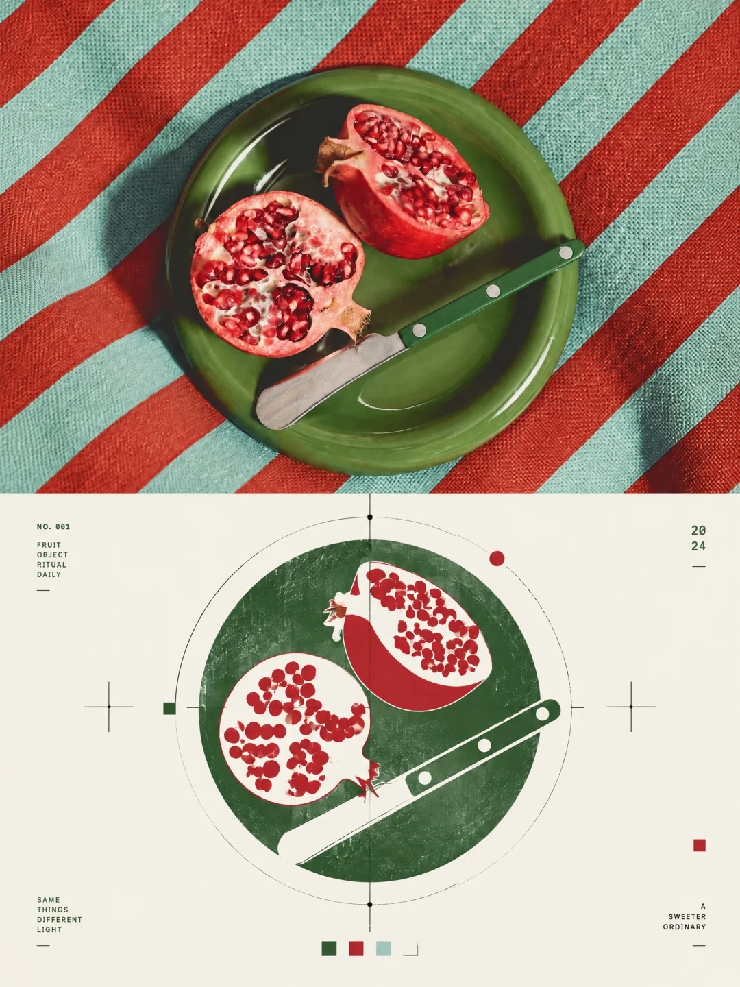
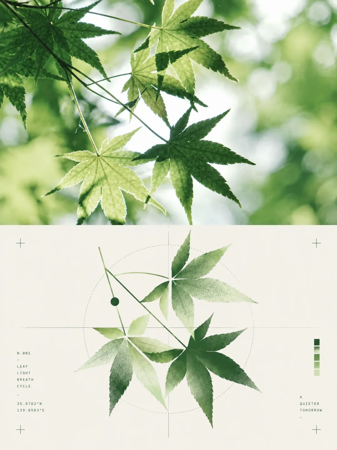
Prompt template
- Format
- Text
- Inputs
- Uploaded_photo (image) · Required
- Outputs
- Design_poster (image)
Create a standalone, high-end 3:4 portrait design poster from the uploaded photo. Divide the canvas strictly into two equal horizontal halves: the upper half is real photography, and the lower half is an abstract visual symbol distilled from the subject’s essence.

In the upper half, preserve the original subject’s structure, realistic texture, natural lighting and shadows, and original color atmosphere. Apply only light, refined color grading to give it the feel of art photography and an independent publication. You may extend the background naturally to fit the canvas, but do not stretch or distort the image or alter the subject itself.

In the lower half, extract the photo’s key identifying information—its subject outline, structure, pose, and narrative relationships—without reproducing the complete object. Compress these into a recognizable abstract visual mark. Use geometric deconstruction, modular forms, line structures, negative space, and symbolic treatment to create the core symbol of a high-end brand identity or experimental design system. Capture the subject’s essential character rather than minor details, while keeping the minimal graphic recognizably connected to the photographed subject.

Use post-digital graphic design, deconstructed Swiss design, a generative symbol system, and diagrammatic abstraction. Build a systematic visual language from geometric modules, fine lines, circular arcs, grids, micro-symbols, numbering logic, and abstract nodes. Create tension between order and error, precision and handmade traces, digital and analog, rationality and emotion. Use the fewest elements possible to achieve strong recognition, and avoid complexity.

Keep the composition highly restrained, with the symbol as the sole focal point, centered or slightly offset, and surrounded by generous, breathable negative space. Do not pile up multiple icons or turn the design into an infographic. Aim for the core visual identity of an art institution, architecture firm, experimental label, or high-end brand. Treat text only as a system component, never as a main headline. If used, add only tiny numbers, letters, or short phrases that function as index references to the symbol; use refined, restrained typography with the annotation feel of an archive or experimental publication.

Derive the colors from the photo’s signature tones and reorganize them into a brand color system. Use a small amount of highly recognizable color as functional coding—for example, teal green, blue, magenta, or orange—against a gray-white or warm-white background. Color should act as a system marker, not decoration. Avoid chaotic palettes, cheap neon, and generic commercial gradients.

Blend in Xerox texture, risograph grain, print registration error, scanner noise, and subtle paper texture. Add faint print misregistration, grain, scanning noise, and imperfect edges to give the digital symbol a tangible printed quality.

The final result should distill an independent, coherent visual identity from the photo: a restrained, refined abstract logo with cultural memory and a strong sense of system aesthetics.
What you'll create
Create a 3:4 portrait design poster divided equally between a lightly edited photograph and an abstract symbol derived from its subject. Use restrained geometry, generous whitespace, selective color, and subtle print textures to give the symbol the character of a high-end identity mark.
Usage instructions
Frequently asked questions
Should the lower symbol reproduce the entire photographed subject?
No. It should distill recognizable information such as the subject’s outline, structure, pose, and narrative relationships into an abstract symbol rather than copy the complete object.
What role should any small text play?
Treat small numbers, letters, or short phrases as indexing components related to the symbol, not as a headline.





Comments
Tried this prompt? Share what you made, compare results, or ask a question