Photo and Geometric Illustration Comparison Poster
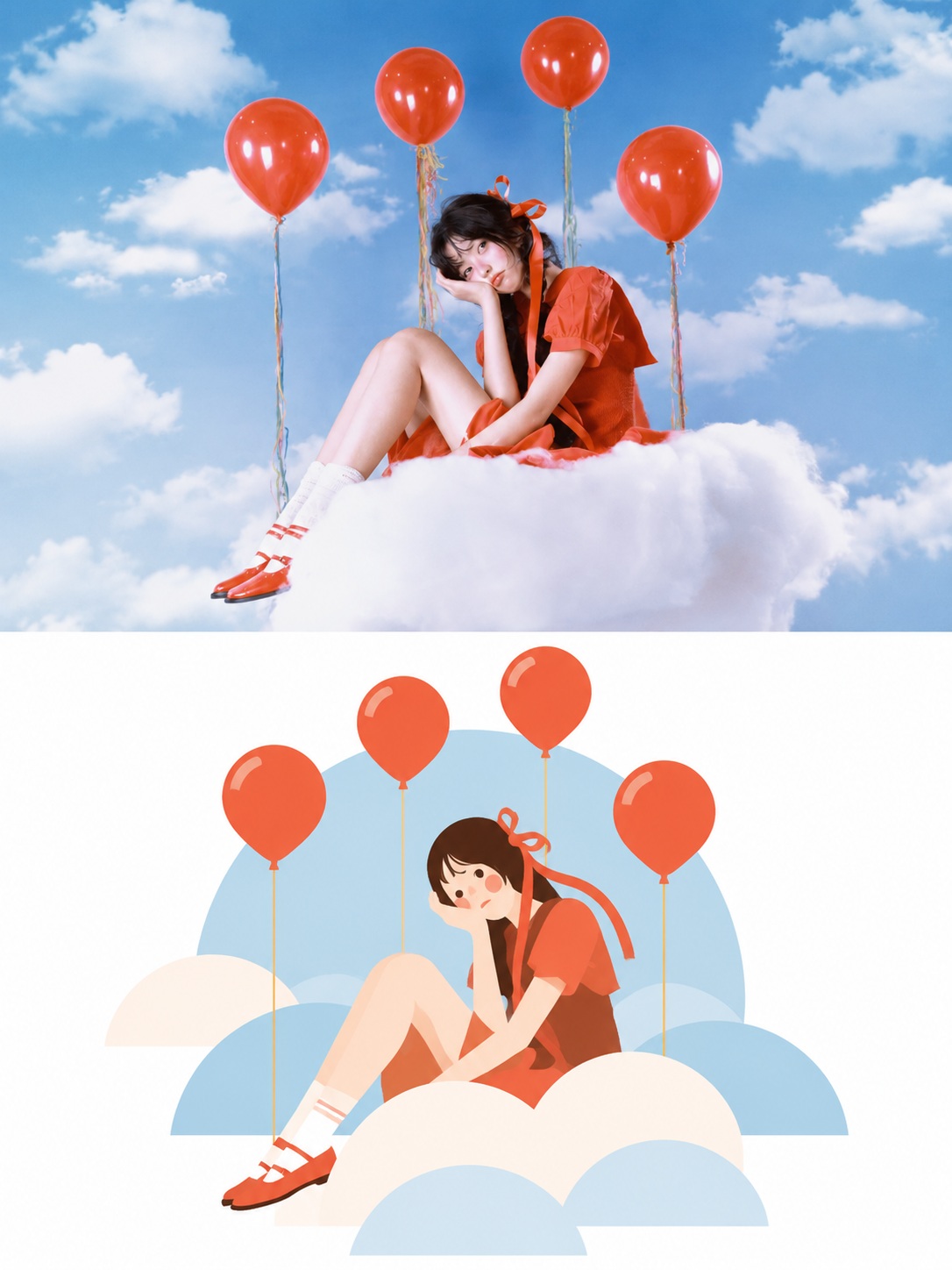
Create a vertical poster that pairs a photograph of the supplied scene with a minimalist geometric illustration of the same scene.
Example outputs
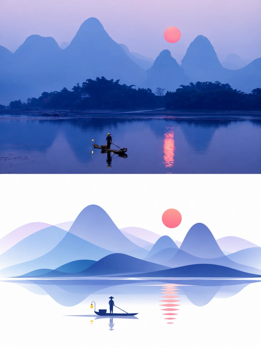
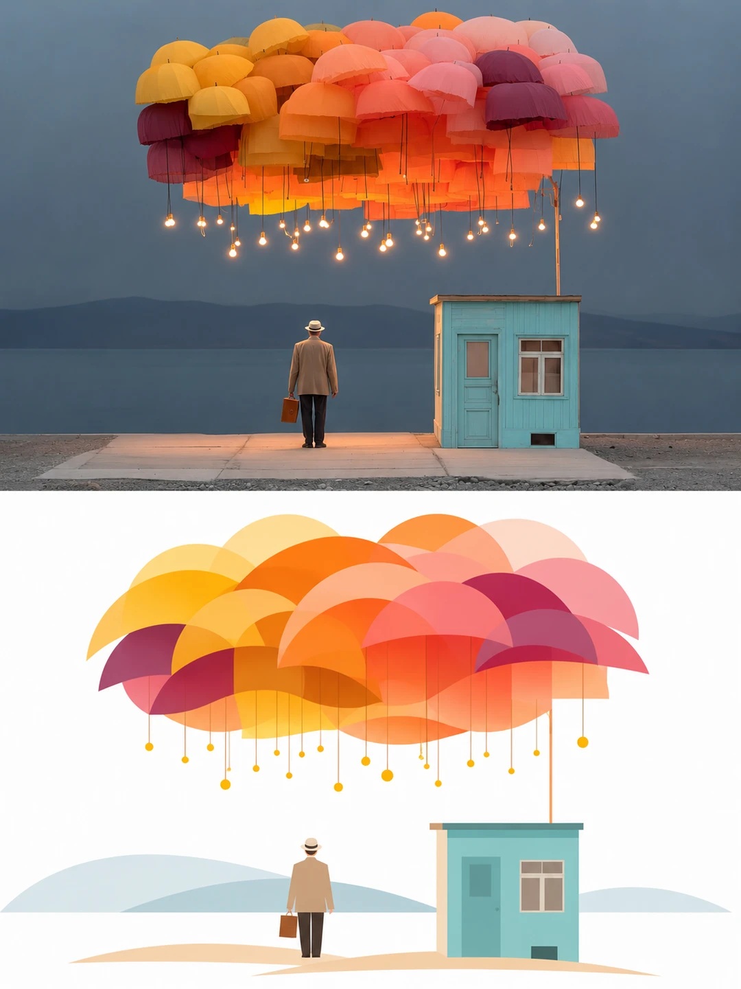
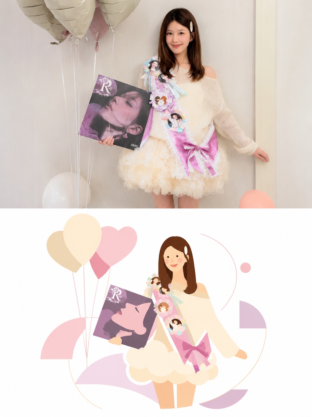
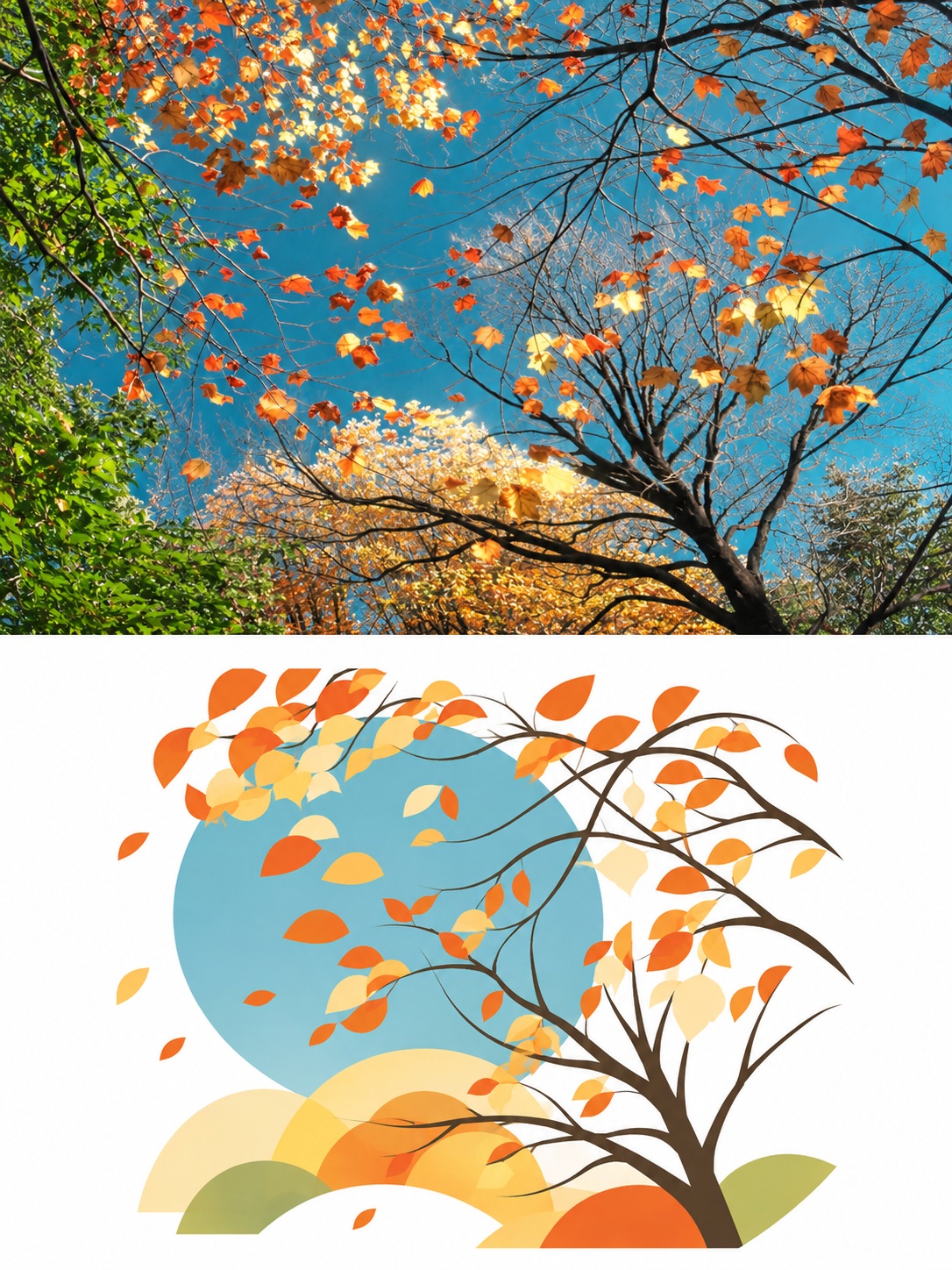
Prompt template
- Format
- Text
- Inputs
- Source_photo (image) · Required
- Outputs
- Comparison_poster (image)
Based on the uploaded photo, create a 3:4 vertical comparison poster in the style of “real photography × minimalist geometric illustration.”

Divide the image into two equal-height halves. In the upper half, present a photographic rendering of the photo, preserving the number of subjects, their poses, key objects, and spatial relationships. You may crop as needed, but do not stretch or distort the image. In the lower half, transform the same scene into a modern geometric art illustration on a pure white background.

First identify the elements that best express the photo’s content and mood, such as people’s actions, object silhouettes, relationships between subjects, and symbolically meaningful colors. Preserve these key features, then recompose the scene using circles, semicircles, arcs, fan shapes, pointed wedges, and flowing bands of color.

Choose the shapes and composition according to the photo’s content: keep people’s poses recognizable, preserve the main structures of buildings, and retain the distinctive outlines of animals and objects. Keep only environmental details that help the scene remain understandable. Do not apply the same pattern to different photos, and do not add important subjects that are absent from the original.

Extract 2–5 main colors from the original photo, preserving its key warm–cool and light–dark contrasts. Use flat color blocks in varied sizes with crisp edges; selected areas may overlap semi-transparently. Vary the density and direction of the shapes, and leave ample white space.

Keep the overall result clean, fresh, and dynamic, with the character of modern graphic design and an art poster. Use smooth color blocks; do not add paper texture, grain, photorealistic texture, complex shadows, or 3D effects.

Do not add a watermark, account name, title, commercial logo, or border. Output one complete comparison poster with the two halves stacked vertically.
What you'll create
The upper photo preserves subjects and relationships; below, circles, wedges and flowing bands rebuild the scene on white. A small palette drawn from the source unifies the crisp flat shapes.
Usage instructions
Provide the source photo as the required input; the prompt preserves its key subjects and relationships in the upper half and reinterprets the scene with geometric shapes below. If the illustration feels too busy, emphasize the prompt’s limited 2–5-color palette and generous white space.
Frequently asked questions
Is one fixed geometric pattern reused for every source?
No. The illustration should follow each photo’s actions, silhouettes and relationships.
Should the lower half include paper grain or 3D shadows?
No. It uses smooth flat color without texture or dimensional effects.






Comments
Tried this prompt? Share what you made, compare results, or ask a question