Photo and Geometric Illustration Split Poster
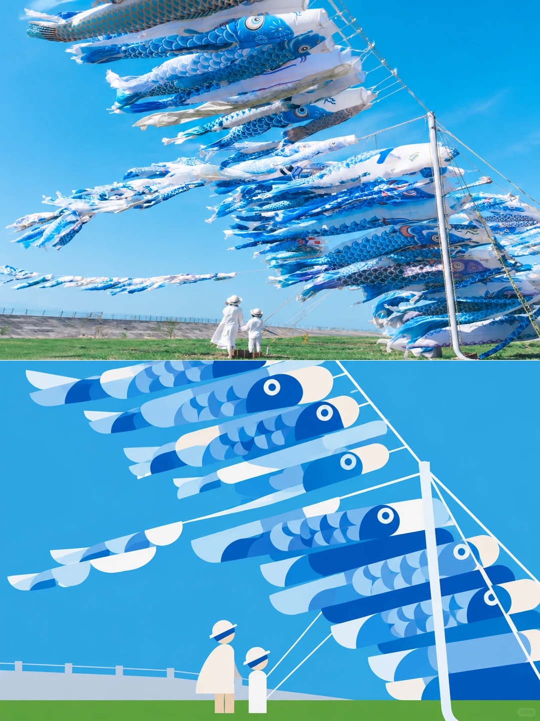
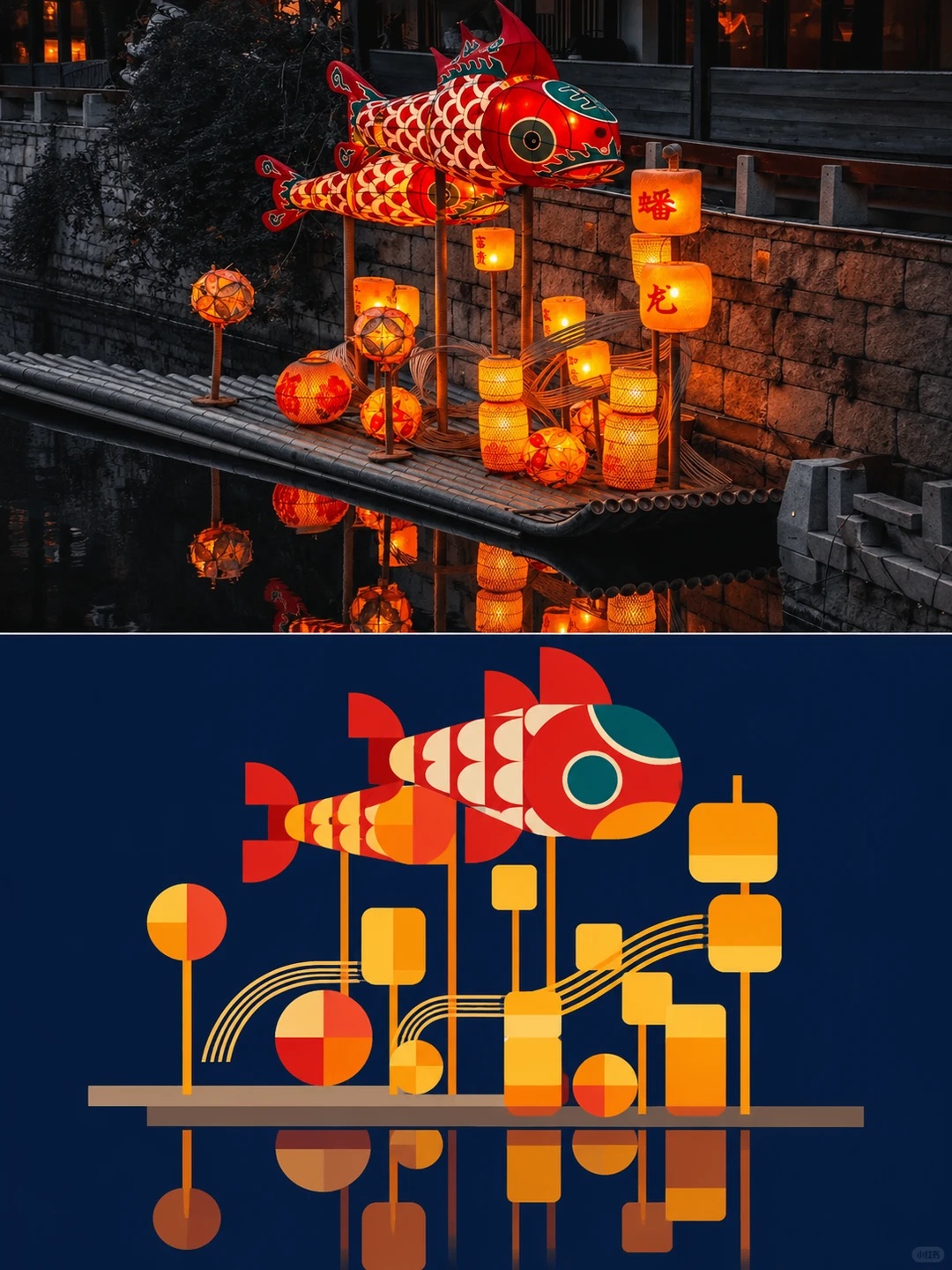
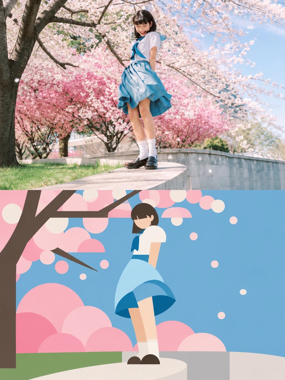
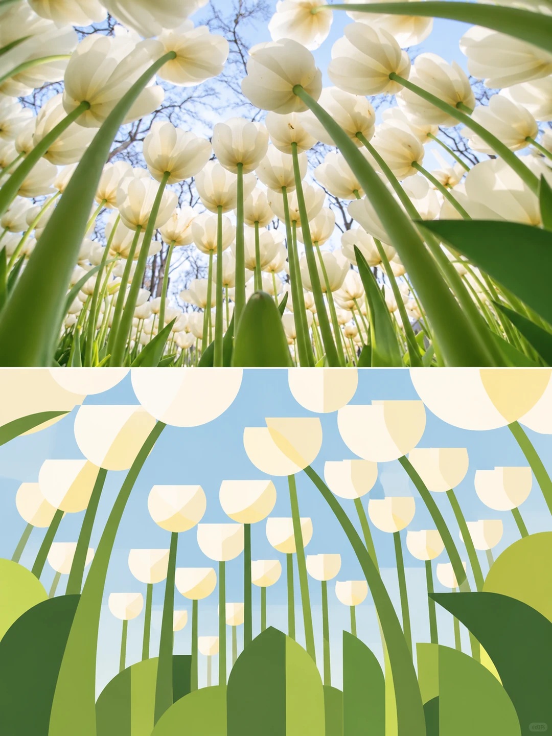
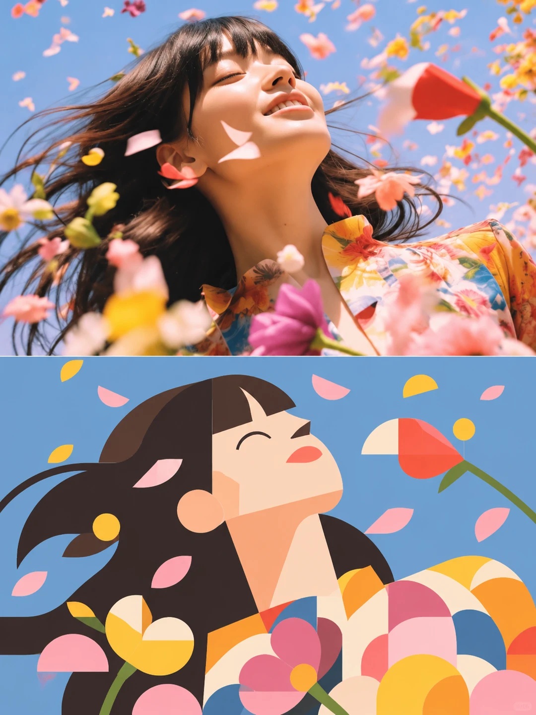
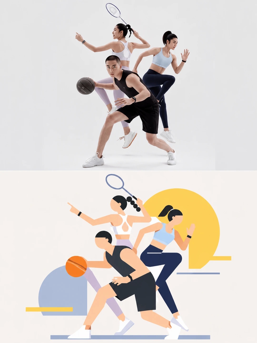
Create a vertical 3:4 poster with the original photograph in the upper half and a minimal geometric reinterpretation of its scene in the lower half.
Example outputs
Prompt template
- Format
- Text
- Inputs
- Reference_photo (image) · Required
- Outputs
- Comparison_poster (image)
Using the uploaded photo, create a vertical 3:4 comparison poster. Divide the canvas into two exactly equal horizontal halves: the top 50% is the original photograph, and the bottom 50% is a minimal geometric illustration redesigned from that photograph. Join the halves directly, without a divider or border.

In the upper half, preserve the original photographic appearance, number of subjects, poses, and key objects. Crop as needed to fit the canvas, but do not stretch or distort the image or change anyone’s appearance. The geometric simplification instructions below apply only to the lower half.

1. Decide what to depict based on the photo, rather than applying a geometric template. First identify the cues that make the scene recognizable: distinctive outer contours, the subjects’ poses, prominent objects, and relationships such as contact, overlap, or direction. Keep only the most important information and omit the rest. Do not depict every item in the photo or break complete contours into many tiny shapes. First decide how much can be removed while keeping the scene recognizable, then reconstruct it with as few shapes as possible.

2. Use only square and circular forms. In the lower half, use only squares, rectangles, circles, ellipses, semicircles, and semi-ellipses. Depict all subjects, structural details, connecting lines, and necessary environmental elements using these shapes. Shapes may be rotated, scaled, layered, and offset, but do not use triangles, polygons, arbitrary curves, or freely drawn irregular contours. Do not keep adding shapes just to make the illustration resemble the photo more closely. If one ellipse can express a part, do not add many extra color blocks. Suggest complex curved structures with a few ellipses or semi-ellipses in different orientations rather than tracing them completely. Keep people recognizable through head direction, the overall mass of their hair, body posture, and objects they are holding. Keep other objects recognizable through their proportions, contours, and connections. Do not render individual strands of hair, eyelashes, clothing folds, material textures, or tiny text.

3. Use dots and lines to create visual rhythm. Dots: Use a small number of small circles or ellipses to represent necessary local features, points of contact, or focal points in the photo. Create rhythm through variation in size, off-center placement, and clustering or spacing. Do not scatter dots evenly or add meaningless circular decoration. Lines: Use thin rectangles or narrow ellipses to summarize directions, connecting structures, and movements in the photo. Vary their lengths, thicknesses, and angles to create paths that guide the eye; do not outline every object. Small circles create “dots,” thin rectangles create “lines,” and squares and circles create “planes.” Make the design feel intentional through the relative size, direction, spacing, and density of these elements, rather than by adding extra decoration.
What you'll create
The original scene remains photographic above a redesigned lower illustration. Essential contours, contact and movement become circles, lines and planes rather than a repeated geometric template.
Usage instructions
Provide the photograph whose scene should be reinterpreted. The prompt preserves it in the top half and reduces the scene to essential geometric shapes in the bottom half; adjust how much detail remains by emphasizing the scene’s most recognizable cues.
Frequently asked questions
Is there a divider between the halves?
No. They join directly without a border.
May the photograph be stretched to fit?
No. Cropping is allowed, but stretching and distortion are not.




Comments
Tried this prompt? Share what you made, compare results, or ask a question