Geometric Deconstruction Photo Poster
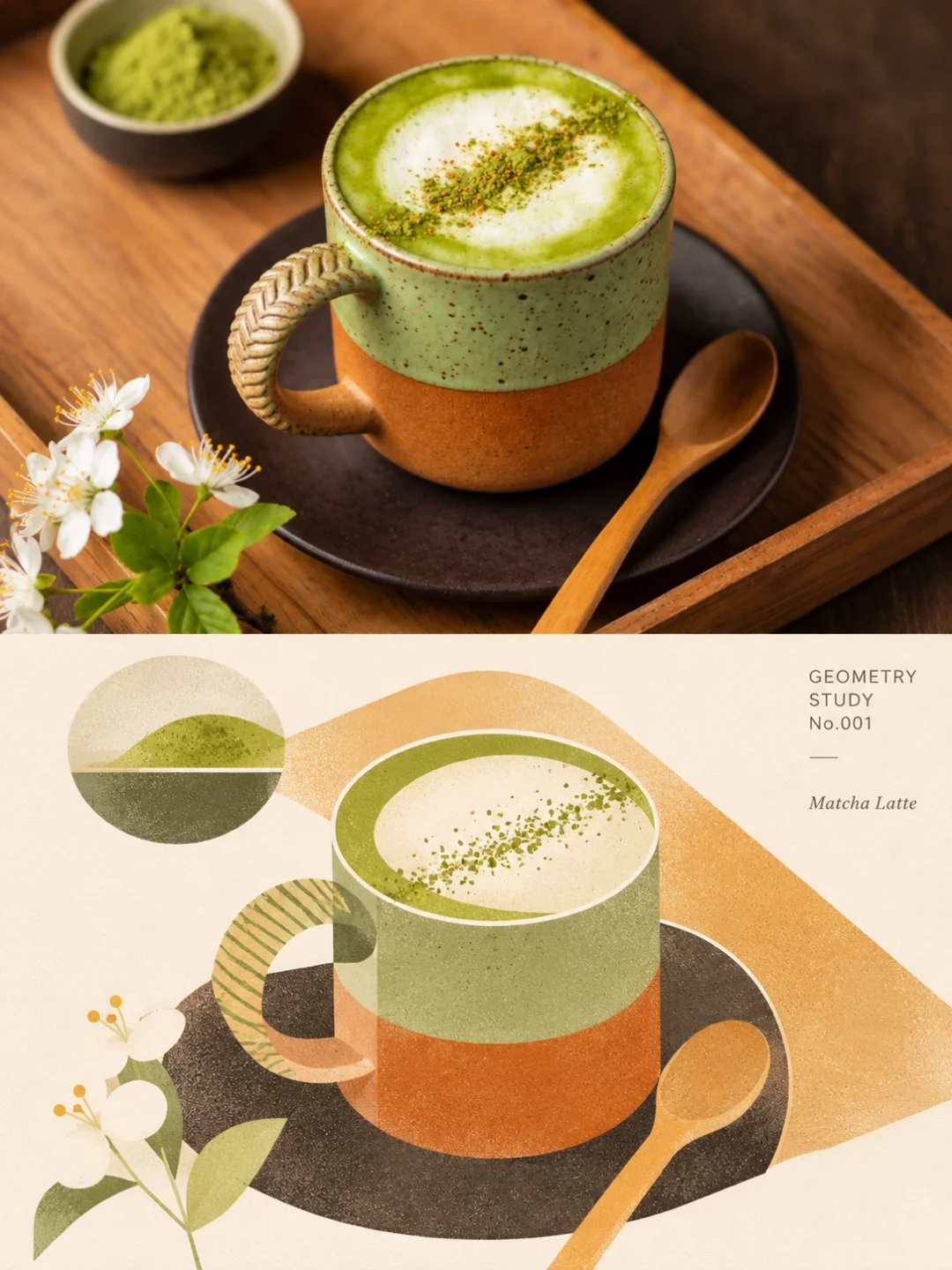
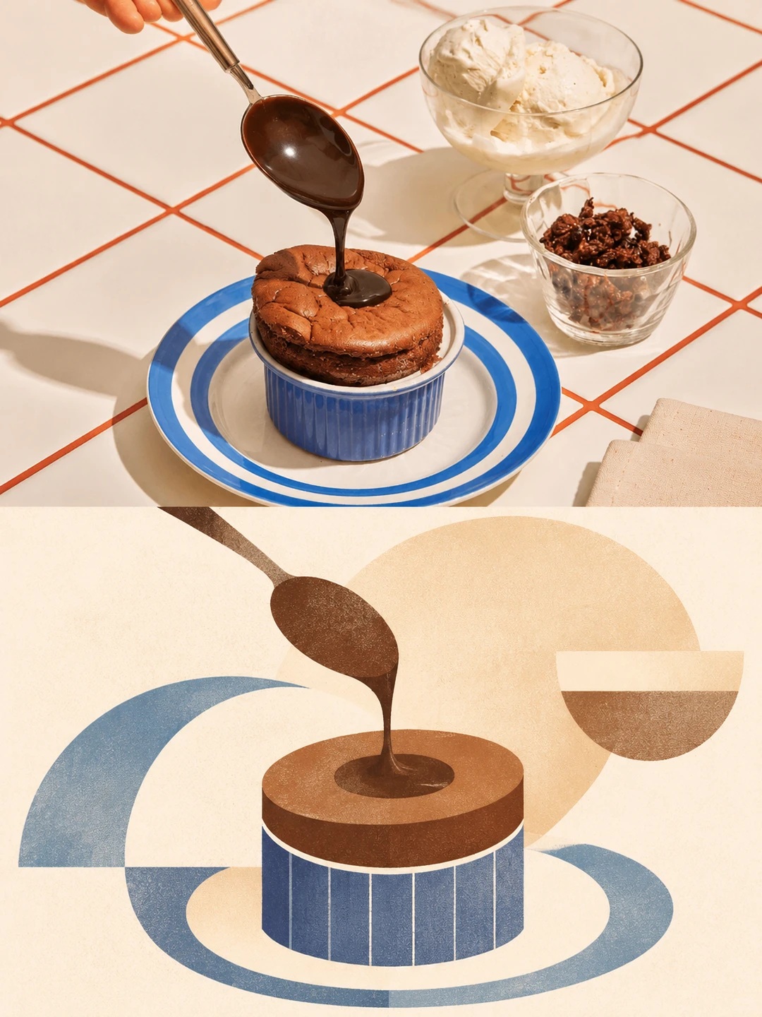
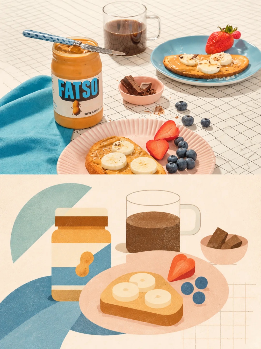
Create a vertical comparison poster that pairs the original photograph with a minimalist geometric reinterpretation of the same scene. The composition, palette, and visual treatment are specified in the prompt.
Example outputs

Prompt template
- Format
- Markdown
- Inputs
- Reference_photo (image) · Required
- Outputs
- Comparison_poster (image)
Using the provided photograph, create a **3:4 vertical art comparison poster**.

**1. Overall composition**

Divide the image into two strictly equal horizontal halves, each occupying 50% of the canvas.

- **Upper half:** Preserve the original photograph’s realistic photographic quality, subject features, and spatial relationships. Crop it if needed, but do not alter the subject.
- **Lower half:** Reinterpret the same scene as a minimalist geometric artwork.
- Connect the two halves directly, without a border or decorative divider.

**2. Artistic reinterpretation of the lower half**

Do not simply trace the original image or turn every object into a complete illustration.

First examine the photograph and identify its most distinctive silhouettes, shapes, poses, and spatial relationships. Then actively simplify and recombine them.

Build the composition from circles, arcs, semicircles, geometric color blocks, fine lines, and irregular shapes.

You may enlarge, crop, offset, overlap, or arrange elements asymmetrically. Secondary objects may be reduced to simple color blocks or lines and need not be shown in full.

**3. Visual style**

Modernist graphic design × minimalist abstract art × independent art publication.

- Use 2–4 muted main colors.
- Use warm off-white as the primary background.
- Preserve generous areas of natural negative space.
- Keep shapes simple and silhouettes clear; avoid intricate detail.
- A very subtle paper grain or hand-printed texture is acceptable.
- Avoid realistic three-dimensional depth and heavy shadows.

**4. Design principles**

Create visual interest through the relative size, proportion, direction, spacing, density, and rhythm of the shapes.

The composition may be incomplete or abstract and may depart from the original layout, but it must preserve the photograph’s most essential visual identifiers.

**5. Strictly avoid**

Ordinary flat illustration, complete object replication, cartoon style, elaborate decoration, too many colors, dense textures, excessive symmetry, meaningless geometric patterns, and a generic commercial-template look.

**Final goal:**

The lower half should feel like an independent work of modern art, not a simplified version of the original photograph.

Prefer restraint over clutter and abstraction over blandness. Let viewers recognize the original subject while experiencing a distinctly different visual expression.
What you'll create
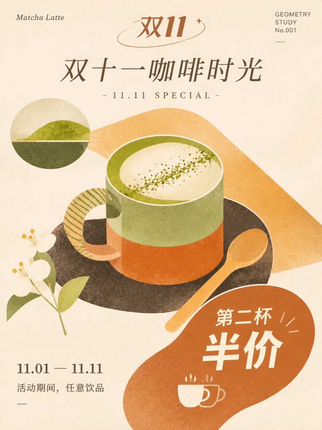
The prompt creates a 3:4 vertical comparison poster, with the original photograph in the upper half and an abstract geometric reworking of the same scene below. The lower section uses a restrained modernist palette, warm off-white, and generous negative space.
Usage instructions
Frequently asked questions
What should the abstract lower half preserve?
Retain the photograph’s most recognizable visual features, such as its defining silhouettes, shapes, poses, and spatial relationships, while freely simplifying and rearranging secondary elements.
How should the color palette be handled?
Use 2–4 muted main colors, with a warm off-white background and plenty of natural empty space.
Should the lower half reproduce every object?
No. Reduce or omit secondary objects as needed; the lower half should read as an independent modern artwork, not a simplified full copy of the photograph.


Comments
Tried this prompt? Share what you made, compare results, or ask a question