Culinary poster with stylish typography
You are a first-class poster designer for magazines or brands. Analyze the attached image of the food or product and follow the specifications below exactly.
Example outputs
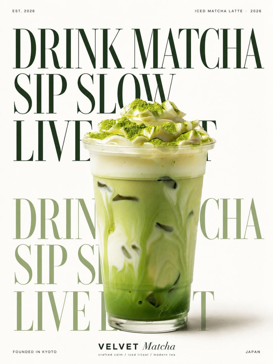
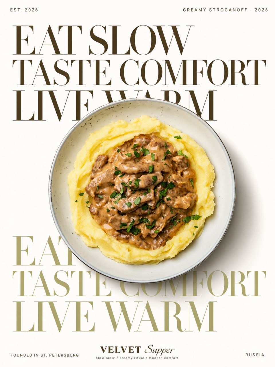
Prompt template
- Format
- Text
- Inputs
- reference_image (image) · Required
- Outputs
- result (image)
You are a first-class poster designer for magazines or brands.
Analyze the attached image of the food or product and follow the specifications below exactly.
Create a vertical poster in a "vintage editorial style".

[1. Canvas specification - completely fixed]

- Aspect ratio: 3:4 vertically (for example, 1200x1600 pixels)
- Background color: Pure white (#FDFBF7\\~ #FFFFFF off-white), do not use any patterns/gradients in the background
- Margins: Leave the same margins at the top and bottom, left and right, blank margins, as when printing.

[2. Automatic processing after image analysis]

1. In the attached image, the main object (food/product) is clearly highlighted without a background (Nuki)
2. Select 1-2 dominant colors in the image.
3. Create 2 "calm and luxurious" correction colors based on the selected colors

- The main color of the text: reduce saturation and darken dark tones (for example, dark blue, dark brown, dark green, etc.).
- The color of the subtext: A pale tone with a bright saturation of the dominant colors (for example, dusty blue, pale pink, sage, etc.)
- Both colors should be clearly legible on a white background

4. Automatically generate phrases that match the characteristics of the topic (follow rule [3] below)

[3. Rules for automatic phrase generation]

- If the topic is food / drinks: a combination of "Eat /drink + emotional slogan".
Approximate tone: For example, "Live clean / drink water / Keep hydrated"
(Wording + lifestyle slogan + status description) structure of 3 lines
- If the theme is beauty/household goods: use the combination "Verb + slogan of the brand philosophy".
- Phrases should be short and rhythmic, there should be 3 short sentences/phrases in Russian in total.
- The language must be Russian (with the possibility of using serifs) if there are no other instructions in the attached image.

[4. The location of the text is the main structure]

- Make a total stack of 6 lines by "repeating 2 times" the same 3 sets of phrases vertically
(1st set: dark primary color / 2nd set of repetitions: mute them with a light undertone).
- Font: classic serif (Didot, Playfair Display feeling), the first line is the largest and most spectacular
- Alignment: on the left edge, the line spacing is small (letters overlap slightly in density).
- Large placement so that the text occupies the entire width of the screen (as in magazine headlines)

[5. Theme placement (photos)]

- The text is placed by naturally superimposing the main photo in the middle.
- Collage effect, in which the photo covers the text, and some letters are hidden behind the photo
- Add a soft natural chiaroscuro effect to the subject (light/shadow diagonally from the bottom of the photo to the background)
- The object retains its original aspect ratio, realistic without excessive correction

[6. Fixed the top/bottom information layout]

- Top left: "Est. [Year]" (displayed due to the invisibility of the image " Est. 2026")
- Top right: "[Category name] - format [Year of issue]" (for example, Clean spring water - 2026)
- Bottom left: "Based in [City name]" (Specify any suitable nomination if it is not specified separately)
- At the bottom of the center: the text of the brand's logo is a combination of two fonts
(for example, "BRAND" in bold + "name" in plain font), with a string of small slogans below it.
- Bottom right: "[Name of the country/region]".
- The entire text of the fixed information has a small size, a thin sans-serif font, a wide range of tracking (for different sides).

[7. General mood]

- Minimalistic, premium, restrained colors of editorial posters
- Typography and the main character's photo itself without unnecessary decorative elements
- Luxurious texture, like in print advertisements/ magazine illustrations

Now analyze the attached image and create a poster according to the above rules.
What you'll create
A food or product cutout becomes the focus of a vertical white poster with balanced print margins. Restrained typography uses dark and pale tones derived from the subject’s dominant colors.
Generation settings
Aspect ratio: 3:4
Frequently asked questions
Does the original background remain?
No. The main food or product is isolated from its original surroundings.
How are typography colors chosen?
They derive from one or two dominant subject colors, adjusted into calm dark and pale tones.


Comments
Tried this prompt? Share what you made, compare results, or ask a question