Photo-to-Memory-Grid Poster
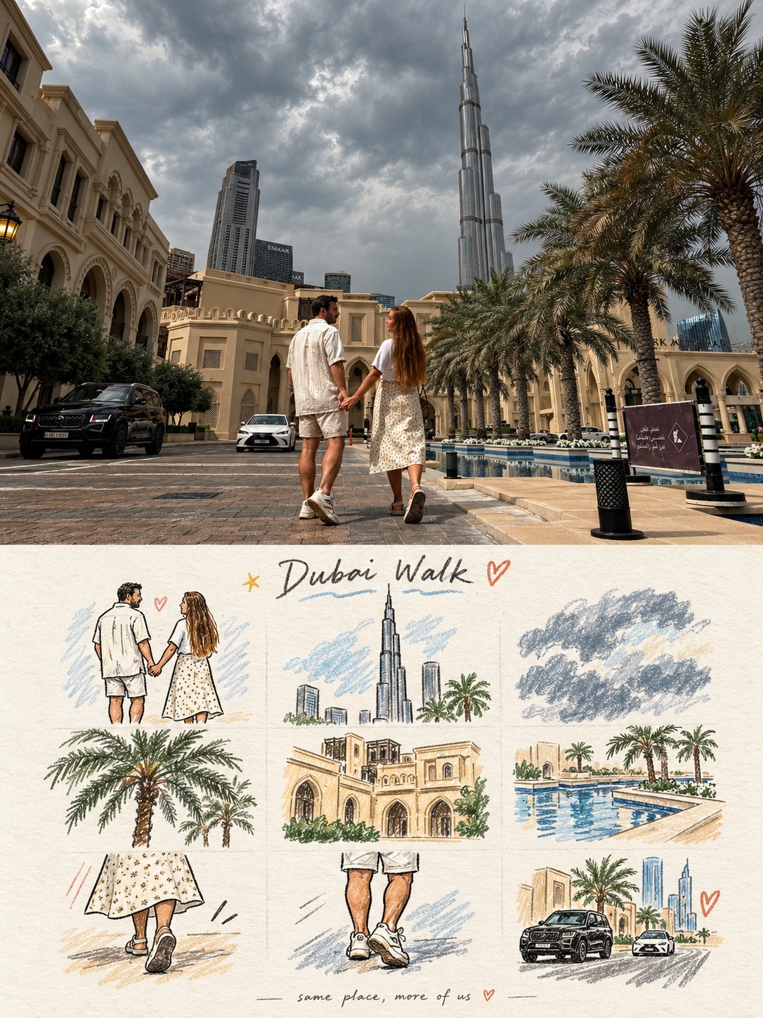
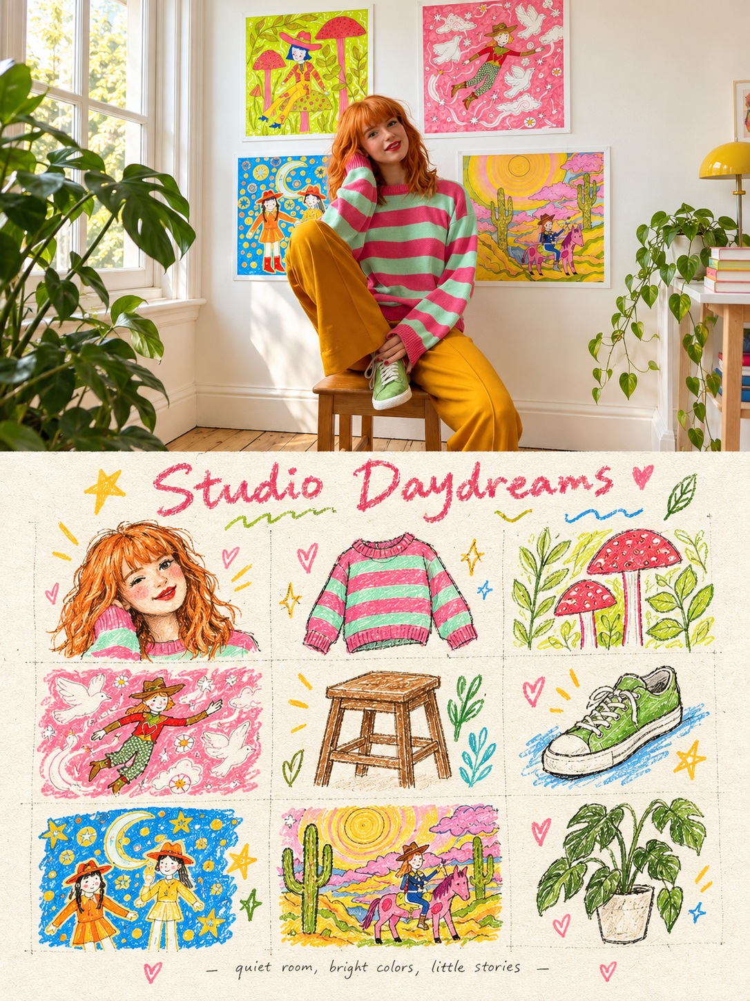
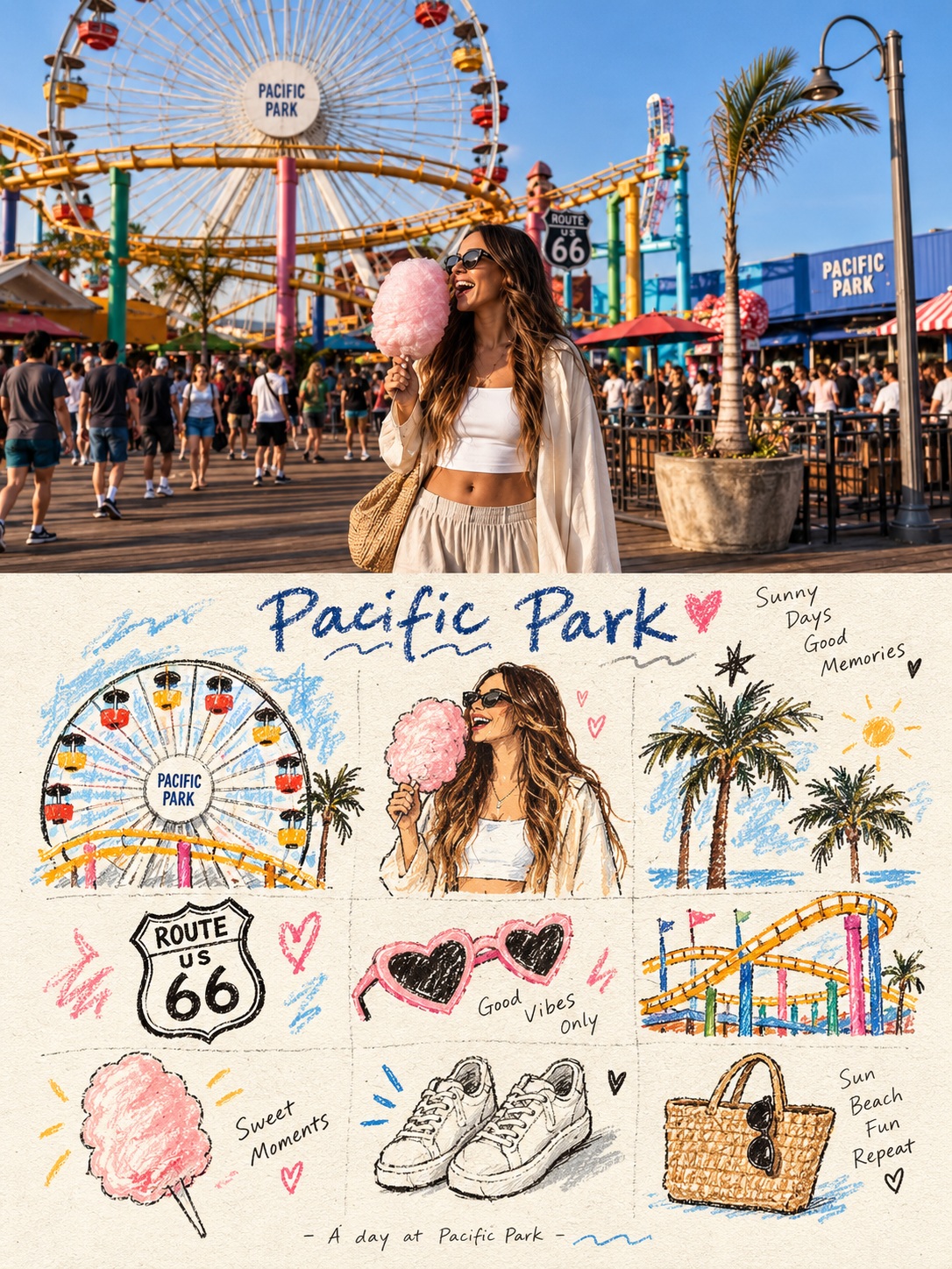
Turn each supplied photo into a separate 3:4 poster, pairing the original image with a loose grid of hand-drawn memory icons.
Example outputs
Prompt template
- Format
- Text
- Inputs
- Photo (image) · Required
- Outputs
- Poster (image)
Create a separate advanced design poster for each uploaded photo. Output each poster independently; do not combine multiple photos into a collage.

Use a 3:4 vertical composition divided into upper and lower sections of equal height, each occupying exactly 50% of the image.

In the upper section, retain the original photo. Preserve the subject's identity, structure, pose, true texture, natural light and shadow, and original color atmosphere. Apply only subtle color grading for the feel of an art magazine, independent publication, or exhibition image. Expand the environmental background naturally if needed to fit the frame, but do not stretch, distort, or alter the subject.

In the lower section, extract the photo's most recognizable subjects, local features, action cues, object details, and narrative relationships. Reconstruct them as nine memorable visual units in a loose, hidden 3×3 grid, combining simple icon-like forms, childlike hand-drawn graffiti-style illustrations, crayon or colored-pencil grain, and handwritten text. The units may depict the subject itself, local details, personal objects, plants, food, transportation, gestures, emotional symbols, or small scene-specific memories. Each unit must be a semantic extension of the photo above, so the set reads as a memory list belonging to that same image. Do not trace the photo in full or make realistic illustrations; distill its complex information into nine memorable units.

Use the 3×3 grid only as an underlying guide, not a rigid table. Slightly vary the position, size, angle, and placement of the icons to create an orderly but organic arrangement. A short handwritten title may appear at the top, accompanied by a few small waves, stars, or symbols; a tiny handwritten caption may appear at the bottom. Make the poster feel like a private handbook, visual diary, or collection sheet.

Leave plenty of blank space and keep the layout loose, cute, restrained, and uncluttered. Use a naïve hand-drawn doodle style: simple, slightly childlike forms; gently shaky outlines of uneven thickness; and occasional open contours that retain intentional imperfections. Avoid overly dense coloring. Let paper texture, white flecks, and rough edges show through. Combine thin black outlines with colored-pencil or crayon coloring and a few localized color blocks. Build the image with flat colors and graphic shapes rather than realistic light-and-shadow modeling. If any grid guide lines are visible, make them extremely faint, like lightly penciled construction lines rather than a digitally drawn table.
What you'll create
The original photo occupies the top half while simplified scene-derived icons and details form a graphic lower section. Pencil-like outlines, crayon color and rough paper give the design an independent-publication feel.
Usage instructions
Provide the photo or photos you want transformed; each photo will become its own poster rather than part of a collage. The source photo determines the icons and visual details, while the 3:4 format and equal-height sections define the layout.
Frequently asked questions
Should any grid lines resemble a digital table?
No. They should be extremely faint, like penciled construction guides.
Does the lower half model realistic light and volume?
No. It uses flat colors and graphic shapes.


Comments
Tried this prompt? Share what you made, compare results, or ask a question