- Category
- Design & Image
Minimalist Two-Part Editorial Poster
Transform a reference image into a refined, minimalist poster combining a lightly edited photograph with an abstract geometric interpretation of its subject.
By Threads — Published on — Modified on
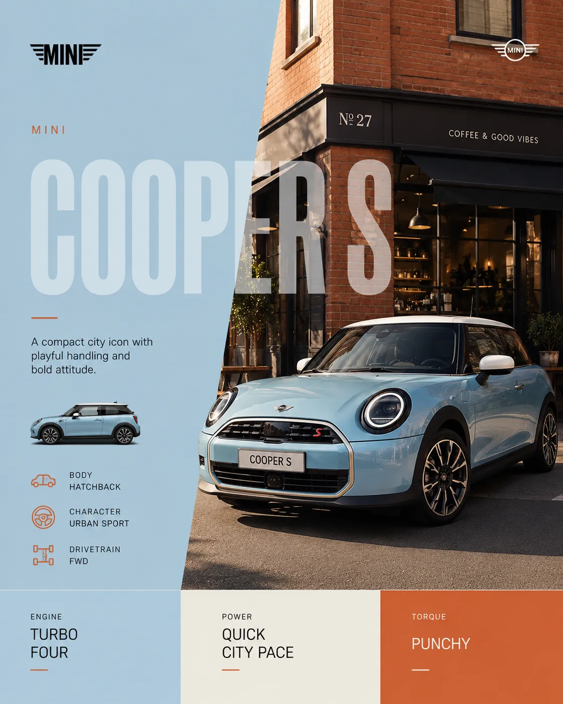
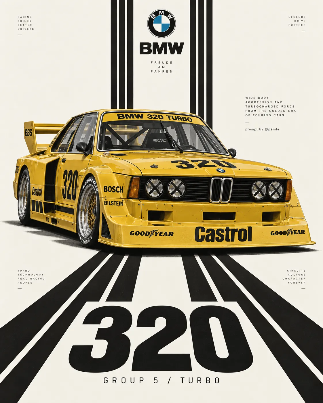
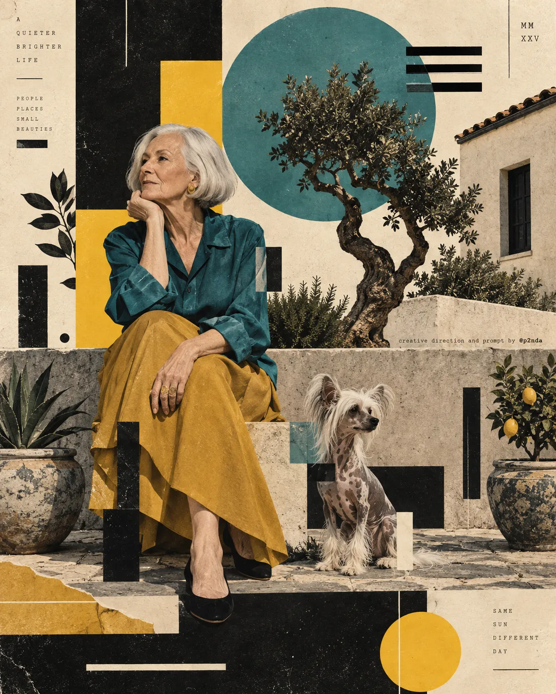
Example images


Prompt template
- Format
- Text
- Inputs
- ReferenceImage (image) · Required
- Outputs
- Poster (image)
Create a standalone, refined minimalist poster based on the uploaded image. Do not create a collage. Divide the canvas into two equal horizontal sections, with each section occupying exactly 50% of the image.

Upper section: Preserve the original subject’s identity, structure, pose, realistic texture, natural lighting, and color atmosphere. Apply only subtle, sophisticated color grading to achieve the quality of an art magazine or exhibition image. Extend the background if needed to fit the canvas, but do not stretch, distort, or alter the subject. Include no text in this section.

Lower section: Extract the most recognizable contours and structural features of the subject and express them as a minimalist abstraction using simple geometric shapes, flat color blocks, fine lines, and negative space. Avoid realistic illustration and complex detail while preserving enough defining features for the subject to be immediately recognizable. Derive the palette from the photograph above. You may add a small number of horizontal lines, structural lines, or abstract environmental elements.

Use an ivory-white background with generous negative space. Center the subject and keep the composition balanced and restrained. In quieter areas of negative space, add 2–3 small typography blocks in a minimalist modern sans-serif typeface.

Aim for the visual language of international design studios, architectural posters, art-exhibition posters, and premium brand identity systems: sophisticated, modern, quiet, and artistic. Avoid ordinary filter effects, cheap-looking vector graphics, cartoon styling, an e-commerce aesthetic, and template-like design.




Comments — 0