Custom-Motif Cream Advertising Poster
Create a full-bleed 3:4 poster from a supplied photo, combining custom curved lettering, a close-up of the original subject, and a bold graphic motif derived from it.
Example outputs
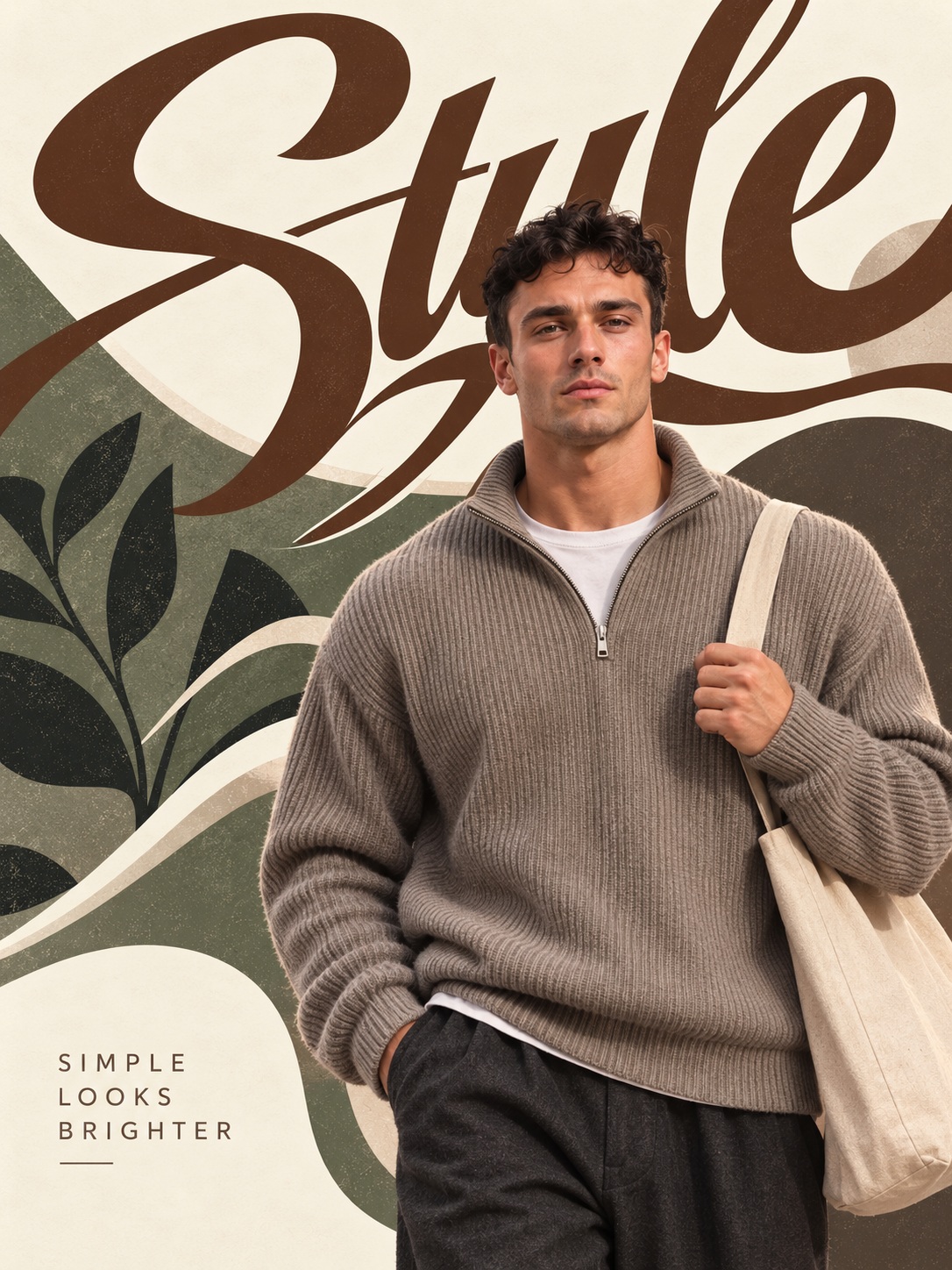

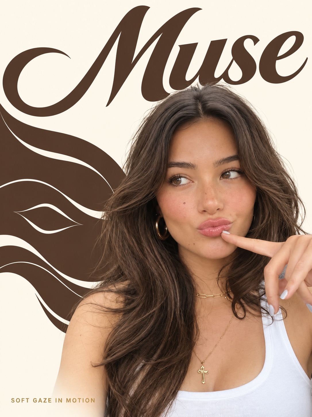
Prompt template
- Format
- Text
- Inputs
- Reference_photo (image) · Required
- Outputs
- Poster (image)
Use the attached photo to create a full-bleed poster in a fixed portrait ratio of 3:4. The poster should combine custom lettering, a close-up photograph, and a simple graphic motif derived from the photo.

DESIGN
Use a bright cream or light ivory background. Combine a close-up image of the real subject with bold color graphics and clear, modern advertising-poster design. Let the photo’s colors inform the lettering and graphics, and let the photo’s shape relate to the curves of the letters. Use large letterforms, bold cropping, and a broad color field rather than many small decorations. Keep the result polished, vivid, and easy to read.

PRESERVE THE ORIGINAL SUBJECT
Use the actual subject in the attached photo. Preserve its defining features and original appearance, including any applicable facial expression, hairstyle, clothing, pose, animal appearance, hair color, pattern, dish shape, material, quantity, composition, product structure, colors, and existing labels. Do not invent or add shapes, objects, materials, props, or body parts. Do not arbitrarily cut or disassemble food; if the original photo shows no cut, do not create one.

You may remove the background, resize or reposition the subject to suit the layout, and crop where needed. Change the design layout, not the original subject.

HEADLINE LETTERING
Automatically identify a short, natural English name or one or two category words that reflect the subject. Prefer a single short word when possible, with the first letter uppercase and the remaining letters lowercase. Make the headline large enough to occupy roughly one-third to two-fifths of the poster’s upper area.

Draw the headline as a custom wordmark rather than using an ordinary font. Use bold, elegant lettering with smooth edges and solid interiors, as though shaped with a brush but without visible brush texture. Make the initial capital large and distinctive; connect the following lowercase letters naturally. Balance broad, full curves with tapered ends and long, sweeping terminals, and make the counters—the spaces inside the letters—look deliberate. Adjust letter spacing and connections carefully. Use one especially striking long curve from the first or last letter to lead toward the photograph and unite the composition; do not add several long strokes.

Do not use brush strokes, rough ink, scratches, dimensional outlines, shadows, delicate wedding-calligraphy styling, or balloon lettering.

PHOTO COMPOSITION
Place the subject from the center toward the lower-right of the poster. Enlarge it to emphasize nearby, appealing textures and shapes, allowing some less important areas to crop naturally off the right or bottom edges. Use bold cropping rather than shrinking the entire subject, but retain important features such as drawings, animal eyes and expressions, distinctive food ingredients, and recognizable product details.

Render natural colors and realistic textures without unnecessary alteration. Preserve clear detail in skin, hair, flesh, food surfaces, glass, and metal where present. If the original contains multiple objects, you may use their relative sizes and foreground/background placement, but do not duplicate them.

Keep the photograph and graphic elements sharply defined. Do not apply a real-time filter, blend graphics into the photo, or blur the subject.

PHOTO-DERIVED GRAPHIC MOTIF
Select a shape or surface feature of the subject and simplify it into a flat graphic motif. Use only a feature present in the photo, such as fruit seeds, petal outlines, an animal’s fur pattern, a product’s repeated structure, or waves and curves in a landscape. Do not add motifs unrelated to the photo.

Create a broad, organic color field that extends from the left edge toward the center. Repeat the selected motif sparingly within this field as a background pattern. Let the field flow in a wide arc or gentle wave; some of it may extend beyond the canvas or sit behind the main subject. Keep the pattern on the colored area only, with enough space between repeats for the shapes to remain clear at small sizes. Do not fill the entire poster, scatter small icons, or turn the motif into another oversized character. Use colored edges and patterns to emphasize the subject’s features.

COLOR
Use light ivory or cream as the base. Select one of the brightest colors in the photo for both the headline and the large graphic field. If the photo is achromatic, choose a primary color suited to the subject. Use another color from the photo only sparingly, if needed, for the bottom caption. Limit the design palette to the background color, the main color, and a small accent; preserve the subject’s original colors. Keep the large color field and headline monochrome. Create clear contrast without excessive gradients or neon.

INTEGRATE THE ELEMENTS
Do not isolate the headline, photo, and graphics in separate areas. Bring the headline’s long curve close to the photograph, let a small part of the subject edge appear to overlap it, and place the broad patterned color field behind the photograph. Use only a few clear intersections, without making them so complex that they hinder reading or obscure the subject. Arrange the headline near the top, the large close-up toward the bottom, and the connecting graphic field on the left, leaving a natural cream-colored area between them.

BOTTOM CAPTION
Automatically generate a short English caption of 3–6 words that suits the subject and design. Place it in small, uppercase sans-serif letters at the lower left on the light margin. Slightly increase the letter spacing. Set it directly against the background, without a strip or frame.

TEXT RULES
Add only two new text elements: the large English headline and the small bottom caption. Do not add names, articles, numbers, prices, invented brand names, logos, or watermarks. Existing labels on the original product may remain.

AVOID
Do not use torn paper, drawn backgrounds, paintbrushes, tape, stickers, copier noise, vintage filters, three-dimensional typography, or extraneous decorations. Avoid a monotonous layout with only a title above a photo, and avoid an advertising template that shrinks all elements into the center.

OUTPUT
Return a finished poster that fills the screen on its own, with no photo frame, wall mockup, or external margins. Use the fixed portrait ratio of 3:4.
What you'll create
The real source subject remains recognizable within bold crops, large letterforms and broad color fields. Photo colors and contours guide a vivid modern layout on ivory rather than a framed mockup.
Usage instructions
Provide the photo whose subject should appear in the poster; the layout, headline color, and motif are based on that image. The design calls for a tight crop, so keep the subject’s defining details visible while letting less important parts extend beyond the right or bottom edge. If the photo is achromatic, use a primary color that suits its subject for the headline and graphic surface.
Frequently asked questions
Is the poster shown hanging on a wall?
No. It fills the output by itself.
Should every element be shrunk into the center?
No. The source rejects that template-like arrangement.







Comments
Tried this prompt? Share what you made, compare results, or ask a question