- Category
- Design & Image
- Model
- openai-chatgpt
Photo-to-Pastel Crayon Editorial Poster
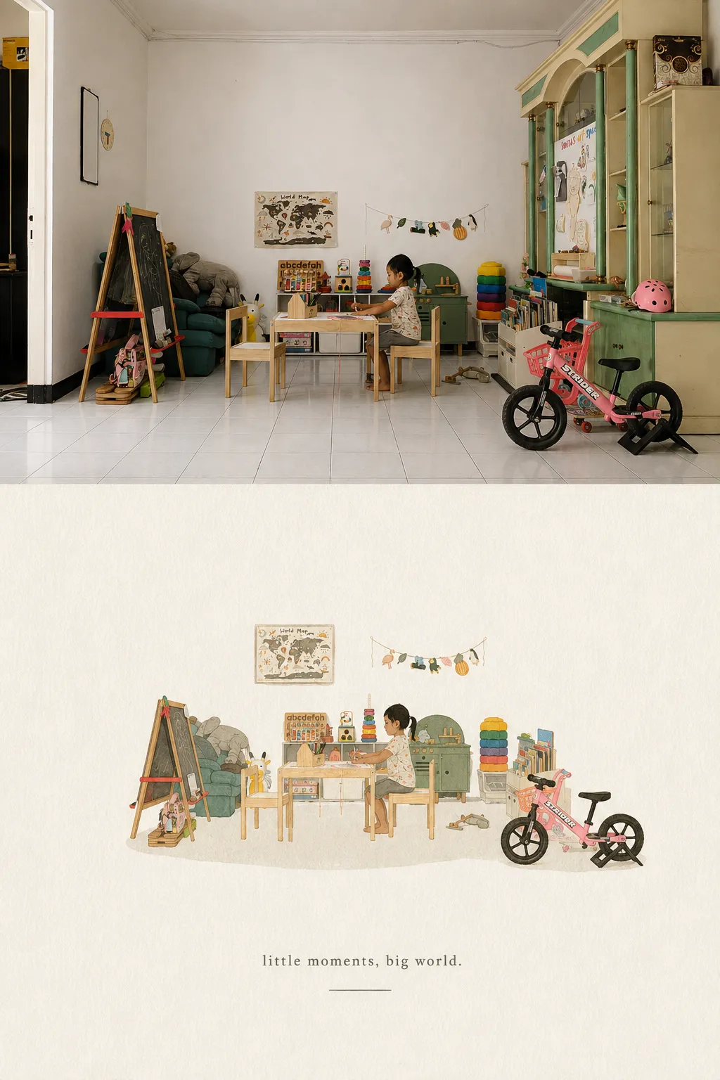
Turn each uploaded photo into its own 3:4 editorial poster, pairing the lightly color-graded original photo with a minimal pastel-crayon interpretation on bright paper.
By Threads — Published on
Example images


Prompt template
- Format
- Text
- Inputs
- Photos (image) · Required
- Outputs
- Editorial_poster (image)
Use each uploaded photo to create one separate, high-end editorial poster. Do not combine multiple photos into a collage. If several photos are uploaded, create one independent poster for each.

Use a vertical 3:4 composition divided into two equal-height sections, each occupying exactly 50% of the image.

TOP HALF — PHOTO
Preserve the original photo’s subject identity, structure, pose, realistic texture, natural lighting, and color mood. Apply only subtle, refined color grading to give it the feel of an art magazine, independent publication, or exhibition image. You may naturally extend the environment to fit the format, but do not stretch, distort, or alter the subject.

BOTTOM HALF — CRAYON INTERPRETATION
First identify the photo’s most memorable core theme, subject relationships, structural flow, mood, and visual metaphor. Reinterpret these as a pastel-crayon doodle illustration on textured paper. Do not copy every object or fully redraw the whole photograph. Retain only the most recognizable contours, poses, directions, and visual cues, using simplification, omission, slight exaggeration, and recombination so the illustration clearly relates to the photo above.

Draw the main subject with bold, grainy chalk- or crayon-like outlines: loose, dry, slightly rough lines with powdery texture, intermittent fading, a little wobble, and edges that may remain partly open. Use naturally blunt line ends. Add only a few pastel areas, simple grids, stripes, dots, or casual marks inside the subject to suggest its structure. Avoid realistic volume and complete detail.

Draw surrounding small elements in the same line style, simplified to recognizable doodle symbols made with just a few strokes. Stars, flowers, plants, objects, environmental clues, or abstract symbols should be simple, naive, open, and often unfinished, mostly in single-line outlines with very little fill. Do not make them polished icons, stickers, or separate miniature illustrations.

COMPOSITION AND PAPER
Keep the subject small, like a seal or stamp, with generous empty space. Arrange it freely according to its direction, proportions, and visual center; it may be off-center, near an edge, suspended, or partly cropped. Let the subject and a few doodles form a loose but clear visual cluster. Leave the rest intentionally blank. Use negative space as a major compositional element, creating a sense of breathing room, distance, and pause through contrast, grouping, scale, and asymmetry. Prefer drawing less to filling the page.

Use a very light, bright, clean paper background: for example, cream white, ivory, pale beige, light apricot white, very pale gray-white, or a near-white tone that suits the overall warmth of the photo. Keep paper fibers and grain extremely subtle. The paper must not look brown, yellowed, gray, or aged. Make the background clearly lighter than the lines and color areas so every crayon outline, symbol, and text element remains legible.

COLOR
Take 2–4 of the photo’s most vivid, appealing, and representative colors and reinterpret them as bright, soft pastel-crayon colors. Suitable light hues include peach pink, apricot orange, buttery yellow, mint, sky blue, and pale violet. Favor clear outline colors that stand out from the paper, such as coral pink, soft blue, green, warm orange, pale violet, or a deeper creamy tone. Repeat these colors sparingly in small elements for cohesion. Maintain the contrast of a pale background, clear colored lines, and a few soft color areas. The result should feel bright, soothing, relaxed, and lived-in. Avoid dull or dirty browns, gloomy muted colors, low contrast, fluorescent colors, and a cheap candy-like look.

TEXT
Add only a small amount of text, in any language. Freely distill a short phrase or fragment from the subject, action, emotion, memory, or metaphor. Set it in a light, airy typewriter-style font with slight irregularity in letter spacing and subtle vintage mechanical-print imperfections. Use a readable, non-harsh gray-brown, soft black, dark blue-gray, or other dark color that echoes the subject. Scatter the text naturally through the negative space as part of the image-and-type composition; do not use a fixed title template.

OVERALL LOOK
Create a refined, soothing visual built from very light paper, bold grainy crayon outlines, sparse pastel fills, minimal doodle symbols, a small-scale subject, and generous artistic negative space. Keep the subject and small elements clearly visible against the pale paper, balancing looseness, innocence, warmth, and mature editorial composition.

Avoid dark kraft paper, dark brown backgrounds, low-contrast lines, elements blending into the background, precise polished outlines, realistic redraws, complex icons, filled-in backgrounds, smooth vector art, 3D effects, and generic commercial-template styling.




Comments — 0