Character-Driven Limited-Color Editorial Poster
Create an original vertical poster that turns a character’s identity into a bold graphic design, using their reference images and name to guide two consistent character compositions and a tightly controlled palette.
Example outputs
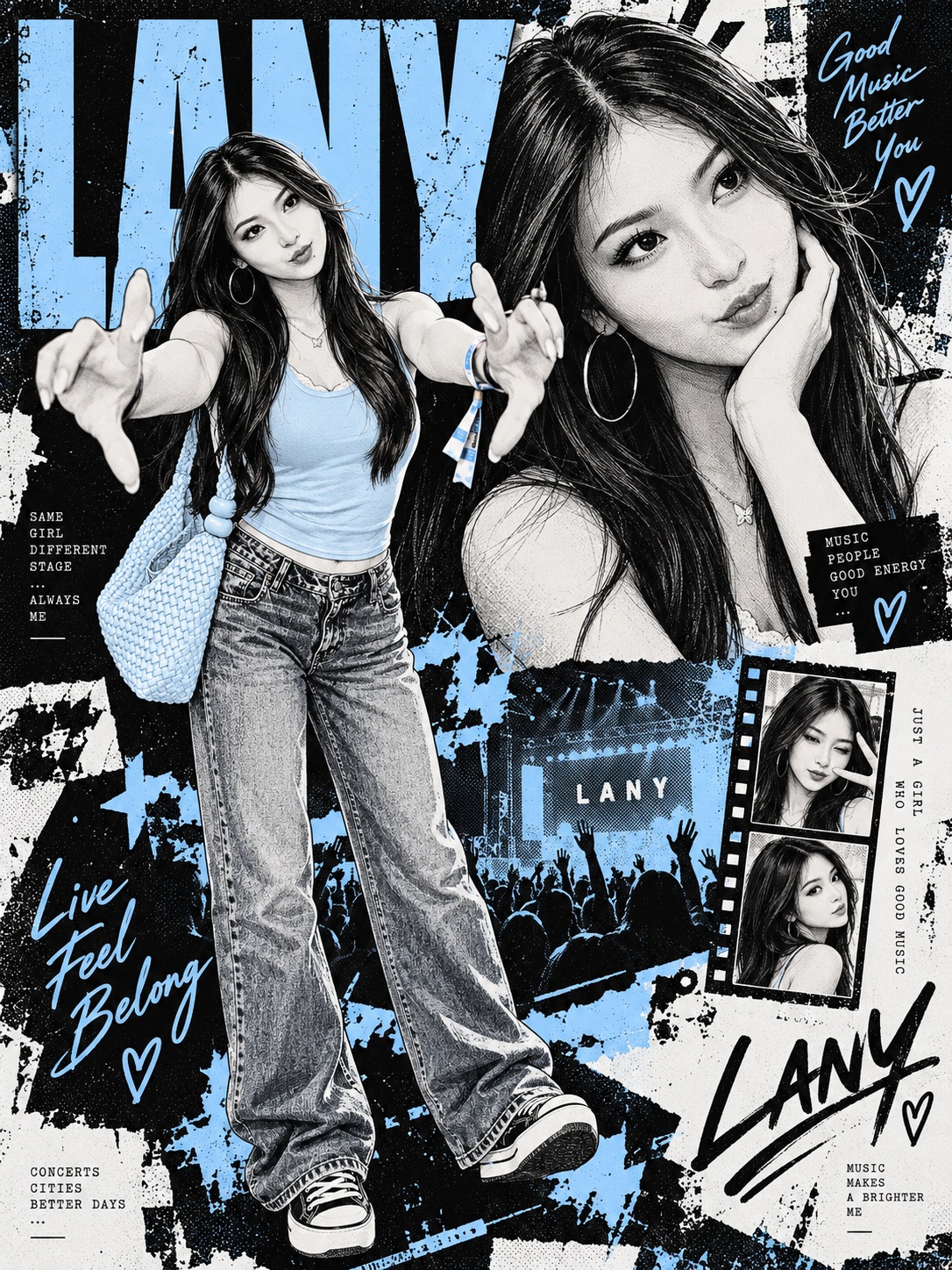
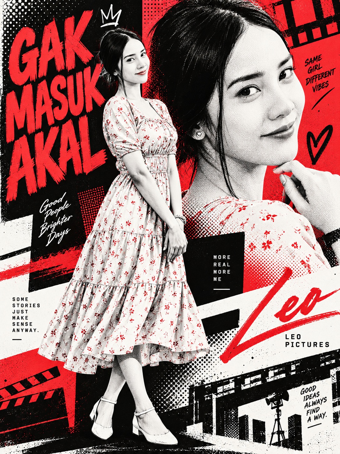
Prompt template
- Format
- Text Parameterized
- Inputs
- character_images (image) · Required character_name (text) · Required
- Outputs
- character_poster (image)
If the reference images and character name have not yet been provided, first ask the user to provide several images of the character and the character’s name. Once both are available, begin creating the image immediately without asking any further questions or requesting confirmation.

Create an original, exclusive bi-color poster for the character, making the character the central design element. Analyze not only the character’s physical appearance but also their personality, atmosphere, distinctive qualities, world, and symbolic motifs, and transform those characteristics into a bold graphic design.

01 | Character analysis
Using the supplied character images, carefully understand the character’s physical features—including facial features, hairstyle and hair color, eyes, body shape, clothing, and accessories—as well as their expression, personality, atmosphere, signature colors, distinctive motifs, and appeal. Preserve the original character’s defining traits and identity so they do not look like a different character.

02 | Color design
Choose one main color that best represents the character. Use only three colors: the main color, black, and white. Maintain these proportions consistently throughout the poster: 45% black, 30% white, and 25% main color.

Use these three colors for every element, including skin, hair, eyes, clothing, accessories, background, text, and shadows. Do not use the original colors, such as skin tones or gold; use monochrome (white, black, and gray) or replace those colors with the main color. For shadows and texture, use gradients from the same palette. Use black as the base, white for contrast and visibility, and the main color for strong accents.

03 | Character reconstruction
Show the same character in two different compositions within a single poster.

Primary visual — full body: Show the character from head to toe, clearly displaying their clothing and pose. Make the character large, prominent, and the poster’s main visual element.

Secondary visual — bust-up or facial close-up: Show the character with an expression or viewpoint different from the primary visual, and place this depiction in the background or another area of the poster. It may overlap the primary visual or appear as a separate graphic element.

Keep the character’s appearance and identity consistent across both depictions while giving each one a distinct appeal. Do not simply place the original images into the poster; redesign the expression, pose, and clothing to emphasize the character’s personality. Keep the result faithful to the character’s original image while making it powerful and compelling.

04 | Graphic design
Create a sharp, edgy graphic design using elements such as bold typography, geometric patterns, halftone, dotted patterns, stripes, and collage. Use techniques such as boldly layering text and character imagery, allowing elements to extend beyond the frame, and combining large and small elements to create visual rhythm and depth.

Adapt the composition and graphic style to suit the individual character’s personality. Avoid a uniform or rigid design.

05 | Typography
Place the character’s name exactly as provided: ${character-name}. Treat the name as a major graphic element in the poster, using bold text treatments such as very large lettering, vertical orientation, or layering. If appropriate, add a short English phrase or numbers as decorative elements. Keep the character’s name easy to read while arranging all text aesthetically as an integral part of the design.

06 | Final visual
Format the poster in a vertical 3:4 aspect ratio. Combine modern, elegant editorial design with street graphics to create work with the quality of a fashion magazine or art poster.

Keep the character as the clear focal point, using strong contrast, sharp graphic elements, and meaningful negative space. Tailor the composition, pose, clothing, typography, and graphic style to each character; do not make the result look uniform, as if the character had simply been inserted into a pre-existing template. Prioritize the character’s personality and the overall design quality rather than merely adding more information.

Create a unique, original bi-color poster for the character, with the character’s personality itself becoming the central design.
Replace the ${…} placeholders with your values
before using this prompt. See parameters
and defaults below
Parameters
Replace each placeholder with your own value, or use its default when one is provided
${character-name}
character-name
Required
What you'll create
A named character becomes the center of a graphic poster built from their appearance, symbolic motifs and atmosphere. Two coordinated compositions and a restrained color system express the character’s identity rather than placing them into a generic layout.
Usage instructions
Frequently asked questions
Does bi-color mean only two colors in every element?
The usage describes two coordinated compositions within a three-color limit, so the source is more flexible than the label alone suggests.
What should drive the accent color?
The character’s distinctive traits and atmosphere guide its selection.


Comments
Tried this prompt? Share what you made, compare results, or ask a question