Dimensional Paper-Craft Editorial Poster
Turn each supplied photo into its own premium vertical poster, pairing the original photograph with a layered paper-cut interpretation.
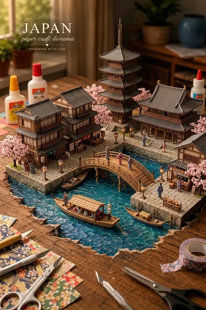
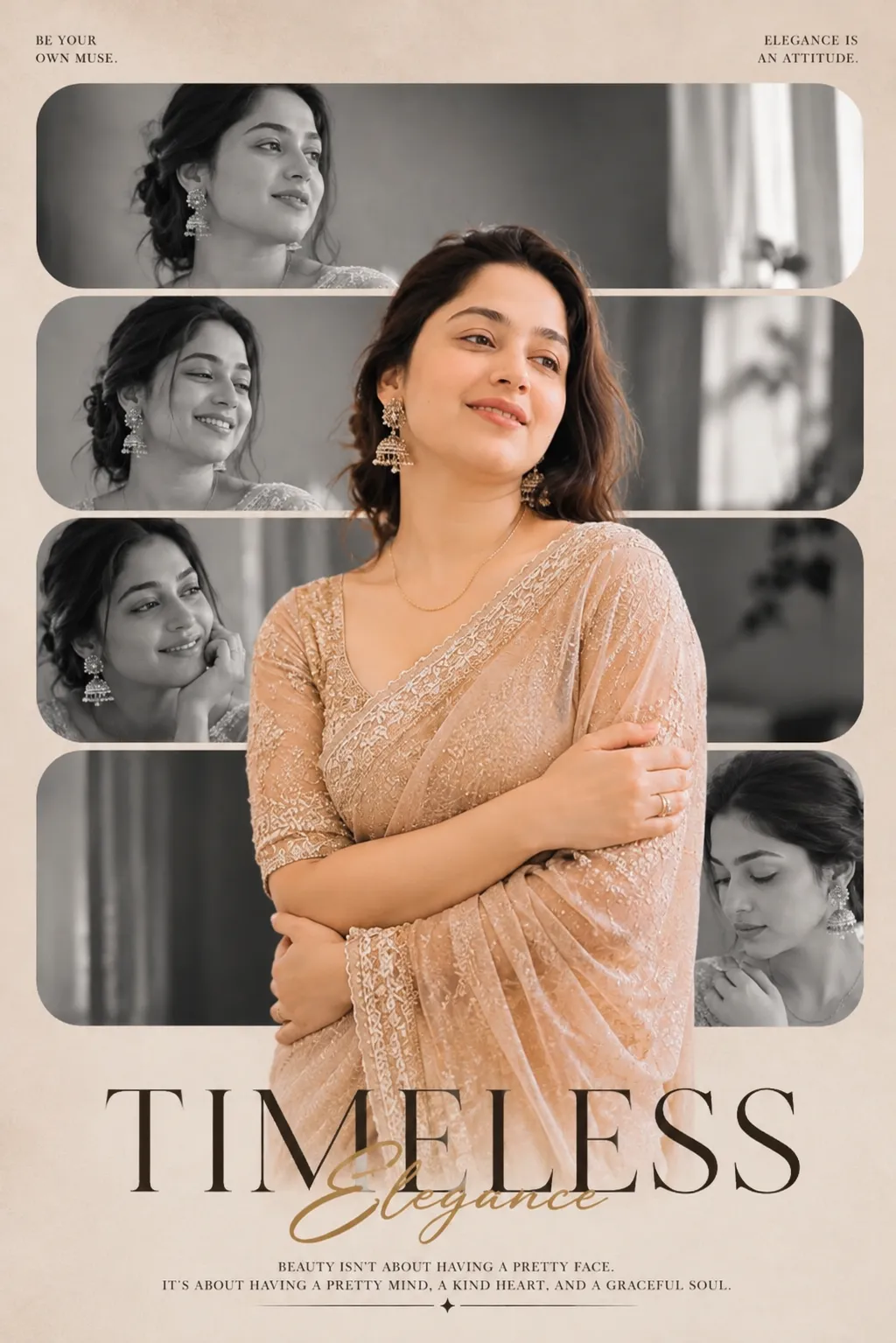
Example outputs
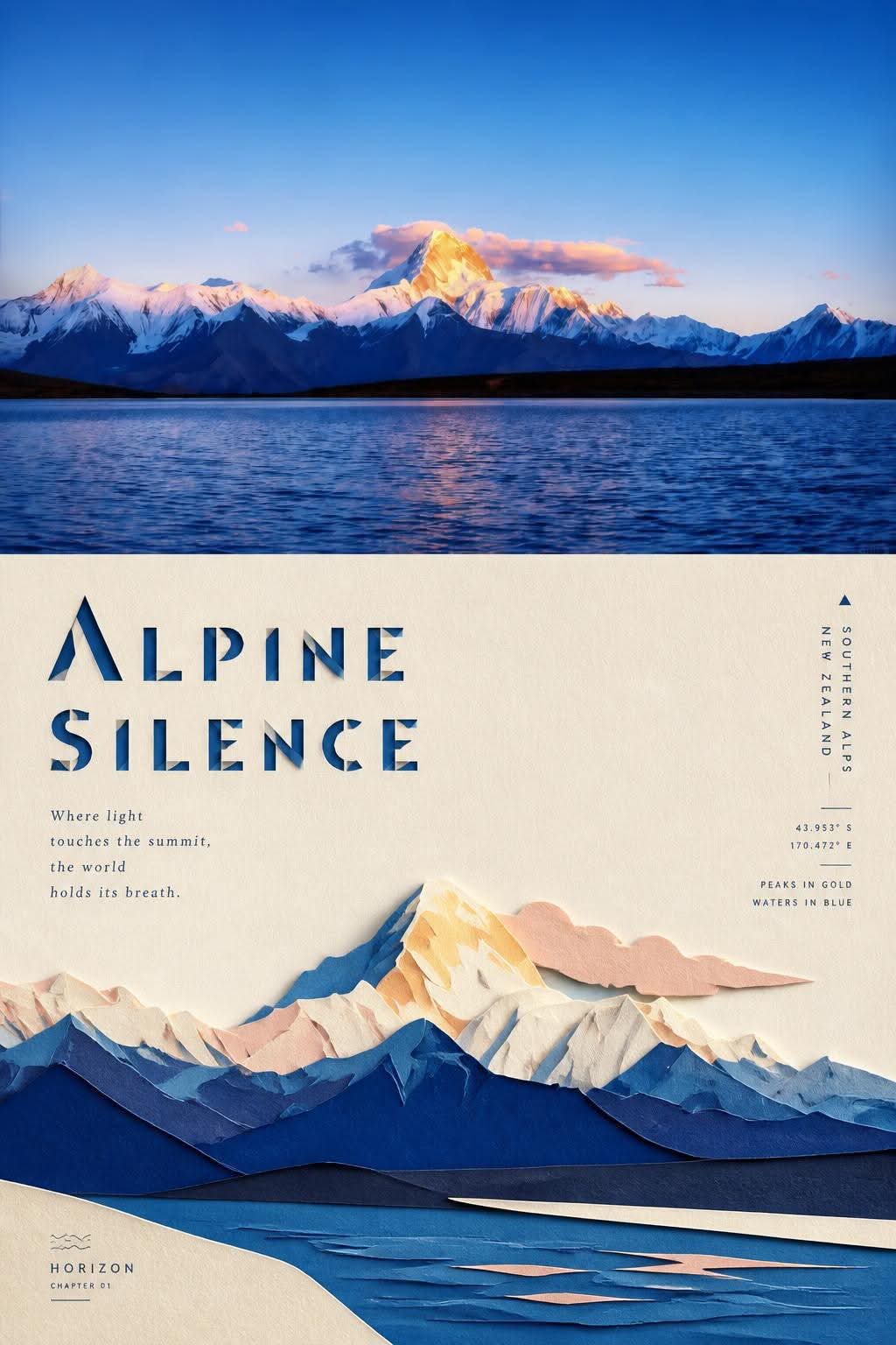
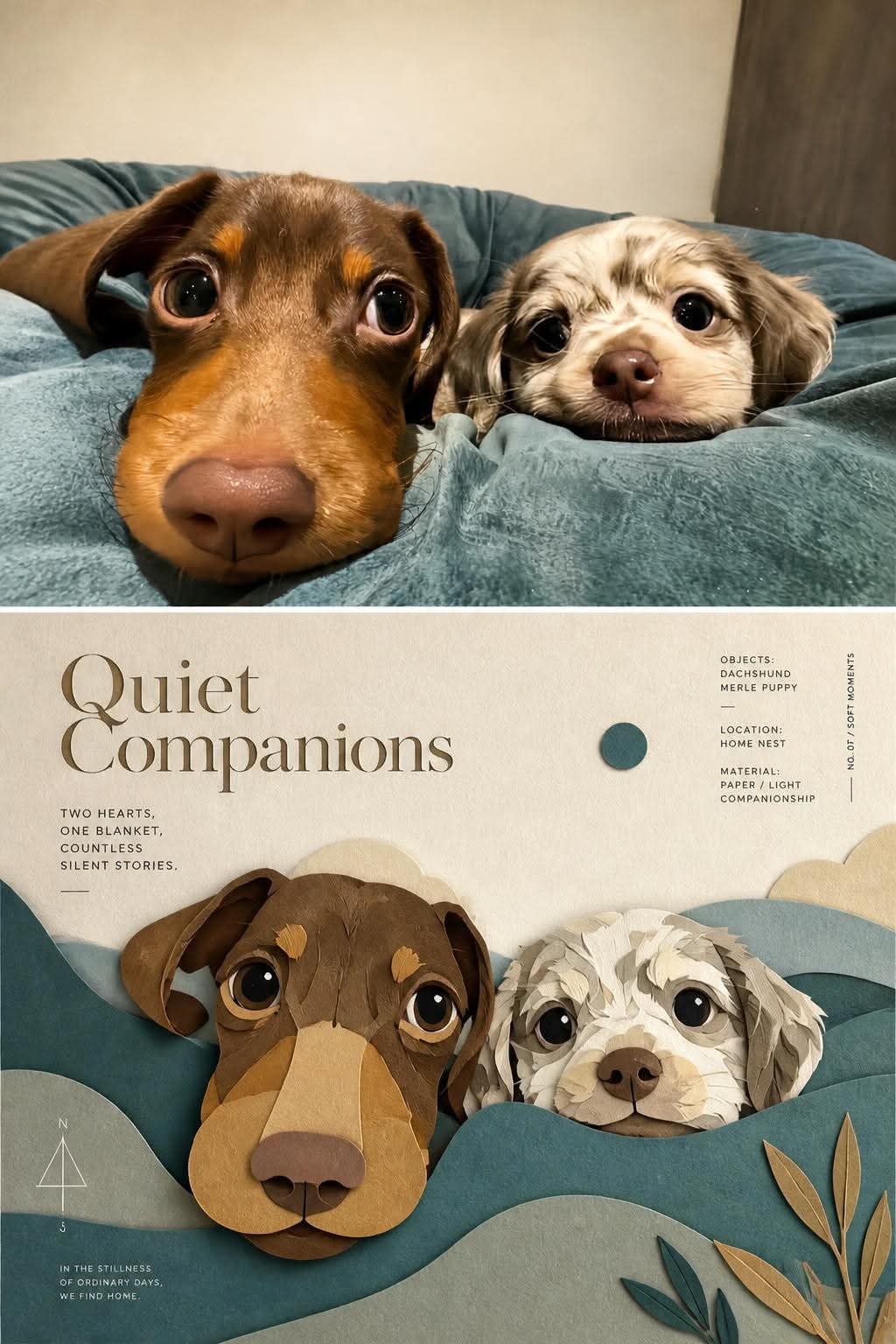
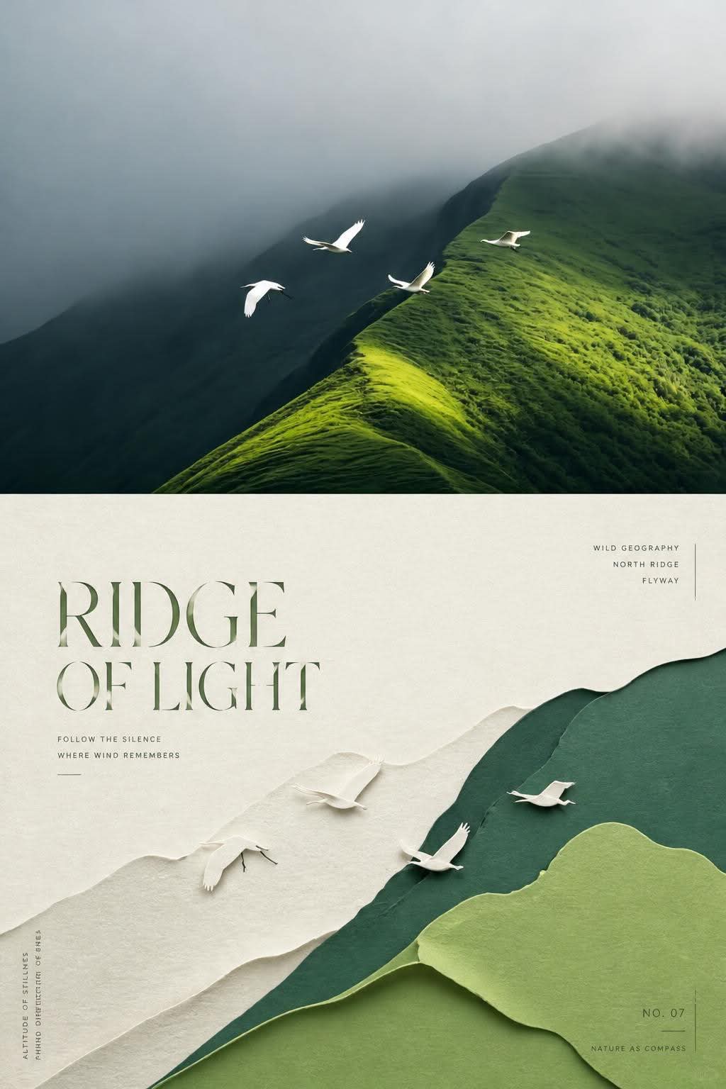
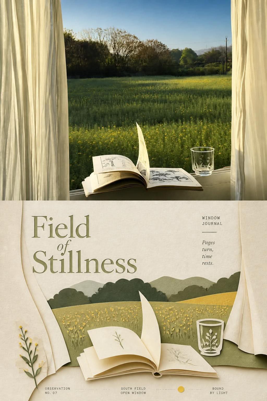
Prompt template
- Format
- Text
- Inputs
- Uploaded_photo (image) · Required
- Outputs
- Poster (image)
For each photo I upload, create a separate premium design poster. Do not combine multiple photos into a collage; output one poster per photo.

Use an overall vertical 3:4 composition, with the upper and lower sections exactly equal in height: each section occupies 50% of the image.

In the upper section, preserve the original photograph’s main structure, realistic texture, natural light and shadows, and original color atmosphere. Apply only subtle, high-end photographic color grading to evoke an art magazine, independent publication, or exhibition photography. You may naturally extend the sky, ground, or environmental background to fit the composition, but do not stretch, distort, or alter the subject.

In the lower section, extract the photo’s most recognizable subject, silhouette, pose, and narrative relationships, and reconstruct them as a minimalist handmade layered paper-cut and paper-sculpture collage. Use one central subject as the visual anchor. Reinterpret its key contours, proportions, and structure through folding, cutting, layering, and masking rather than mechanically copying details. Select a few environmental relationships from the original image and transform them into foreground, middle-ground, and background paper layers. Establish a clear hierarchy through differences in scale, axes, positive and negative shapes, overlapping masks, and generous negative space. Keep the subject immediately recognizable while maintaining the restraint and order of a modern editorial composition.

Derive the color palette from the most distinctive, vivid colors in the photograph above, then translate them into a limited, harmonious paper palette. Use warm ivory or light-colored paper as the base, and build spatial depth with primary colors, dark structural tones, lighter overlays, and minimal accent colors. Use fine matte cardstock, visible paper fibers, clean edges, and soft contact shadows. Natural diffused light should reveal the thickness of the folded layers and the authentic handmade texture. Avoid a plastic 3D appearance, cheap cardstock, neon colors, and complex gradients.

Create a complete high-end editorial micro-typography system. Derive a short headline from the photo’s subject identity, location, action, materials, atmosphere, or symbolism. Pair it with 2–4 very small supporting text groups, combining elements such as an object name, location information, numbers, chapter markers, serial numbers, coordinate-like numerals, directional words, status words, material terms, category labels, or one very short poetic annotation. Do not use a year. The headline should convey identity and emotion; the smaller text should provide order, rhythm, and refinement.

Integrate the text with the paper-cut graphics. Align it along paper-layer edges, the subject’s outline, geometric axes, or negative space. You may use horizontal or vertical layouts, rotation, wide letter spacing, edge alignment, corner placement, placement across color blocks, embedding within paper layers, or interaction with the subject through masking and interweaving. The headline may be transformed moderately into paper-cut or origami lettering, while the smaller text remains fine, restrained, and modern in its editorial typography. Use contrasts in size and shifts in direction to create a reading path.
What you'll create
The top retains the source photo while lower paper structures reinterpret its defining forms. Lettering follows edges, folds and color blocks to create a designed reading path.
Frequently asked questions
Can several uploads be merged?
No. Each source receives a separate poster.
Do the halves occupy equal height?
Yes. The split is exactly fifty-fifty.




Comments
Tried this prompt? Share what you made, compare results, or ask a question