Monochrome Glitch Editorial Portrait Poster
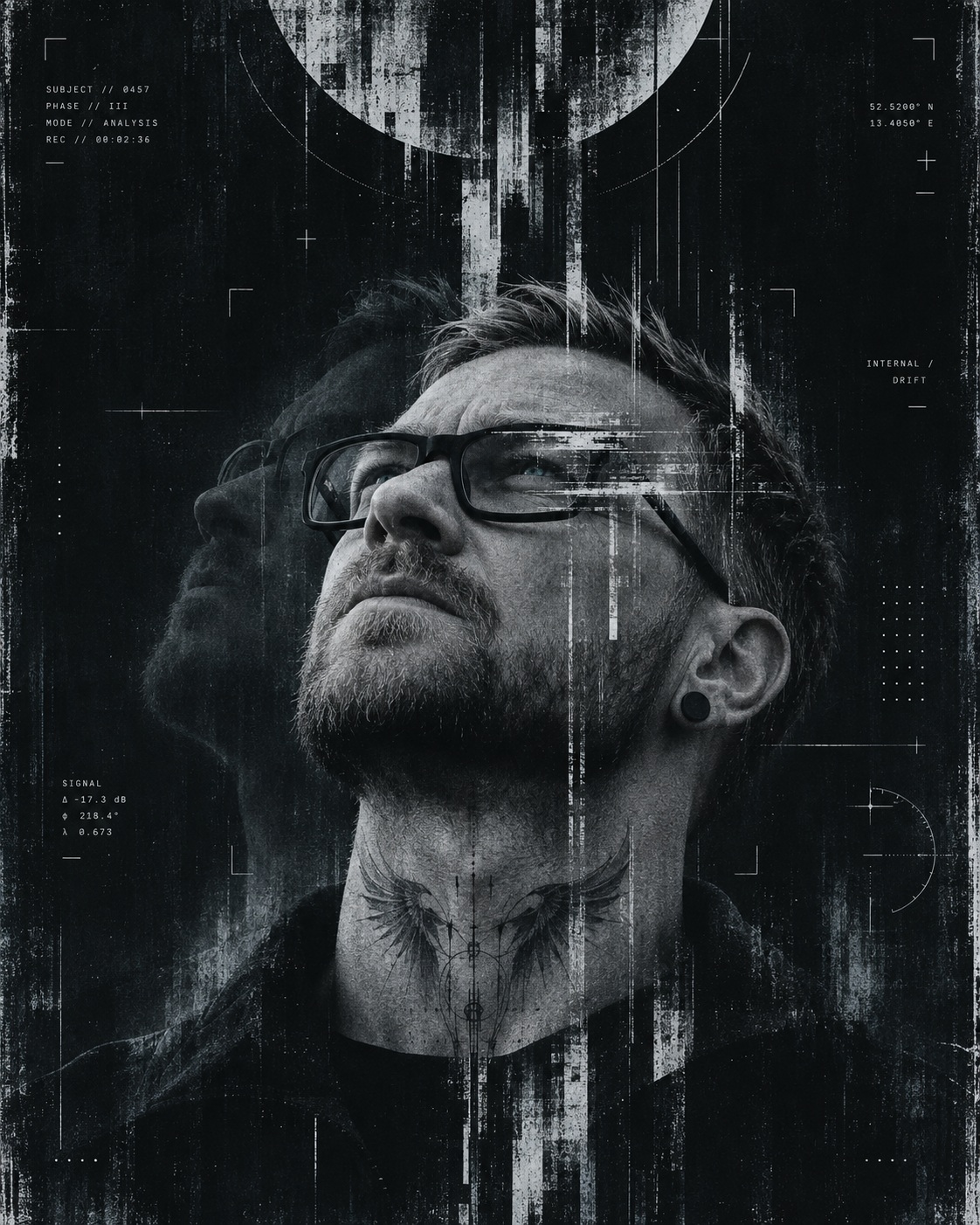
Create a dark, restrained editorial poster from a selfie, combining a recognizable photographic portrait with glitch textures, a subtle double exposure, and refined technical graphics.
Example outputs
Prompt template
- Format
- Text
- Inputs
- UploadedSeflie (image) · Required
- Outputs
- Portraitposter (image)
Create a vertical 4:5 experimental monochrome portrait poster using the uploaded selfie as the sole and strict identity reference.

STRICT IDENTITY PRESERVATION:
Depict the exact same real person from the uploaded photo. Preserve his recognizable face, actual age, natural masculine features, short haircut, hairline, beard length and shape, black rectangular glasses, ear gauge, jawline, nose shape, cheek contours, lip shape, neck structure, and subtle skin asymmetry. Keep realistic skin texture and natural facial proportions. No beautification, no face swap, no generic fashion-model replacement, no altered ethnicity, no exaggerated features, and no artificial smoothing.

POSE AND COMPOSITION:
Use a shoulders-up portrait occupying the lower two-thirds of the frame. Show the subject from a low angle with the head tilted far backward, chin lifted, and nose pointing diagonally toward the upper left. The pose should feel contemplative, distant, and introspective. Eyes may be partially hidden by shadow, glasses reflections, or graphic disruption, but the face must remain readable and recognizable. Keep the neck anatomically believable and strong. Dark clothing should merge into the silhouette and feel minimal.

BACKGROUND AND MAIN SYMBOL:
The overall format is a premium art poster, not a normal portrait. Use a deep matte black background with subtle distressed paper texture, faint abrasion, fine photocopy grain, and worn editorial grit. Leave generous negative space above the head. Near the top edge, place an abstract fragmented circular scan-disc or eclipse-halo form, partially cropped by the frame. It should feel like a broken scanning symbol or digital eclipse, not a literal moon copied from the reference poster.

GRAPHIC TREATMENT:
A central system of distressed vertical glitch columns, fragmented ink bars, scan-noise streaks, and eroded digital structures descends from the circular symbol through the hair, forehead, eye line, neck, and torso. Add scraped white horizontal interference strokes across the eye region and upper face, as if from damaged scan data or overprinted xerox abrasion.

Use tactile poster effects:
- dry-brush distress
- worn screen-print artifacts
- photocopy grain
- scraped emulsion
- fine scratches
- grunge edge wear
- distressed collage fragments
- subtle offset misregistration
- broken digital-ink erosion

Keep the overall result minimal, composed, and tasteful, not cluttered.

DOUBLE EXPOSURE:
Integrate a subtle double-exposure effect as part of the composition. Add a semi-transparent secondary exposure of the same face drifting slightly to the left side, soft and ghostlike, partially dissolving into the dark background and glitch texture. This secondary exposure should feel embedded into the visual system, not like a duplicated second person pasted beside him. It must remain understated and atmospheric, reinforcing the contemplative psychological tone.

INFOGRAPHIC SYSTEM:
Add our own refined technological infographic language, more developed than before, but still restrained and elegant. Use subtle white and faint cool OLED-blue elements only.

Possible elements:
- thin scan arcs
- registration crosses
- tracking marks
- coordinate labels
- micro technical labels
- tiny data blocks
- narrow ruler-like scales
- alignment lines
- minimal interface fragments
- subtle modular indicators
- fine grid traces
- optical targeting points
- discreet bracket marks
- tiny system codes

Do NOT use the old black-to-white square calibration strip or heavy grayscale swatches. No bulky charts. No obvious stock HUD. The infographic should feel premium, sparse, futuristic, and intentionally designed.

COLOR SCIENCE:
Keep the image monochrome with a gentle cool OLED-blue tint integrated like a subtle filter. The dominant palette is black, charcoal, off-white, silver-gray, and faint cold cyan-blue highlights. The blue tone should be minimal and atmospheric, never neon and never green. Preserve a clean cinematic coldness.

TATTOO:
Add an original neck tattoo inspired by raven wings or dark feathered forms opening symmetrically from the sides of the throat. It should feel sharp, graphic, and believable as a real tattoo. Do not directly copy the sample tattoo. No oversized chest piece. No fantasy clichés.

TYPOGRAPHY:
If any text appears, keep it extremely small, secondary, and white or soft off-white. It may resemble technical labels or poetic micro-copy, but must never become the main subject. No bold poster headline. No logos. No watermark.

PHOTOGRAPHIC REALISM:
Even though this is a poster, the man must still feel like a real photographed subject. Keep:
- believable anatomy
- realistic glasses
- accurate facial hair
- natural pores
- authentic lighting behavior
- real clothing folds
- sharp but not oversharpened detail

The face should remain the emotional anchor of the composition.

LIGHTING:
Use low-key cinematic lighting with deep shadow structure and selective cool highlights along the face, beard, neck, glasses, and cheek. The portrait should emerge from darkness in a controlled way. Avoid flat frontal studio lighting. Use realistic contrast and subtle reflected glow without losing resemblance.

WARDROBE:
Dark minimalist clothing only. A black or very dark charcoal top or hoodie is ideal. Keep it simple and merge the clothing into the poster silhouette. No bright logos, no busy fashion details.

OVERALL ART DIRECTION:
The final result should feel like an original experimental editorial poster that fuses:
- photographic portrait realism
- restrained double exposure
- refined grunge texture
- subtle futuristic interface language
- minimalist black-poster aesthetics

It should feel inspired by contemporary dark editorial design, but clearly transformed into its own new direction.

AVOID:
literal copying of the sample poster, literal moon duplication, Chinese facial features, different identity, green tint, colorful effects, large headlines, black gradient calibration squares, overcomplicated infographics, random clutter, weak resemblance, cartoon rendering, CGI look, excessive blur, broken anatomy, exaggerated distortion, or visible watermark.

PRIORITY ORDER:
1. Preserve the real person’s face accurately.
2. Maintain the low-angle backward-tilted head pose.
3. Keep the poster dark, minimal, grungy, and premium.
4. Use refined technological infographics without clutter.
5. Integrate subtle double exposure naturally.
6. Add a slight OLED-blue cold tint.
7. Keep the result original, not copied.
What you'll create
A low-angle portrait rises from the lower part of a matte-black poster, with the head tilted backward beneath a broken circular scan form. Distressed ink columns, scraped interference marks and a faint leftward facial echo merge with cool selective lighting, photocopy grain and an original feather-inspired neck tattoo.
Usage instructions
Frequently asked questions
Is the upper circular form supposed to be a literal moon?
No. The template describes an abstract broken scan-disc or eclipse-halo symbol and explicitly rejects copying a literal moon from the inspiration poster.
Should the poster have a large headline?
No. Any lettering stays extremely small and secondary, resembling technical labels or poetic micro-copy rather than a bold main headline.
Can I include a heavy grayscale calibration chart?
This version excludes the old black-to-white square strip, heavy grayscale swatches and bulky charts. Use the sparse technical marks and small interface elements described in the brief instead.




Comments
Tried this prompt? Share what you made, compare results, or ask a question