Soft Brunch Editorial Food Photography
Transform a food-product photo into a warm, refined brunch editorial while preserving the product’s recognizable identity. Customize the headline, product and brand details, and optional supporting text, or leave optional fields empty.
Example outputs
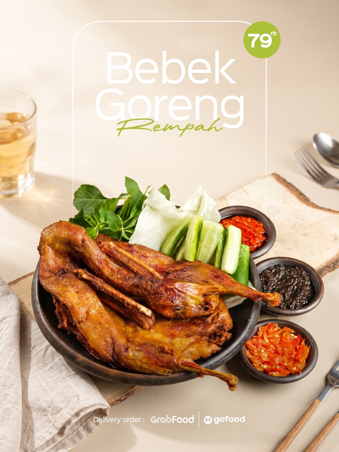
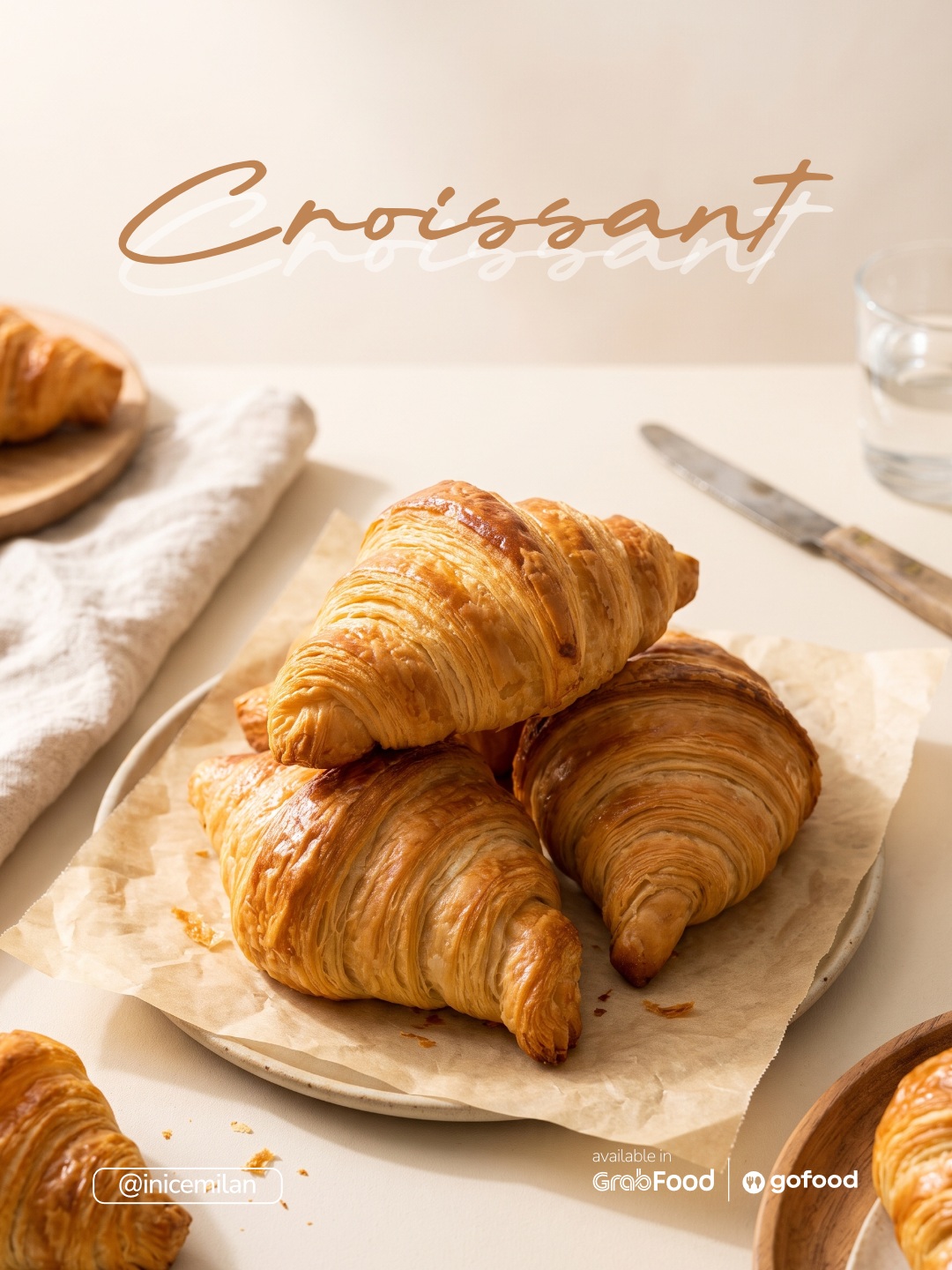
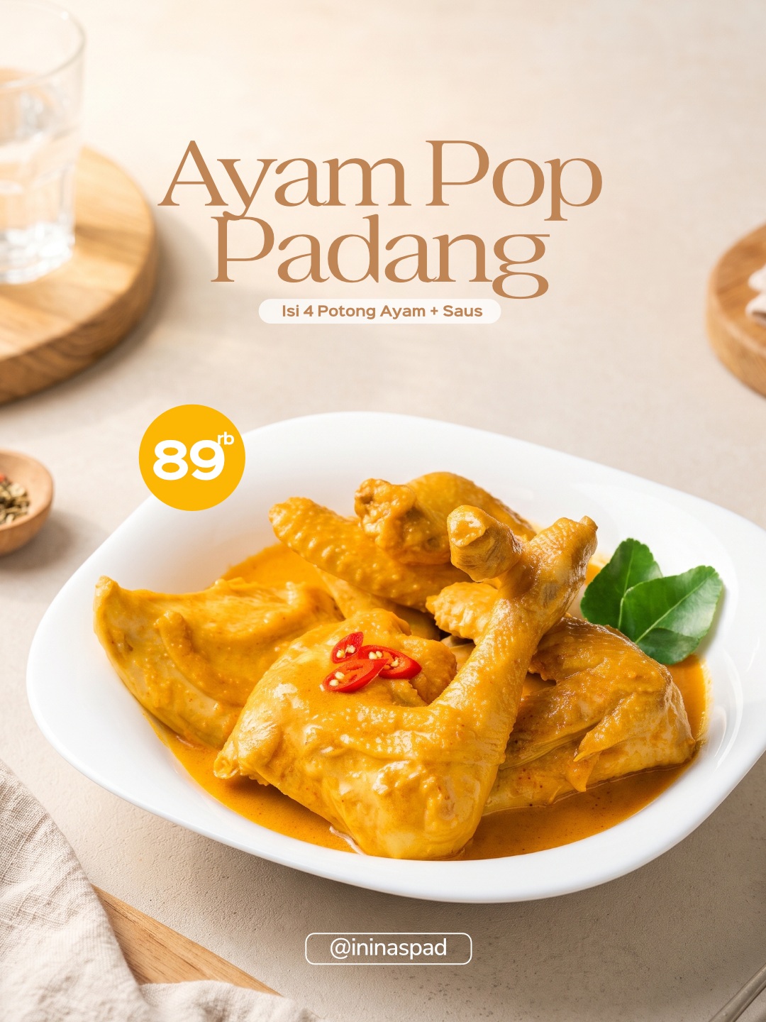
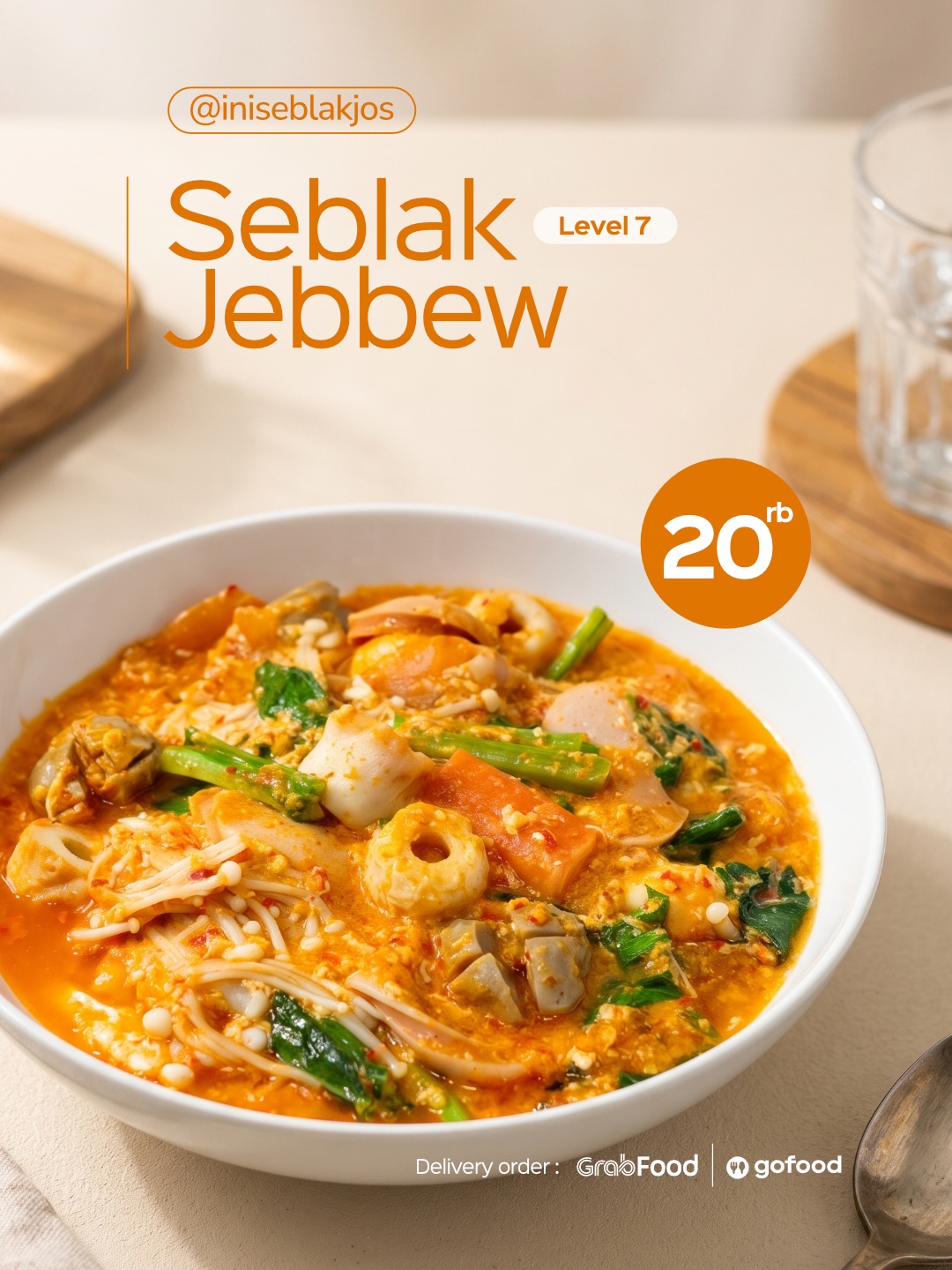
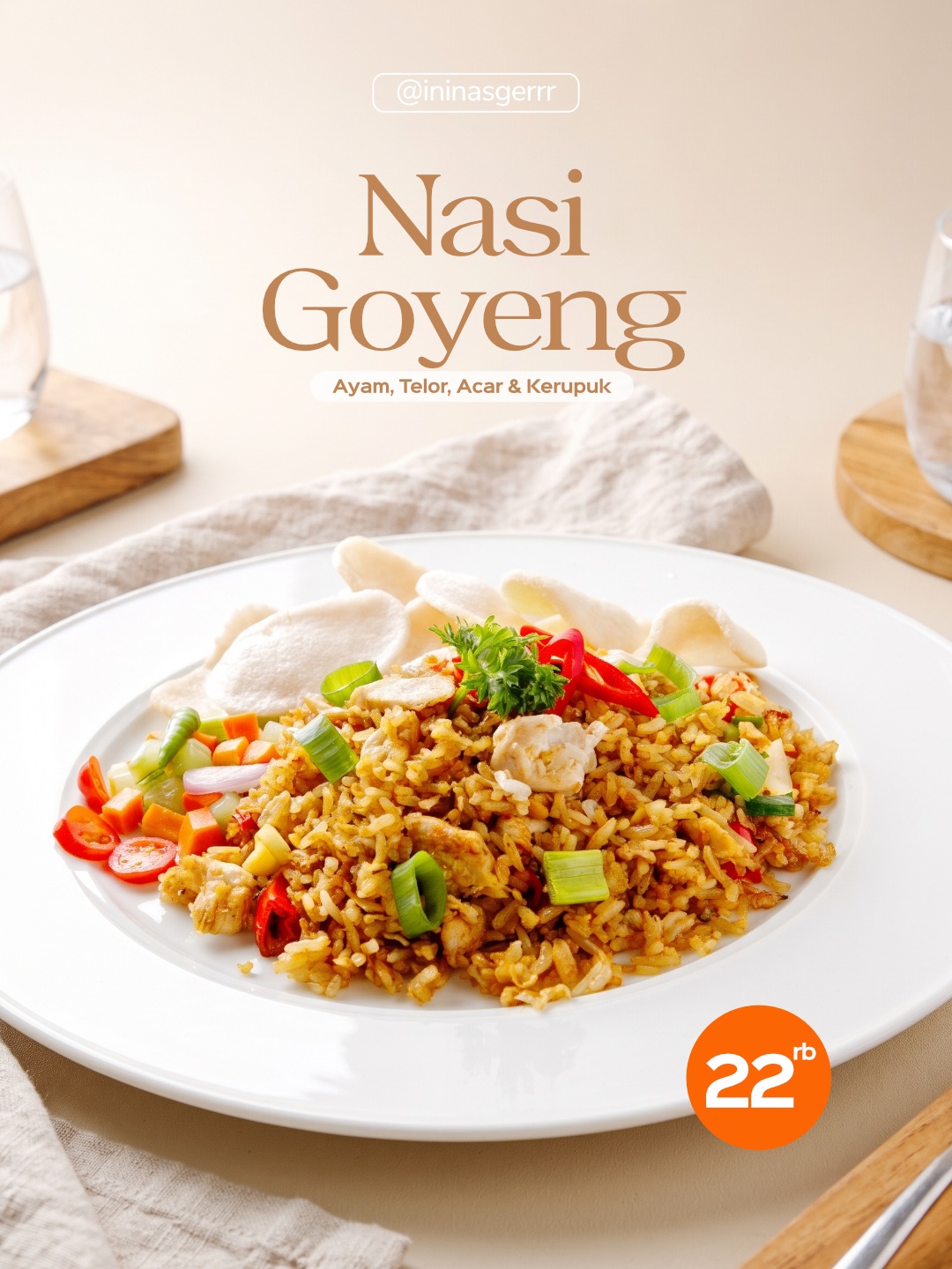
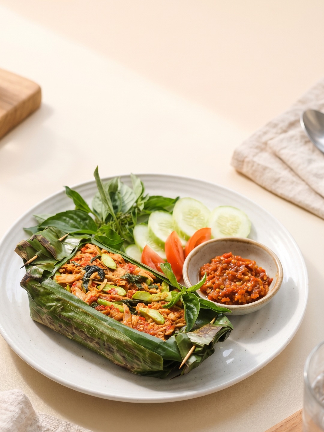
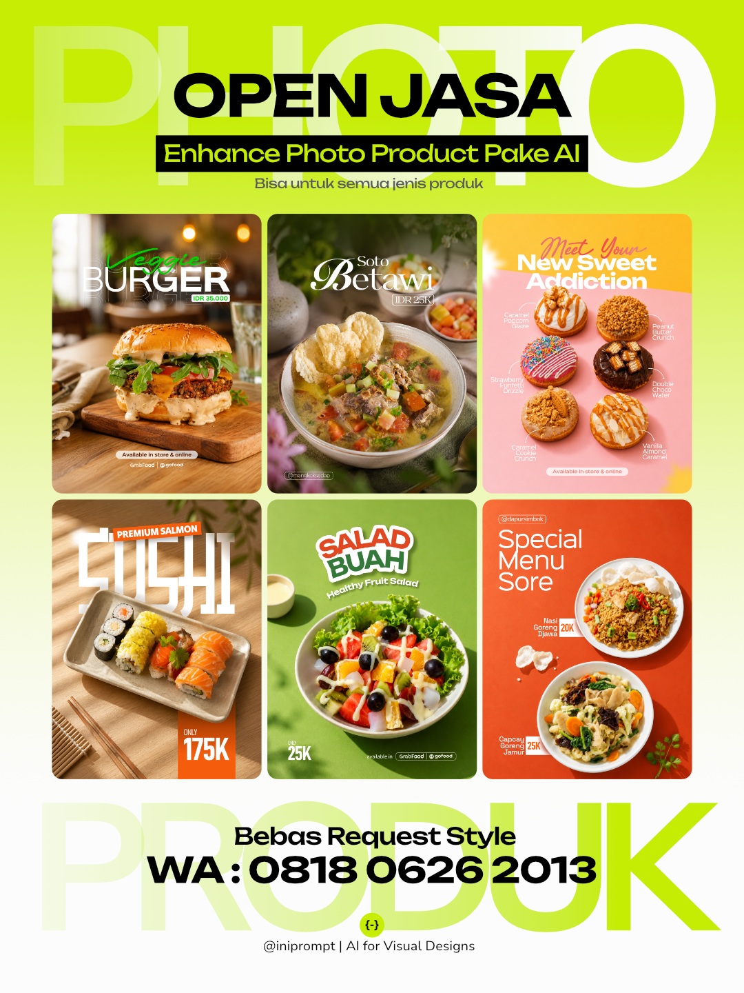
Prompt template
- Format
- Text
- Inputs
- Uploaded_food_photo (image) · Required Main_headline (text) · Required Product_name (text) · Required Brand_name (text) · Required Logo (image) · Optional Accent_phrase (text) · Optional Short_description (text) · Optional Price (text) · Optional Contact_order (text) · Optional
- Outputs
- Brunch_editorial_food_image (image)
SOFT BRUNCH EDITORIAL FEATURE
Warm Refined Lifestyle Photography

Aspect ratio: 3:4 vertical

TASK

Use the uploaded photo as the primary visual reference. Analyze the product’s real structure, ingredients or contents, texture, color, portion or volume, serving style, tableware or packaging, and distinctive visual characteristics, then transform it into a soft premium brunch photograph with warm daylight, elegant plating, and refined editorial typography.

PRODUCT PRESERVATION

Keep the uploaded product clearly recognizable as the same real product. Preserve its overall structure and silhouette, core ingredients or contents, toppings or layers if any, natural texture and color, realistic portion or volume, serving character, tableware or packaging identity, and distinctive visual details. You may improve the lighting, camera angle, composition, plating, serving pieces, and presentation, but do not redesign the product, replace key components, simplify it into a generic AI version, or alter its recognizable identity.

If the original plate, bowl, glass, tray, cup, wrapper, or serving vessel is unattractive, damaged, or poorly cropped, replace it only when necessary with a clean premium serving piece appropriate to the product.

SCENE AND PHOTOGRAPHY

Create a bright, warm brunch-style scene using a soft cream, warm white, pale peach, light beige, or gentle neutral tabletop and background. The overall environment should feel sunlit, calm, refined, and slightly luxurious without becoming overly formal.

Use soft directional morning or late-morning sunlight entering from one side, creating luminous highlights, delicate warm shadows, realistic texture, and natural color. Keep the product bright and appetizing with a fresh premium feel rather than a dark restaurant mood.

Optional supporting details may include a softly blurred glass, cup, linen edge, small cutlery element, or one restrained ingredient cue. Keep them minimal and allow one foreground element to blur gently near the frame edge when it improves depth.

Choose a slightly elevated three-quarter camera angle or a refined close editorial perspective that gives the product enough visual presence while still showing surrounding negative space.

COMPOSITION

Use a close but not cramped composition with the product occupying roughly 45–55% of the frame. Position it mainly in the lower-middle area, leaving a generous clean upper section for the main headline.

Allow the plate or serving vessel to feel substantial in frame while keeping its edges comfortably visible. Supporting objects may be partially cropped or softly blurred to create depth, but they should never compete with the hero product.

The final composition should feel warm, elegant, indulgent, bright, and editorial, like a premium brunch campaign or boutique cafe menu feature.

TEXT LAYOUT AND TYPOGRAPHY

EDIT THIS SECTION ONLY

MAIN HEADLINE:
[ MAIN HEADLINE ]

PRODUCT NAME:
[ PRODUCT NAME ]

BRAND NAME:
[ BRAND NAME ]

LOGO:
[ Upload Logo / Leave Empty ]

ACCENT PHRASE:
[ Optional / Leave Empty ]

SHORT DESCRIPTION:
[ Optional / Leave Empty ]

PRICE:
[ Optional / Leave Empty ]

CONTACT / ORDER:
[ Optional / Leave Empty ]

Use only the provided text: [ MAIN HEADLINE ], [ PRODUCT NAME ], [ BRAND NAME ] or uploaded logo, [ ACCENT PHRASE ], [ SHORT DESCRIPTION ], [ PRICE ], and [ CONTACT / ORDER ]. Omit empty optional fields and never invent additional copy.

Placement:

* BRAND NAME or logo: small, upper-left or upper-right
* MAIN HEADLINE: large editorial headline in the upper-center or upper-middle area
* ACCENT PHRASE: smaller expressive line above, below, or lightly overlapping the main headline
* PRODUCT NAME: medium emphasis near the headline or closer to the product
* SHORT DESCRIPTION: small supporting text in a calm open area
* PRICE: compact and slightly emphasized near the product information
* CONTACT / ORDER: very small near the bottom edge or lower corner

The headline may use layered lines, varied scale, and subtle overlap to create a sophisticated magazine-style composition. Keep all text readable and avoid covering important product details.

Typography:

* maximum two font families
* main headline in a high-contrast editorial serif with optional italic variation
* accent phrase may use a delicate handwritten, signature-style, or italic serif treatment
* supporting information in a clean lightweight sans serif
* allow strong scale contrast between headline and supporting copy
* typography may play a noticeable editorial role while the photographed product remains the visual hero

Use warm brown, deep cocoa, muted burgundy, soft black, warm charcoal, or another restrained dark tone over the bright background. Avoid pure harsh black when a softer tone fits better. Do not use outlines, glow, heavy drop shadows, stickers, badges, gradients, oversized promo graphics, or loud decorative effects.

AVOID

Avoid changing product identity, invented ingredients or layers, excessive garnish, cluttered brunch props, washed-out food colors, overly yellow or beige grading, harsh direct sunlight, dark moody exposure, fake bokeh, distorted tableware, unrealistic shadows, excessive foreground blur, obvious cutout edges, fake AI perfection, overly tight framing, and typography that overwhelms the product.
What you'll create
Create a premium brunch-style food photograph based on the uploaded product, preserving its distinctive appearance while refining the lighting, composition, and presentation. The bright, warm editorial scene leaves generous space above the product for restrained headline and brand typography
Generation settings
Usage instructions
Frequently asked questions
What should the reference photo control?
Use it to preserve the product’s structure, ingredients or contents, texture, color, portion, serving style, and distinctive details
Can I make the image without text?
The prompt says to use only supplied text and omit empty optional fields. Leave optional text fields empty for a less text-heavy layout


Comments
Tried this prompt? Share what you made, compare results, or ask a question