Photo-to-Travel-Stamp Memory Poster
Create a separate 4:3 editorial poster for each uploaded photo, pairing the original photograph with a hand-crafted vintage travel stamp that distills its personal memory.
Example outputs
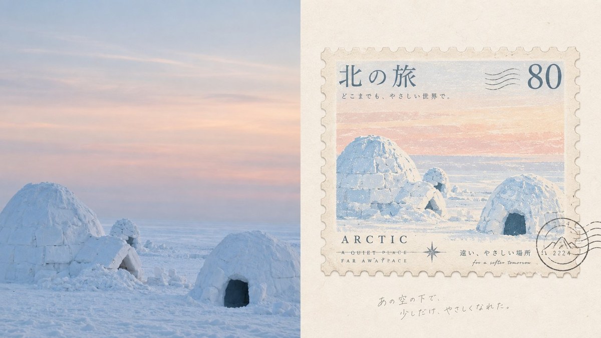
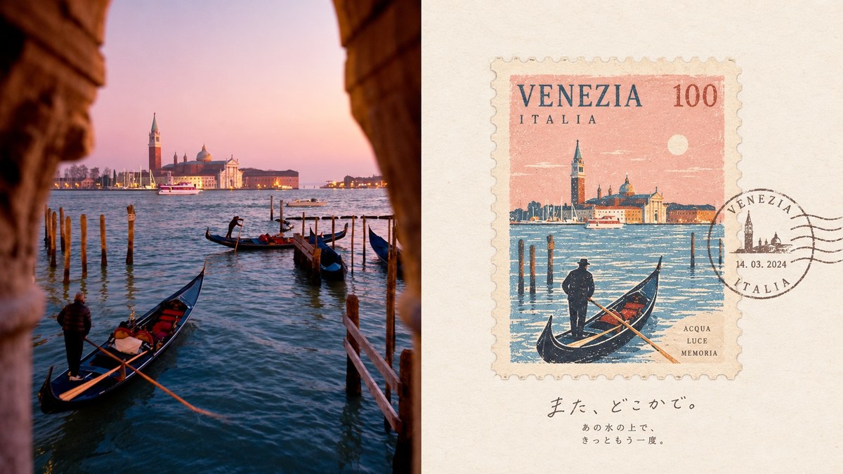
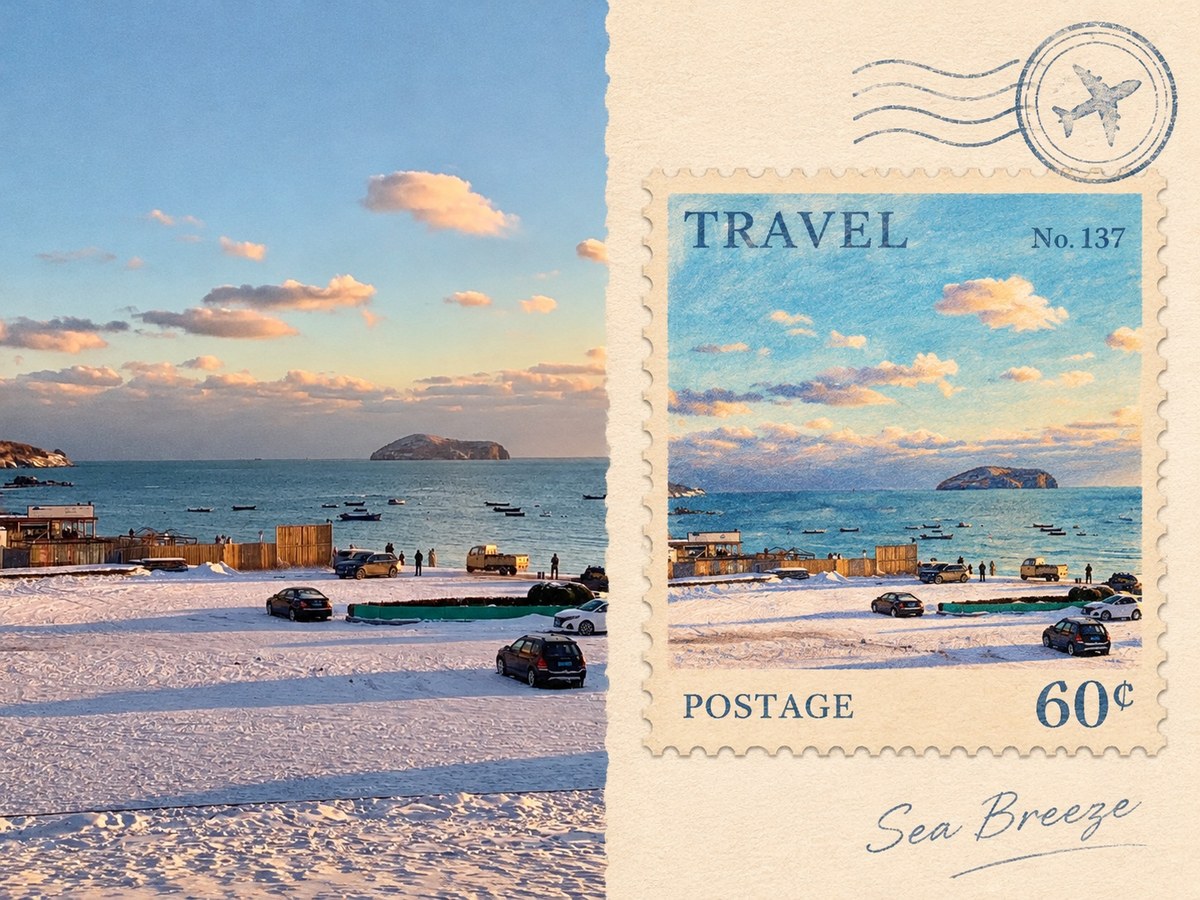
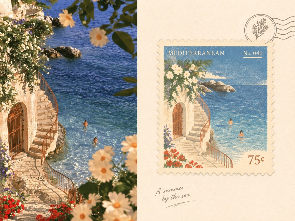
Prompt template
- Format
- Text
- Inputs
- Photo (image) · Required
- Outputs
- PhotoMemoryPoster (image)
For each photo I upload, create a separate, premium minimalist design poster. Do not combine multiple photos into one collage; output each photo separately. Use a landscape 4:3 composition divided into two equal-height areas, with the left and right areas each occupying exactly 50% of the image.

On the left, preserve the original photo, maintaining the subject’s structure, realistic texture, natural lighting, and original color atmosphere. Apply only subtle, refined color grading to give it the exhibition quality of art photography and an independent publication. To fit the format, you may naturally extend the sky, ground, or environmental background, but do not stretch, distort, or alter the subject.

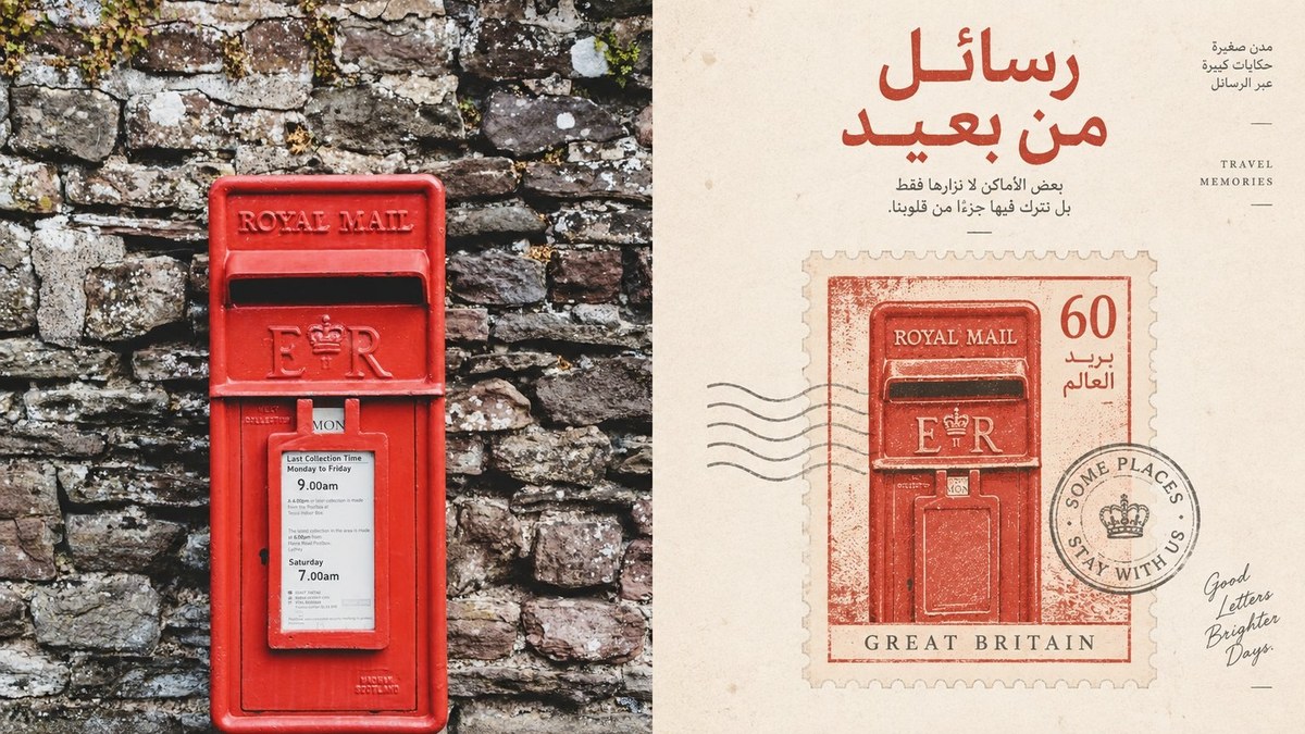
On the right, do not reproduce the entire photo or retain every object. Extract only its most recognizable subject, outline, structure, pose, and narrative relationship. Rework these in light of the original image’s meaning, mood, symbolism, cultural associations, and psychological tension. Transform the real scene into a collectible travel souvenir stamp, elevating an ordinary moment into a cultural memory worth preserving. The stamp is not a decorative border: it is the creative core of the whole composition and a “memory container” holding a sense of place, time, distance, and private memory.

Use the visual logic of Vintage Travel Stamp / Vintage Ephemera Illustration / Travel Journal Illustration. Treat the stamp as a miniature vessel for preserving a private memory of the original image. Whether the subject is a person, building, animal, plant, food, object, or natural landscape, remove most nonessential information. Keep only the visual anchors that make the subject recognizable, then reorganize them using simplified outlines, symbolic forms, hand-drawn lines, limited areas of color, and a few supporting details. Create a transformation from “real object → cultural symbol → private memory.” Do not depict every detail or aim to reproduce the complete scene; retain only what is most worth remembering.

Emphasize the relationship between the small collectible object and abundant negative space. Use intentional negative space and Gestalt-style reduction so that the stamp is the only clearly defined visual focal point, with the surrounding space deliberately pared back. The stamp may be centered, off-center, close to an edge, or partially cropped; arrange it freely according to the subject’s direction, proportions, and mood, while maintaining clear hierarchy, visual breathing room, and editorial balance. Treat the negative space not as emptiness, but as air, distance, time, remoteness, and room for imagination.

Use a gentle handmade material quality: hand-drawn illustration, colored pencil texture, wax crayon marks, paper grain, and screen-print imperfections. Retain slight wobbles in the lines, uneven coloring, minor color spill, paper fibers, and the print texture of aged paper. Make the image feel like a page in a travel journal, an old stamp from somewhere, or a privately treasured collectible—not a smooth digital illustration.

Rework the colors with the most emotionally meaningful and recognizable hues from the photo, rather than copying its palette evenly. Use a warm, soft, nostalgic but not antiquated limited palette—for example, cream, warm beige, mist blue, botanical green, brick orange, coral red, and soft yellow. Keep the colors welcoming, quiet, full of everyday warmth, and collectible in character. Avoid muddy gray, gloomy tones, excessive aging, cheap candy colors, and chaotic color variety.

Introduce only a small amount of text. Based on the photo’s subject, place, mood, cultural meaning, or personal memory, freely generate a short title, stamp text, handwritten note, or tiny marking. Use small, elegant lettering with a slightly handmade or vintage-printed quality, so the text feels like authentic information on a stamp or a natural note in a travel journal—not a rigid title system added afterward.

Overall, combine Vintage Travel Stamp Illustration × Editorial Illustration × Folk Memory Artifact for a nostalgic, warm, poetic, restrained, collectible result with a sense of private memory. The goal is not to turn the photo into an illustration, but to distill an ordinary photo into a beautiful moment that can stand on its own. Even if the source photo is not especially polished, use reduction, negative space, and reworking to transform it into a visual keepsake worth preserving.

Avoid reproducing the complete scene, information overload, generic illustration, commercial postcard templates, complex backgrounds, excessive decoration, a cartoonish look, a cheap souvenir aesthetic, and an obvious digital-generation look.
What you'll create
The original photo remains on the left while a minimalist stamp reinterpretation occupies the right. Subtle grading, restrained source colors and short memory-oriented text create a sophisticated 4:3 keepsake composition.
Usage instructions
Provide the photograph or photographs you want transformed. Each is handled separately, with the original on the left and a distilled stamp illustration on the right. To change the character of the keepsake, adjust the source-color palette or the brief text generated from the photo’s place, mood, or personal meaning.
Frequently asked questions
Should the stamp reproduce every detail?
No; it distills selected features instead of copying the complete scene.





Comments
Tried this prompt? Share what you made, compare results, or ask a question