- Category
- Design & Image
Minimal Editorial Poster from a Photo
Turn each uploaded photo into its own refined, handmade editorial poster with a restrained palette, generous negative space, and a two-part vertical layout.
By Threads — Published on
Example images


Prompt template
- Format
- Text
- Inputs
- uploaded_photos (image) · Required
- Outputs
- editorial_posters (image)
Create one independent, high-end editorial poster for each uploaded photo. Do not combine multiple photos into a collage. Process each photo and output it as a separate poster.

OVERALL FORMAT

Use a strict 3:4 vertical composition. Divide the canvas horizontally into two exactly equal sections, with a precise 1:1 height ratio. The top half must occupy exactly 50% of the canvas, and the bottom half must occupy exactly 50%. Make the two sections feel visually connected as one refined art-publication cover.

Use delicate, slightly imperfect hand-drawn lines; a small number of bold, clearly defined acrylic-style flat-color shapes; rough paper texture; visible handmade brush marks; slightly irregular, organic edges; and subtle imperfections that make the result feel genuinely handmade.

Make the main illustrated subject small, centered, and carefully composed, occupying approximately 10–20% of the bottom half. Leave a large amount of negative space around the illustration.

Use a background that primarily resembles rough white paper, warm off-white paper, pale natural paper, or minimal editorial book-cover stock. Use only a few lines or small color shapes to suggest the surrounding environment.

COLOR PALETTE

Extract the dominant colors directly from the original photograph. Compress the palette into no more than four main colors. Keep the colors restrained, sophisticated, and harmonious. Use bold but controlled flat-color blocks, and avoid excessive color variation. Preserve subtle paper grain and handmade brush texture. Make the illustration feel like a simplified color interpretation of the photograph.

TYPOGRAPHY

A small amount of simple typography may be included when appropriate, such as a short title, keyword, object name, location, year, number, or short phrase. Keep text minimal, understated, and editorial. Let the typography interact naturally with the large areas of negative space and the small illustration, evoking art-book covers, independent publishing, contemporary editorial design, or thoughtful children’s picture books. Do not force text into the composition if it does not naturally fit the photograph.

VISUAL LANGUAGE

The final poster should feel quiet, poetic, refined, minimal, innocent, relaxed, artistic, thoughtful, high-recognition, and premium.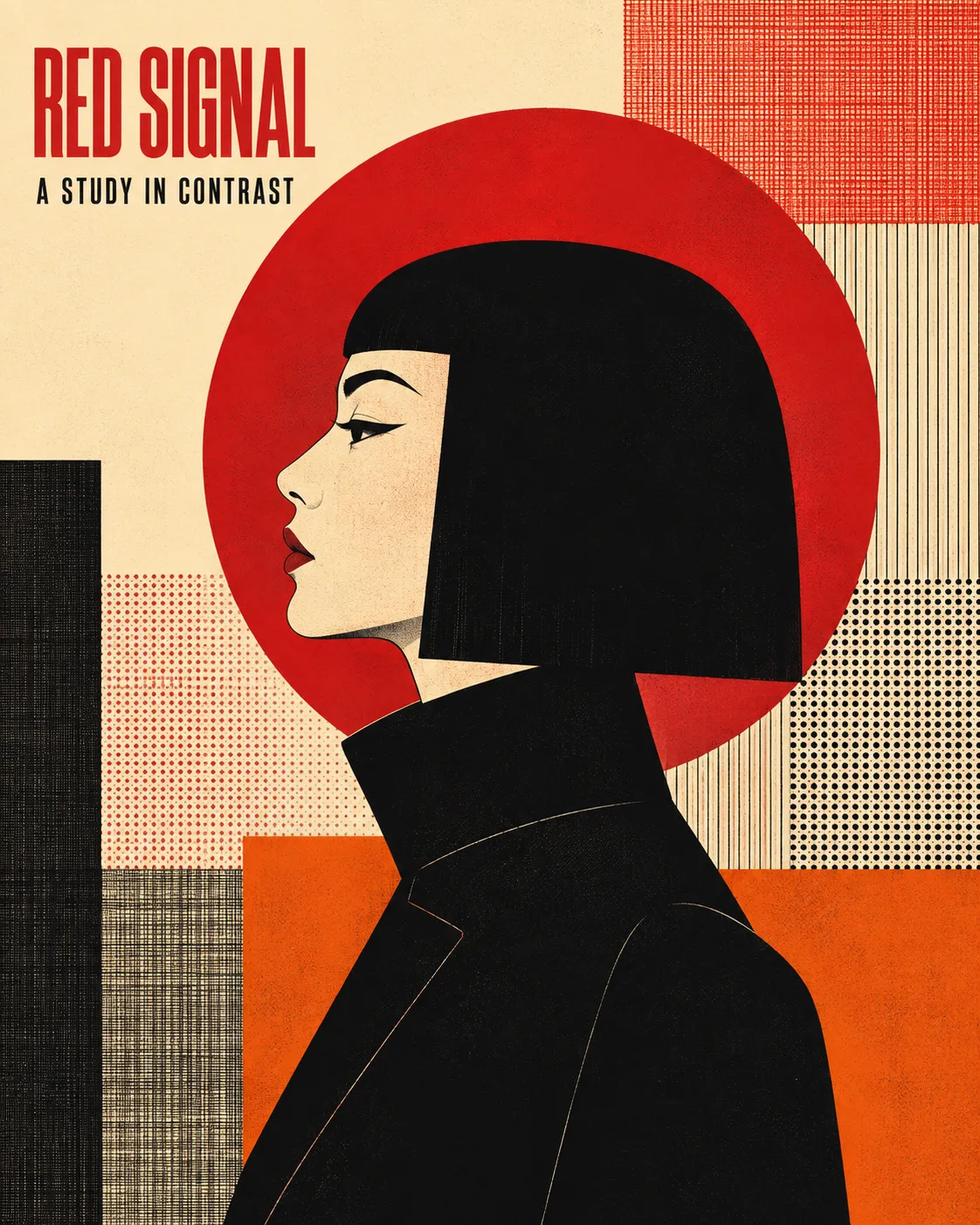


Comments — 0