Vintage Travel Stamp Photo Poster
Turn each uploaded photo into a standalone 3:4 poster pairing the original image with a handcrafted, vintage-inspired travel stamp illustration. The layout, negative space, palette, and stamp details are shaped around each photo’s subject and mood
Example outputs
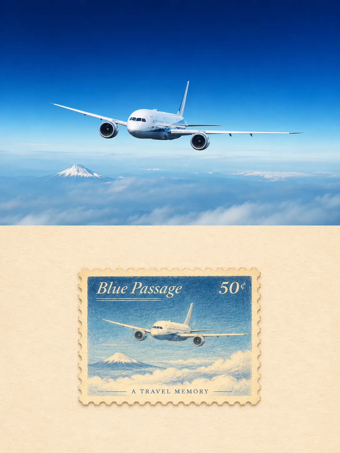
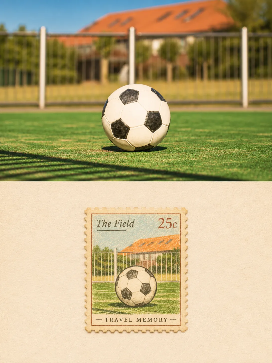
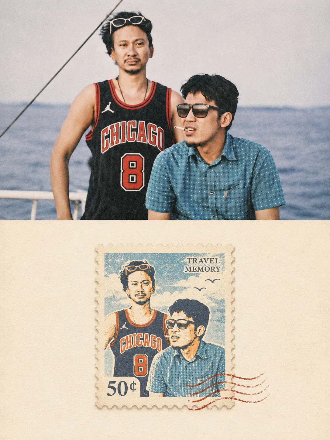
Prompt template
- Format
- Text
- Inputs
- Uploaded_photo (image) · Required
- Outputs
- Individual_photo_posters (image)
Transform each uploaded photograph into an individual, high-end, minimalist-designed poster. Present each photo as a standalone piece; do not create collages. Use a 3:4 vertical format, with the upper and lower sections occupying exactly 50% of the frame each, in a 1:1 height ratio.

Arrange the stamp freely—centrally, off-center, flush against an edge, or cropped—according to the subject’s orientation, proportions, and mood. Maintain a clear hierarchy, visual breathing room, and editorial balance. Treat negative space as more than empty area: let it suggest air, distance, time, the horizon, and room for the imagination.

Do not trace every detail or recreate the entire scene. Keep only what is most worth remembering. Emphasize the relationship between a small, collectible-like element and expansive negative space. Use a Gestalt-inspired reduction so the stamp becomes the composition’s distinct visual focal point, with the remaining space intentionally left empty.

Give the imagery a gentle, handcrafted quality rather than a sterile, polished digital-illustration look. Retain slight tremors in the lines, uneven coloring, occasional color spill, paper-fiber texture, and the character of vintage printed matter. Incorporate hand-drawn illustration, colored-pencil textures, wax-crayon marks, visible paper grain, and subtle screen-print imperfections, evoking a travel-journal page, an old postage stamp, or a cherished personal keepsake.

Whether the photograph shows a person, building, animal, plant, food, object, or natural landscape, strip away nonessential information. Retain only the key visual anchors needed for identification, then reorganize them with simplified outlines, stylized forms, hand-drawn lines, a limited palette, and minimal supporting details. Transform the real-world subject into a cultural symbol and personal memory.

In the upper section, retain the original photograph’s core structure, authentic texture, natural lighting, and original color atmosphere. Apply only subtle, sophisticated color grading that evokes fine-art photography or an independent publication. To fit the aspect ratio, naturally extend the sky, ground, or surrounding environment if needed, without distorting or altering the main subject.

In the lower section, do not simply reproduce the photograph or its full contents. Extract only the most recognizable elements—the subject, silhouette, structure, pose, or narrative core—and reconstruct them by distilling the original’s meaning, mood, symbolism, cultural associations, and psychological tension. Transform the scene into a collectible travel-themed postage stamp that preserves an ordinary moment as a cultural memory.

Derive the palette from the source photograph, selecting hues for their emotional resonance and distinctive character rather than merely copying the original colors. Aim for a warm, soft, vintage-inspired yet timeless palette, with natural, harmonious tones such as creamy white, warm beige, misty blue, botanical green, brick orange, coral red, and muted yellow. Keep the colors inviting and tranquil, with the warmth of lived experience and the appeal of a collectible. Avoid muddy or dull colors, excessive aging, garish candy colors, and chaotic color combinations.

Use text sparingly. Generate short titles, stamp-related lettering, handwritten annotations, or tiny markers based on the subject, location, mood, cultural context, or personal memories associated with the photograph. Make the typography delicate and elegant, with a subtle handcrafted or vintage-printed quality, as though it were authentic information on a stamp or a spontaneous travel-journal note—not an artificial titling system superimposed on the image.

Treat the stamp as the creative heart of the composition: a vessel of memory that encapsulates a particular place, time, distance, and personal experience. Use the visual language of vintage travel stamps, ephemera, or travel-journal illustrations, and let the stamp’s miniature format seal away a memory connected to the original photograph.

Draw on vintage travel-stamp illustrations, editorial art, and folk-memory artifacts to create a nostalgic, warm, poetic, and restrained visual language, like a precious collectible or personal memento. Do not merely redraw the photograph as an illustration; distill a beautiful, self-contained moment from an ordinary image. Use composition, negative space, and restructuring to make even an unremarkable photograph feel like a visual keepsake worthy of preservation.

Avoid full-scene replication, cluttered information, generic illustrations, commercial postcard templates, complex backgrounds, excessive ornamentation, cartoonish styling, a cheap merchandise-like appearance, and an obviously digitally generated look
What you'll create
Create an individual vertical poster from each uploaded photograph, keeping the photo in the upper half and transforming its recognizable elements into a collectible travel stamp in the lower half. The design combines spacious editorial composition, warm source-derived colors, delicate lettering, and handcrafted vintage-print textures
Usage instructions
Frequently asked questions
Should the stamp reproduce the entire photograph?
No. It should distill the most recognizable elements and the photograph’s mood or meaning into a simplified, self-contained keepsake
Can the stamp sit anywhere in the lower section?
Yes. Its placement may be central, off-center, edge-aligned, or cropped, depending on the subject’s orientation, proportions, and mood


Comments
Tried this prompt? Share what you made, compare results, or ask a question