Photo-to-Crayon Split Editorial Poster
Turn each reference photo into a standalone vertical poster, pairing a lightly refined photograph with a sparse, expressive pastel-crayon reinterpretation.
Example outputs
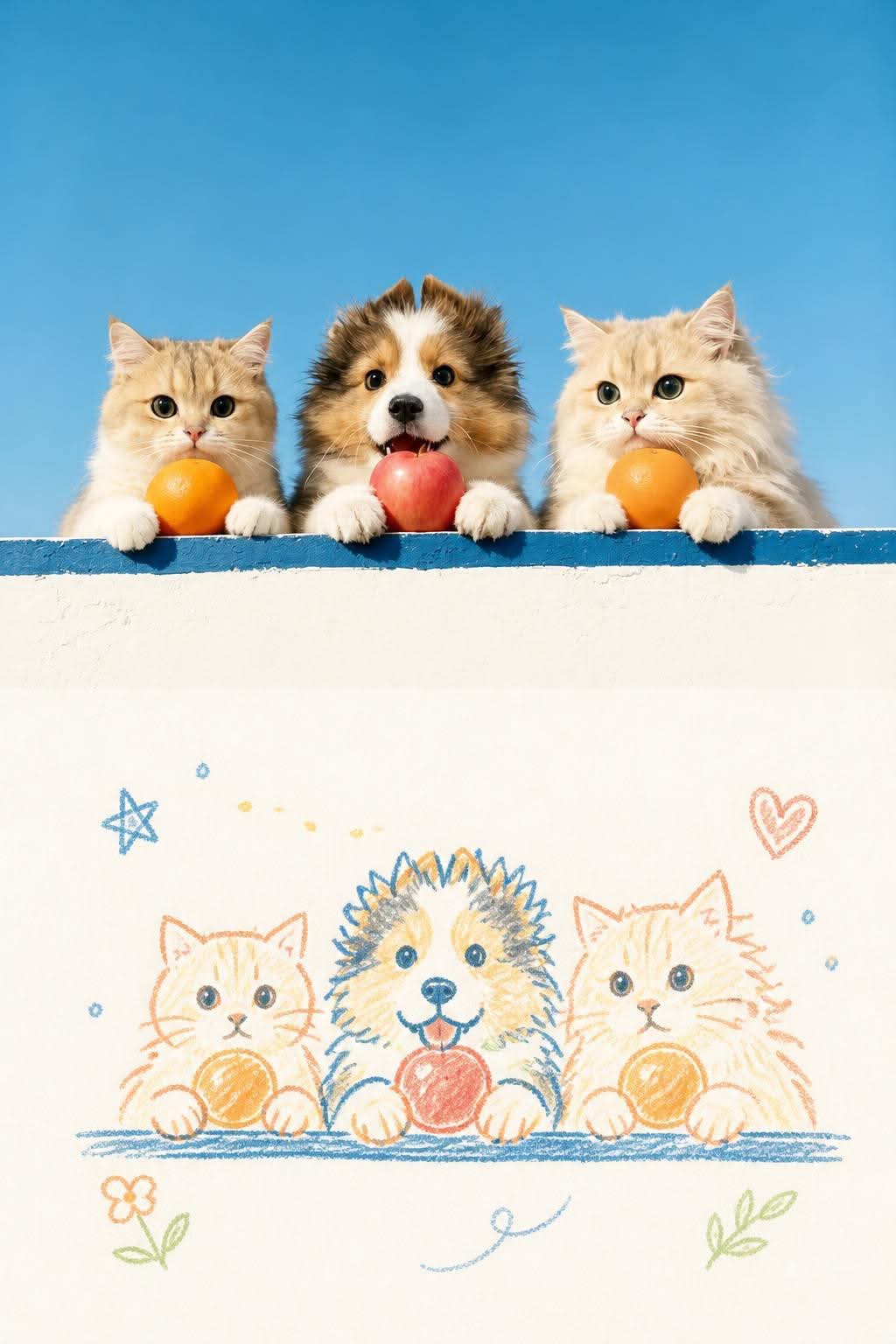
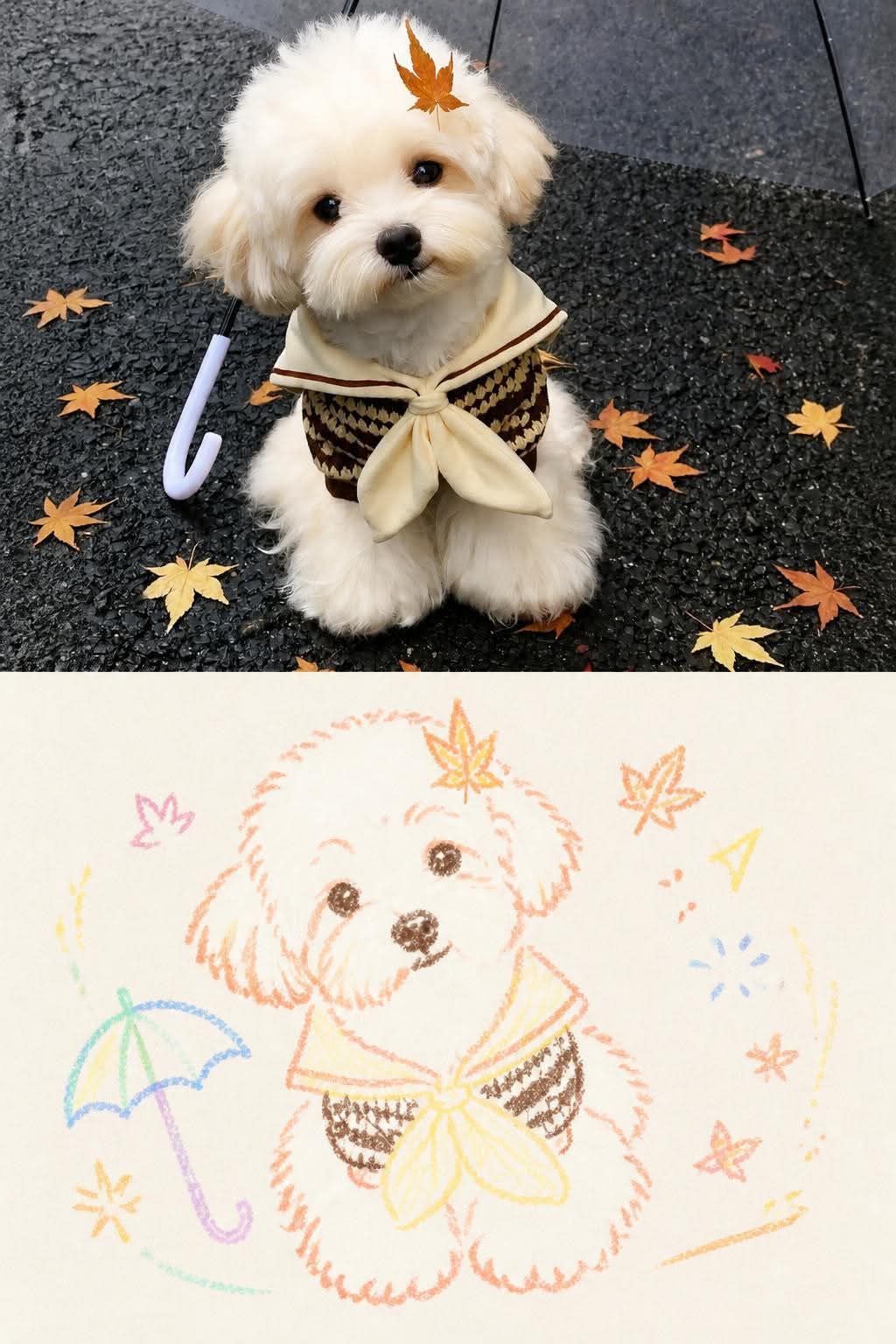
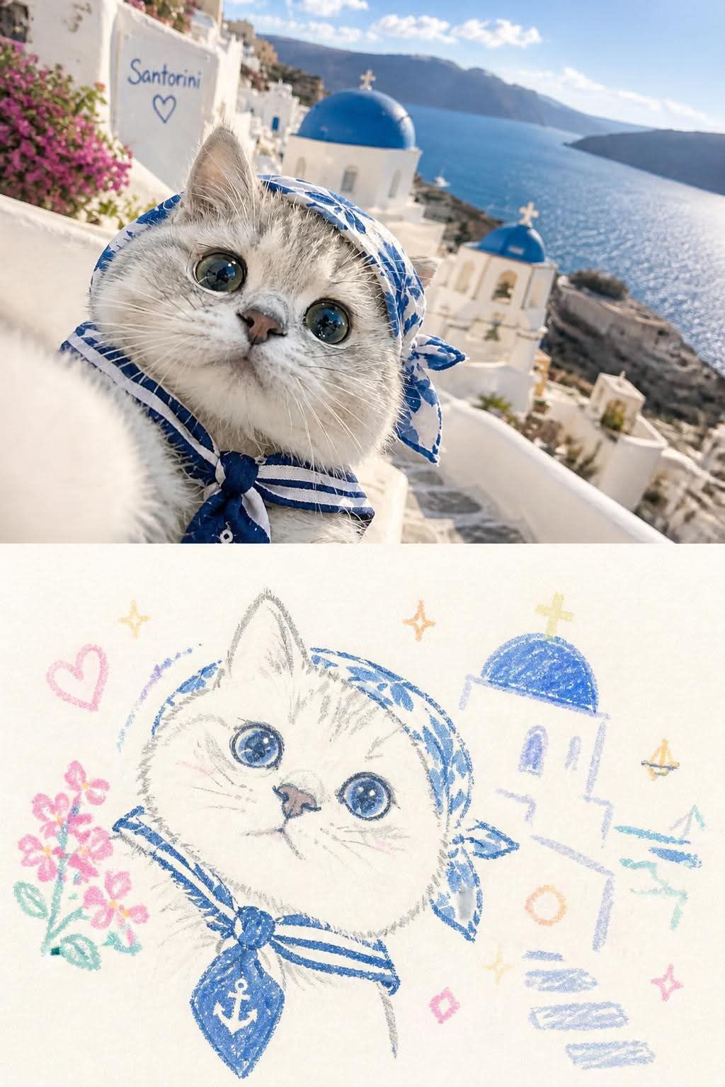
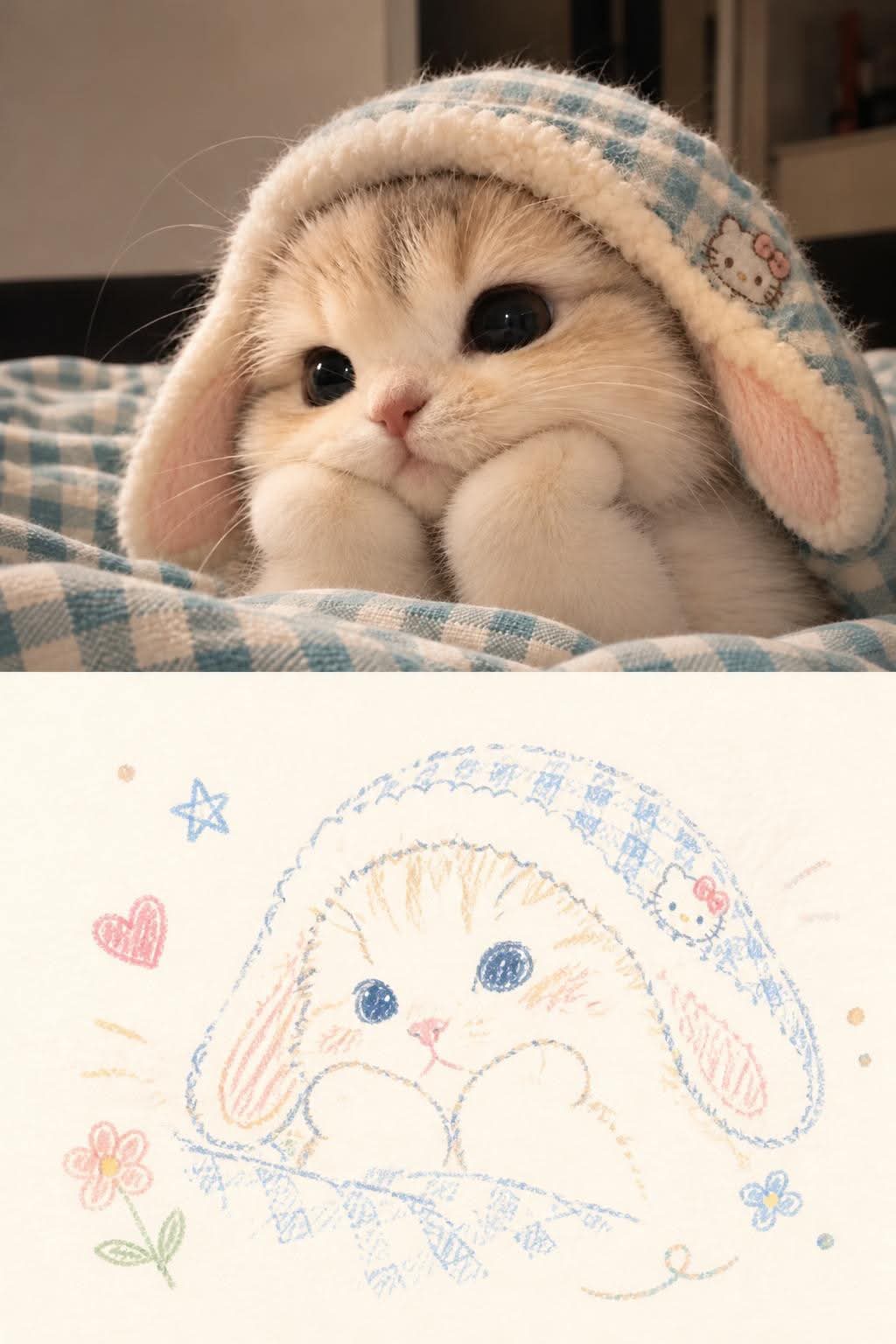
Prompt template
- Format
- Text
- Inputs
- Reference_photo (image) · Required
- Outputs
- Split_photo_and_illustration_poster (image)
Create one separate, sophisticated design poster for each uploaded photo. Do not combine multiple photos into a collage; output one poster per photo. Use a vertical 3:4 composition divided into two equal-height sections, with each section occupying exactly 50% of the image.

In the upper section, preserve the original photograph, including the subject’s identity, structure, pose, realistic texture, natural lighting, and original color atmosphere. Apply only subtle, refined color grading to give it the feel of an art magazine, independent publication, or exhibition image. You may naturally extend the environmental background to fit the frame, but do not stretch, distort, or alter the subject.

In the lower section, first identify the original photo’s most memorable core theme, relationships between subjects, structural lines, mood, and visual metaphors. Then reinterpret them as a pastel-crayon doodle illustration on textured paper with a retro feel. Do not copy every object or fully redraw all the photo’s contents. Retain only the contours, pose, direction, and visual cues that best represent the original, so the connection to the photograph above is immediately apparent. Use omission, simplification, slight exaggeration, and rearrangement to create the reinterpretation.

Draw the main subject with a coarse, grainy, chalk- or crayon-like hand-drawn outline. Make the lines somewhat thick, loose, and dry, with powdery grain, intermittent fading, slight wobble, and edges that do not always close completely; use naturally blunt, rounded line endings. Add a few pastel color patches, simple grids, stripes, dots, and casual strokes inside the subject. Create visual depth through partial color layering, crossing lines, and variations in density. Suggest the structure with minimal information; do not create realistic volume or complete detail.

Draw surrounding small elements in the same line style, but simplify each into a doodle symbol recognizable in one or a few strokes. Choose stars, flowers, plants, objects, environmental cues, or abstract symbols to suit the original photo’s theme. You may add curves, motion trails, clusters of dots, and traces of color so the elements extend, intersect, and echo one another naturally. Keep them simple, naive, open, and partly unfinished, favoring single-line outlines with very little fill. Do not make them look like polished icons, stickers, or standalone mini-illustrations.

Compose the lower section like a small-scale seal surrounded by generous blank space. Arrange the subject according to its direction, proportions, and visual center of gravity; it may be off-center, near an edge, suspended, or partly cropped. Let the subject and a modest number of doodle symbols form a loose but legible visual cluster. Build rhythm through contrasts in scale, changes in density, partial overlaps, and asymmetry. Leave the remaining space deliberately empty. Avoid evenly distributing or mechanically piling up elements. Treat negative space as a major compositional element, using contrasts between empty and filled areas, clusters and open space to create breathing room, distance, and pauses. Keep the result simple but not sparse to the point of feeling empty.

Use an extremely light, bright, clean paper-colored background, such as cream white, ivory, light warm white, pale apricot white, very light gray-white, or a near-white paper color selected to harmonize with the original photo’s overall color temperature. Keep paper fibers and grain extremely subtle; a few natural pastel rub marks are acceptable. Do not let the background appear brown, yellow, gray, or aged. Its brightness must be clearly higher than that of the subject’s lines and color patches, so all crayon outlines, small symbols, and any text remain legible rather than blending into the background.

Extract 2–4 of the most vivid, appealing colors that best express the photo’s spirit, and reinterpret them as bright, soft pastel-crayon colors. Colors may include light, airy peach pink, apricot orange, creamy yellow, mint, sky blue, or pale violet. Prefer clearer coral pink, soft blue, teal green, warm orange, or pale violet for the subject’s outlines, with a main color, supporting colors, and a small amount of contrast color to create layers. Allow local color layering, shifts in shade, and uneven strokes. Avoid an overly monochromatic palette or large areas of uniform fill.

If multiple photos are uploaded, analyze and design each one independently while keeping the overall style consistent. Vary the subject’s placement, the combination of doodles, the direction of the lines, and the palette for each photo; do not repeatedly apply the same composition.

The overall design should combine art photography with handmade crayon illustration: detailed, light in color, distinctly hand-drawn, clean, relaxed, and full of breathing room. Avoid excessive decoration, realistic tracing, vector-like lines, heavy paper texture, dark backgrounds, garbled text, watermarks, and any title or signature that was not requested.
What you'll create
The upper image remains realistic while the lower half distills its subject into relaxed drawn forms. Airy color and abundant space create a clean art-publication layout.
Frequently asked questions
Is realistic tracing the goal?
No. The illustration should reinterpret rather than trace.
Are dark heavy paper effects wanted?
No. The brief favors light color and restrained texture.


Comments
Tried this prompt? Share what you made, compare results, or ask a question