Photo and Silhouette Editorial Poster
Turn each uploaded photo into a separate 3:4 editorial poster, pairing a lightly color-graded photograph with a rough black-on-white silhouette illustration and minimal English text.
Example outputs
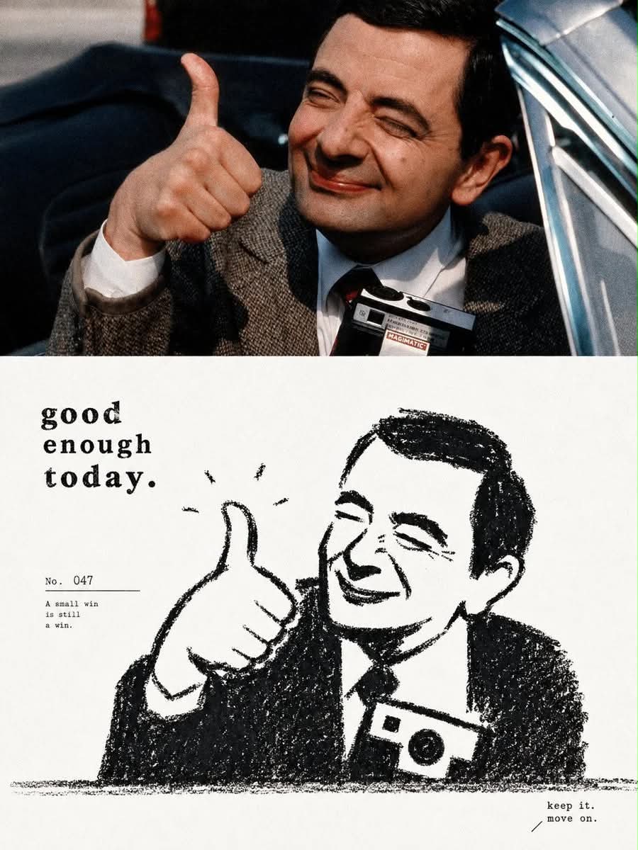
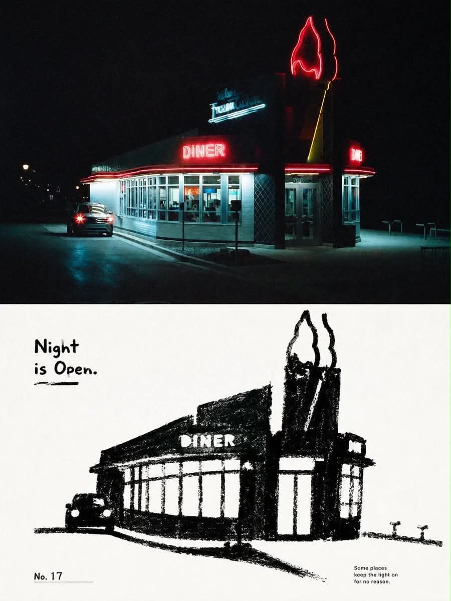
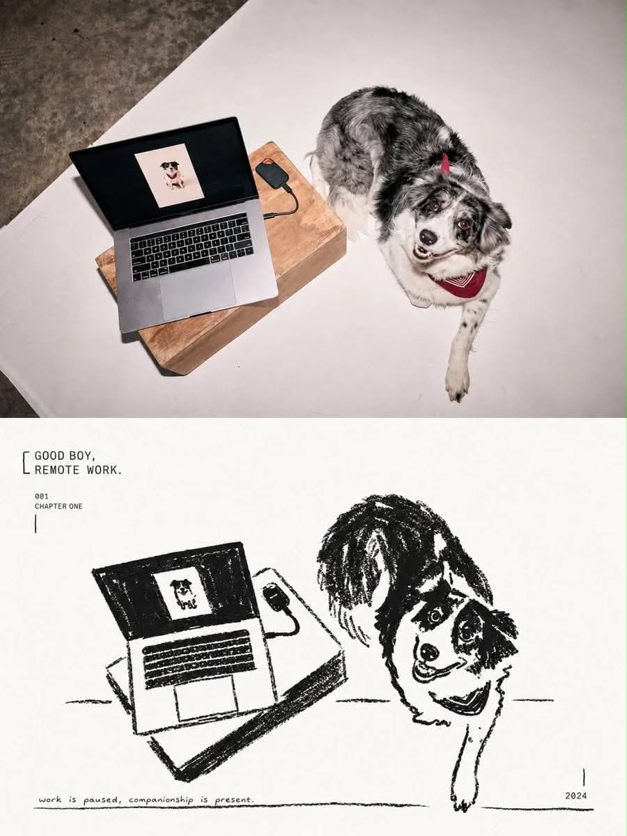
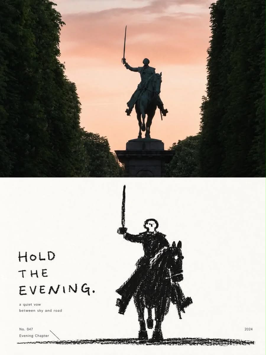
Prompt template
- Format
- Text
- Inputs
- Photo (image) · Required
- Outputs
- EditorialPhotoPoster (image)
Make each uploaded photo into an independent high-end design poster. Do not splice multiple photos together; output each photo separately. Use a vertical 3:4 layout divided into equal upper and lower halves, each occupying 50% of the image.

In the upper half, retain the original photo, preserving the subject's identity, structure, posture, realistic texture, natural light and shadow, and original color atmosphere. Apply only subtle, refined photographic color grading with the feel of art magazines, independent publications, and exhibition photography. The sky, ground, or environmental background may be extended naturally to fit the frame, but do not stretch, distort, or alter the subject.

In the lower half, extract the photo's most identifiable subject, outline, posture, and narrative relationship, then reconstruct them as a minimalist illustration using thick black dry-media marks. Do not mechanically trace photographic details. Compress the subject into a rounded, thick, slightly naive general shape. You may enlarge the head, main outline, or most memorable feature enough that the original subject remains immediately recognizable with very little information. If the photo contains multiple subjects, preserve their most important interaction and treat them as one visual unit rather than distributing attention equally.

Use only an almost pure white paper background and thick black crayon, charcoal, or dry-erase marks in the lower half. Do not use color or grayscale gradients. Build the black forms from repeated, forceful short strokes rather than smooth, solid vector shapes. Retain paper grain, broken marks, indentations, rough edges, uneven coverage, and occasional exposed white areas. Keep outlines slightly shaky, incomplete, and imprecise for an authentic handmade feel.

Emphasize the subject's most important identifying features with white cutouts in the black silhouette, such as the face, area around the eyes, window openings, utensil openings, animal faces, core structures of objects, or other highly recognizable parts. Add expressions and details with very few black spots, short lines, or symbols. Do not aim for realistic facial features or precise structures; use direct, interesting black-and-white relationships that make the subject recognizable.

Use generous pure-white negative space and one main visual relationship. The subject may float in the center, sit slightly off-center, be partially cropped, or be placed near the bottom of the image. Indicate space with only a rough ground-friction line, a few short strokes, or very sparse environmental symbols. Reduce grass, rain, smoke, tabletops, shadows, roads, wind, and other environmental details to minimal crayon marks, keeping the background quiet and empty. Avoid complex scenes; let one gesture, action, distance, or relationship carry the narrative.

Include a small amount of refined editorial text in a restrained, small-scale system that retains a children's-book quality. Do not merely name the place or object. Derive a short English title from the photo's emotions, actions, relationships, time, or small story, then pair it with a number, a suitable aphorism, a chapter number, or very short understated copy. The text may use restrained small print or a minimal amount of awkward handwriting, crayon writing, or imperfect letterforms so it feels part of the illustration.

Relate the text cleverly to the graphics: it may sit near the ground line, extend along the subject's direction of movement, appear in a large blank area, be slightly obscured by the outline, fit into a negative space between two subjects, or connect a number to the subject with a thin line. Keep to a short title plus one or two sets of minimal supporting text, making the text part of the composition's rhythm rather than a conventional poster headline.

The overall design should combine thick black, pure white, simple forms, and rough texture, balancing childlike qualities, gentleness, quietness, humor, and loneliness. Aim for the feeling of an old black-and-white children's book re-edited by a senior design studio. Avoid smooth digital strokes, precise line drawings, realistic light and shadow in the illustration, thick paint, 3D effects, color, large areas of gray rendering, cartoon stickers, and templated business illustrations.
What you'll create
A vertical poster gives equal space to the source photograph above and a handmade silhouette below. Thick broken crayon or charcoal marks, white cutouts and sparse editorial text reduce the subject’s gesture or relationship to a quiet graphic story.
Usage instructions
Provide the photo to be transformed; each photo is handled as a separate poster. The layout preserves the photo above and reinterprets its subject as a rough silhouette below. For photos with multiple subjects, emphasize their most important interaction as a single visual unit.
Frequently asked questions
Are multiple uploaded photos combined?
No. The source explicitly requests a separate poster for each photograph.
Can the lower illustration use gray shading?
No. It is limited to black dry-media marks and nearly pure white paper, without gradients or gray rendering.




Comments
Tried this prompt? Share what you made, compare results, or ask a question