Split Photo and Storybook Woodcut Poster
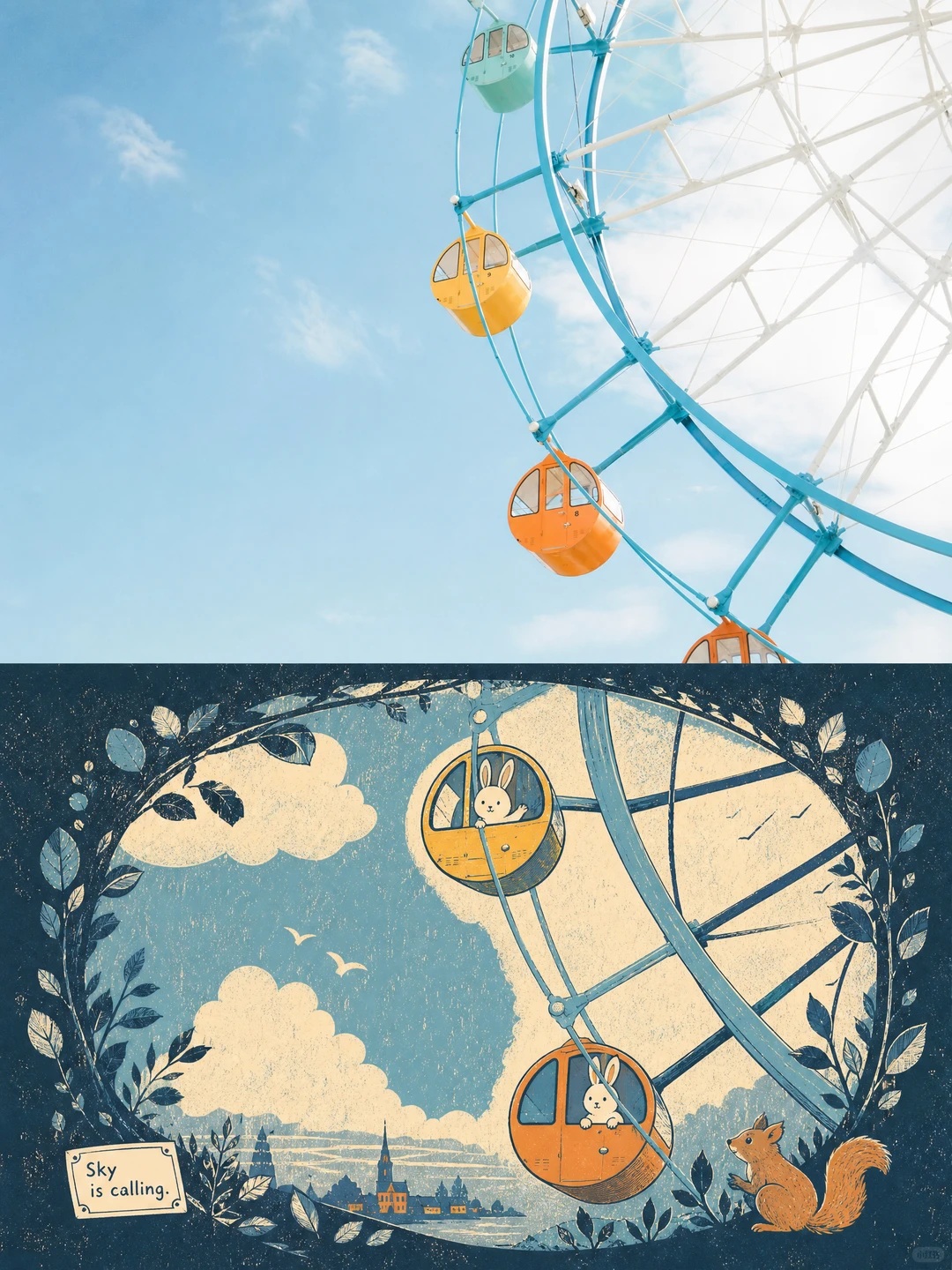
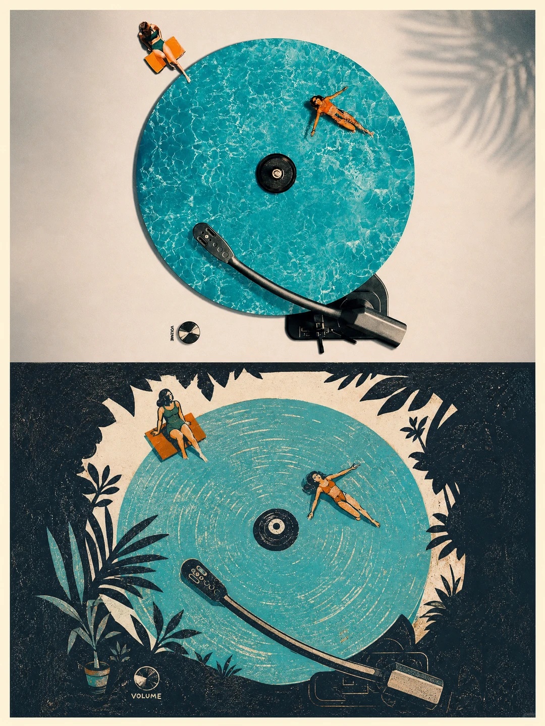
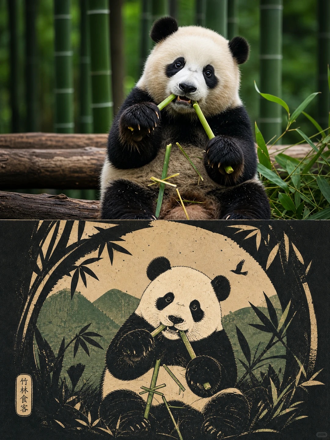
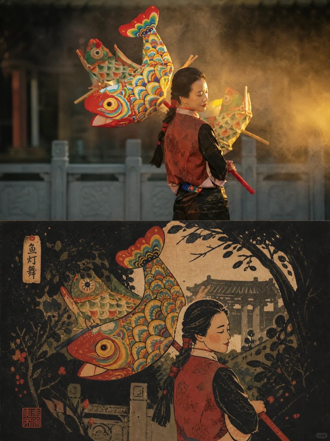
Create a vertical poster for each uploaded photo, pairing a refined photographic treatment with a narrative, storybook-style woodcut illustration.
Example outputs
Prompt template
- Format
- Text
- Inputs
- Uploaded_photo_or_photos (image) · Required
- Outputs
- Separate_split_photo_and_woodcut_poster_for_each_photo (image)
For each uploaded photo, create one independent poster. Do not combine multiple photos into a collage; output a separate poster for every photo. Use an overall vertical 3:4 composition, divided into upper and lower sections of exactly equal height, each occupying 50% of the image. Make the treatment suitable for subjects such as people, animals, architecture, still life, or natural scenery—not only urban scenes.

In the upper half, preserve the original photograph, including the subject’s identity, action, spatial relationships, realistic texture, natural lighting, and existing color atmosphere. Apply only subtle, high-end photographic color grading to evoke magazine photography and an art publication. Extend the sky, ground, or environmental background naturally when needed to fit the composition, but do not stretch, distort, or alter the subject.

In the lower half, extract the photo’s most recognizable subject, silhouette, pose, and narrative relationships, then reconstruct them as a hand-drawn, fairy-tale woodcut illustration. Do not copy every detail mechanically. Instead, condense the subject into one or two clear, large shapes, with blunt contours, slightly exaggerated proportions, and minimal edges, while preserving its identity, action, function, and emotion. Draw source material from the original image and build a broad, dark or high-contrast structural field around the subject, using it as a container, path, frame, or density layer. Let the background grow from the original spatial and semantic elements like the shell of a story world, forming structures that obscure, crop, engulf, and partially reveal elements to enrich the narrative. Use a flat narrative viewpoint and picture-book-page hierarchy to guide the eye through top-down compression, lateral movement, frontal composition, leading paths, shifts in scale, or edge cropping.

Derive the palette from the photograph above and maintain a clear three-part relationship: a large area of dark structural color to convey weight and define boundaries; a middle range of lighter colors or negative space to provide breathing room; and small areas of highly saturated emotional color to mark reading paths and story clues. Concentrate the most important information in a few bold color shapes at faces, poses, paths, functional parts of objects, environmental markers, or narrative focal points. Keep these shapes pressed against dark structures or luminous negative space so the image feels vivid but unevenly distributed. Adjust the hues to suit the subject’s emotional tone while keeping the area proportions and brightness order stable.

Use lines only at functional, path, boundary, texture, and recognition points. Keep them sparse and hand-drawn, with subtle, slightly imprecise strokes. Keep all color shapes flat, while retaining dry-brush marks, grain, splashes, paper texture, stippling, and slight misregistration. Combine the handmade feel of screen printing and crayon. Avoid realistic lighting and shading, complex volume, smooth vector edges, 3D rendering, and plastic-looking texture.
What you'll create
The upper half retains the photographic scene while the lower half reconstructs its recognizable forms as flat illustrative shapes. Sparse lines, paper grain and printing imperfections create a handmade poster surface.
Usage instructions
Provide the photo or photos to be transformed; each photo becomes its own poster. The original scene supplies the motifs for the illustrated lower half, while the emotional tone may guide its palette without changing the specified color hierarchy.
Frequently asked questions
Can the subject be something other than a city?
Yes. The template explicitly includes people, animals, architecture, still life and scenery.
Should the illustration use realistic shading?
No. It calls for flat color shapes and avoids realistic volume.



Comments
Tried this prompt? Share what you made, compare results, or ask a question