Photo-to-Paper Illustration Comparison Poster
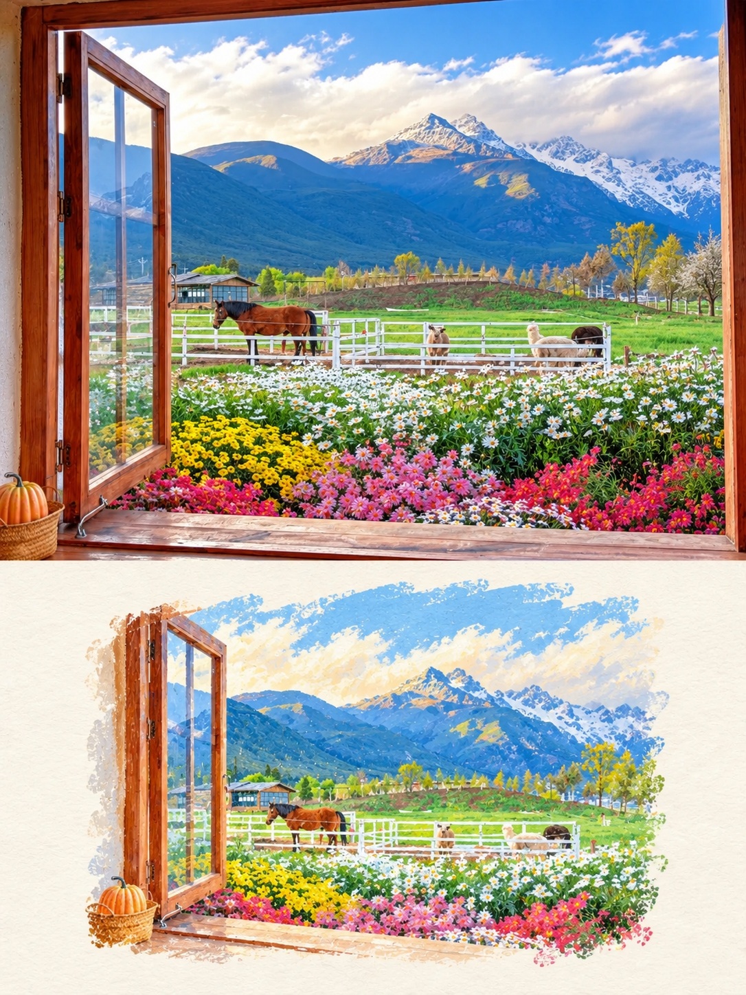
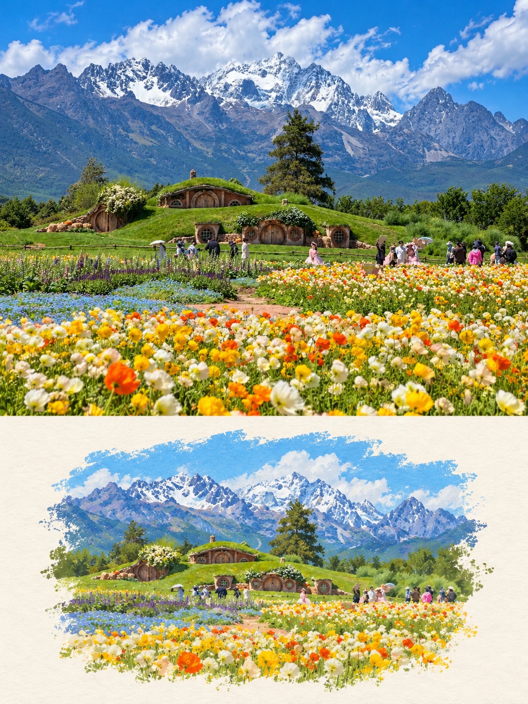
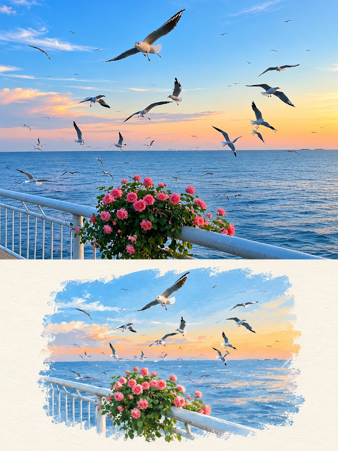
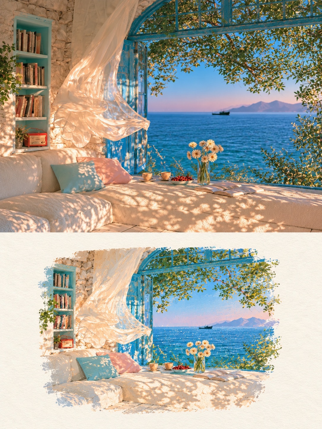
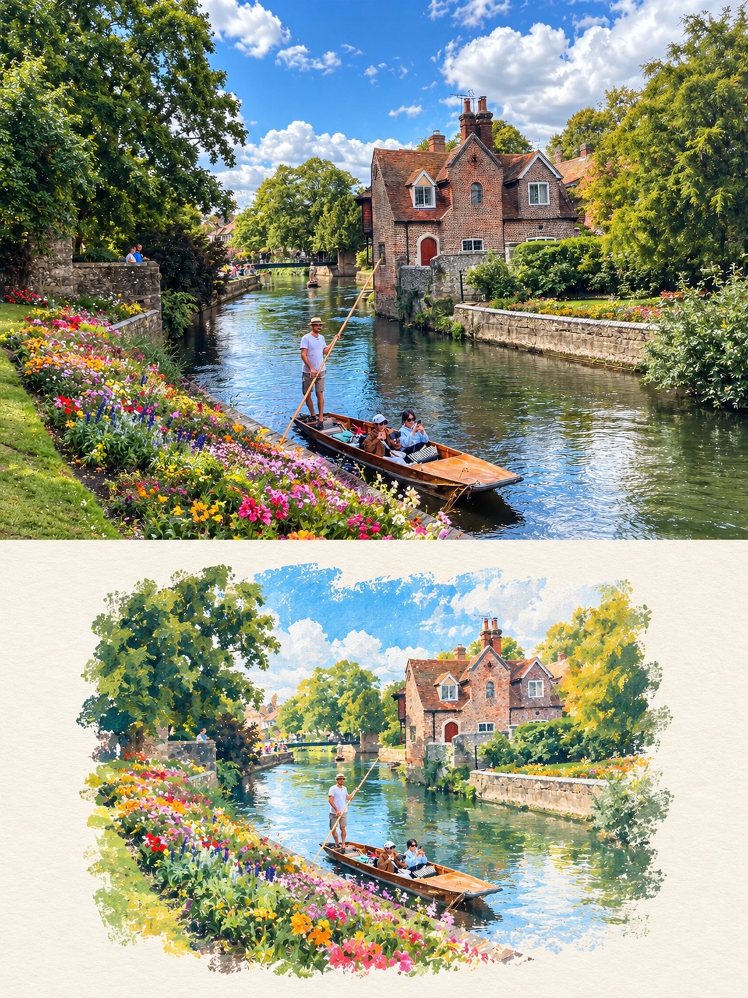
Create a vertical poster pairing a lightly adjusted photograph with a smaller, hand-painted illustration of the same scene.
Example outputs
Prompt template
- Format
- Text
- Inputs
- Uploaded_photo (image) · Required
- Outputs
- Comparison_poster (image)
Using the uploaded photo, create a 3:4 vertical comparison poster with two stacked sections. The upper section should occupy about 55% of the poster and preserve the original photograph's photographic quality, main elements, lighting, and colors, with only slight tone adjustments. Do not stretch the subject. The lower section should occupy about 45%, with a warm off-white paper-textured background and a smaller illustration of the same scene centered within it, leaving generous whitespace around the illustration.

Use matte acrylic color blocks, delicate irregular lines, dry-brush grain, and natural rough edges. Draw the main colors from the original photo and simplify the details moderately. Keep the overall mood quiet and fresh, like a travel art journal. Do not add text, a watermark, or a hard-edged border. If multiple photos are provided, generate a separate poster for each; do not combine them.
What you'll create
A photographic upper section fills slightly more than half the page. A smaller matte painted version of the same scene sits below on off-white paper, using rough edges, dry-brush grain and fresh restrained colors.
Frequently asked questions
What is the panel ratio?
About fifty-five percent photograph and forty-five percent illustration.
Are multiple photos combined?
No. Each photo receives its own separate poster.




Comments
Tried this prompt? Share what you made, compare results, or ask a question