Impasto Oil-Painting Comparison Poster
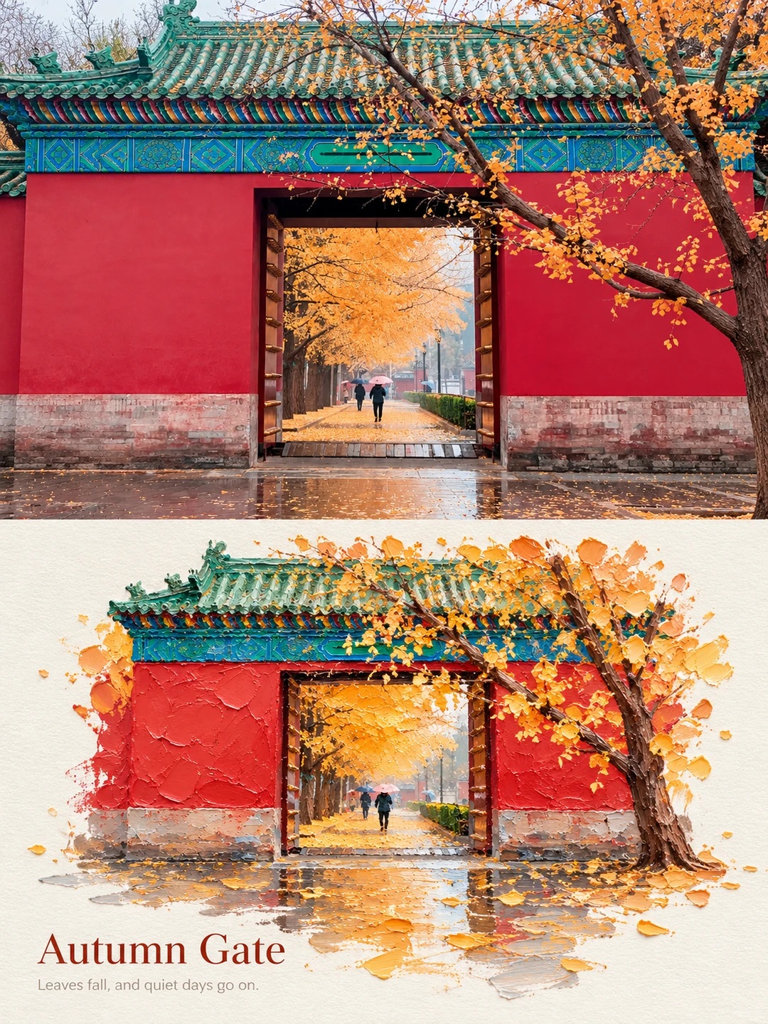
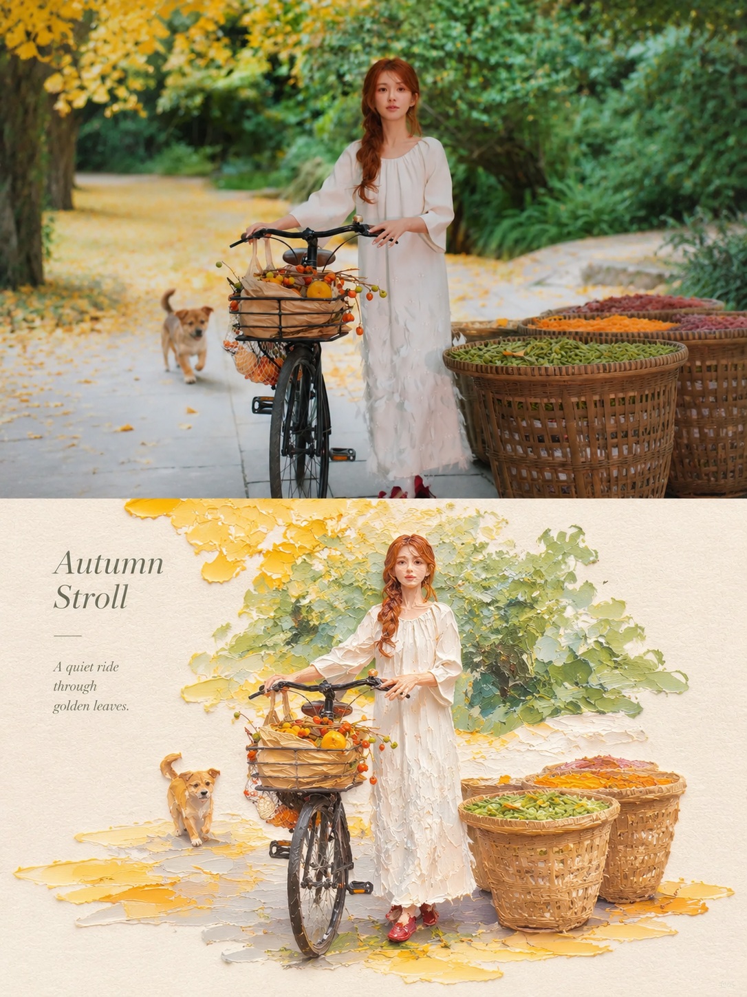
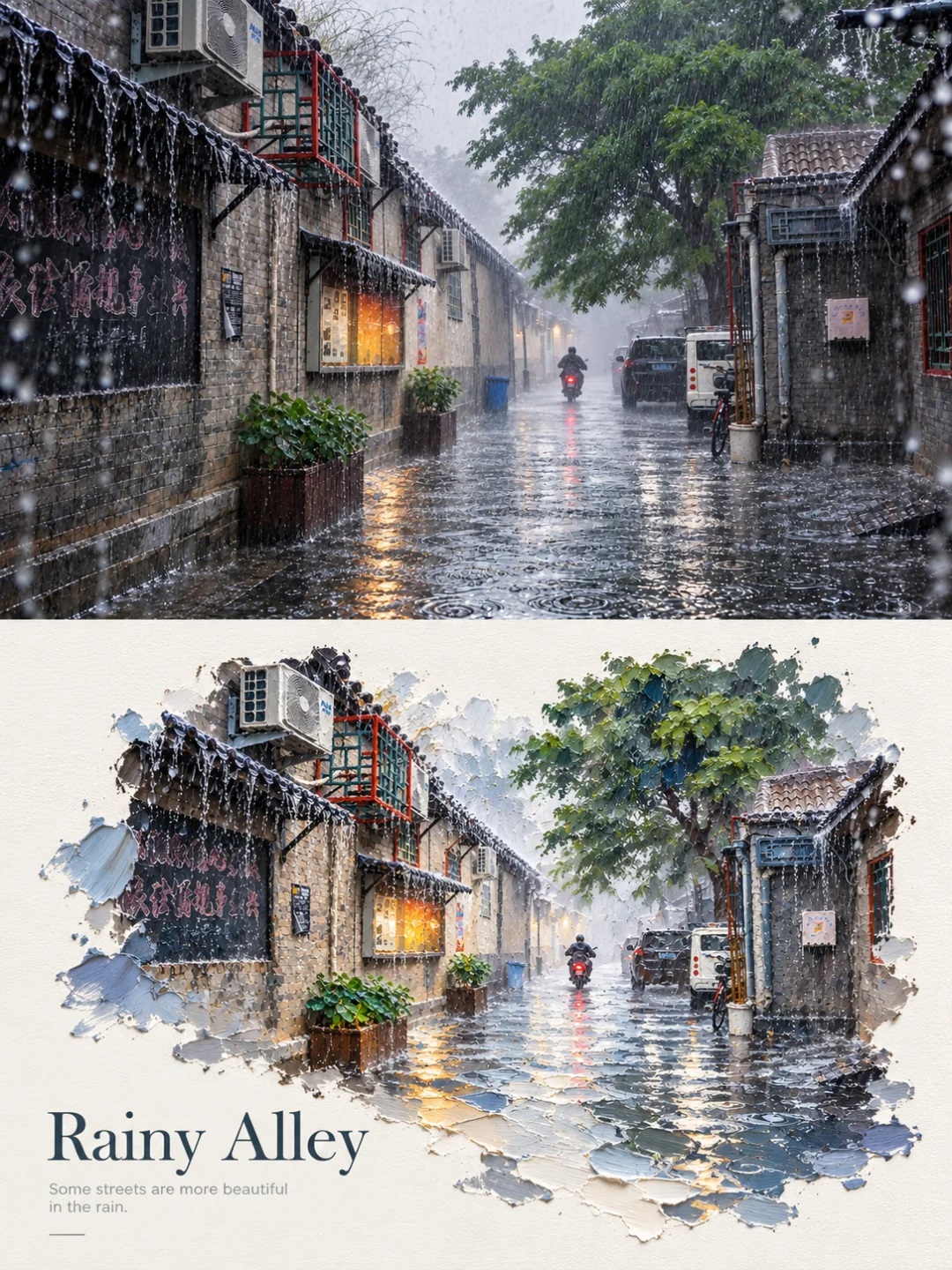
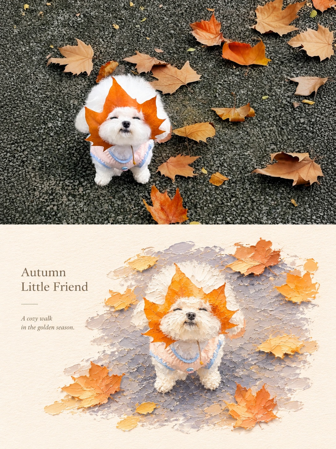
Create a refined split poster pairing each original photograph with an impasto oil-painted miniature landscape based on the same subject.
Example outputs
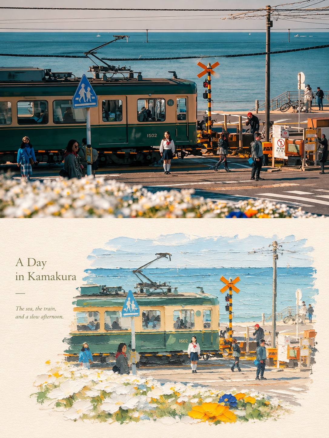
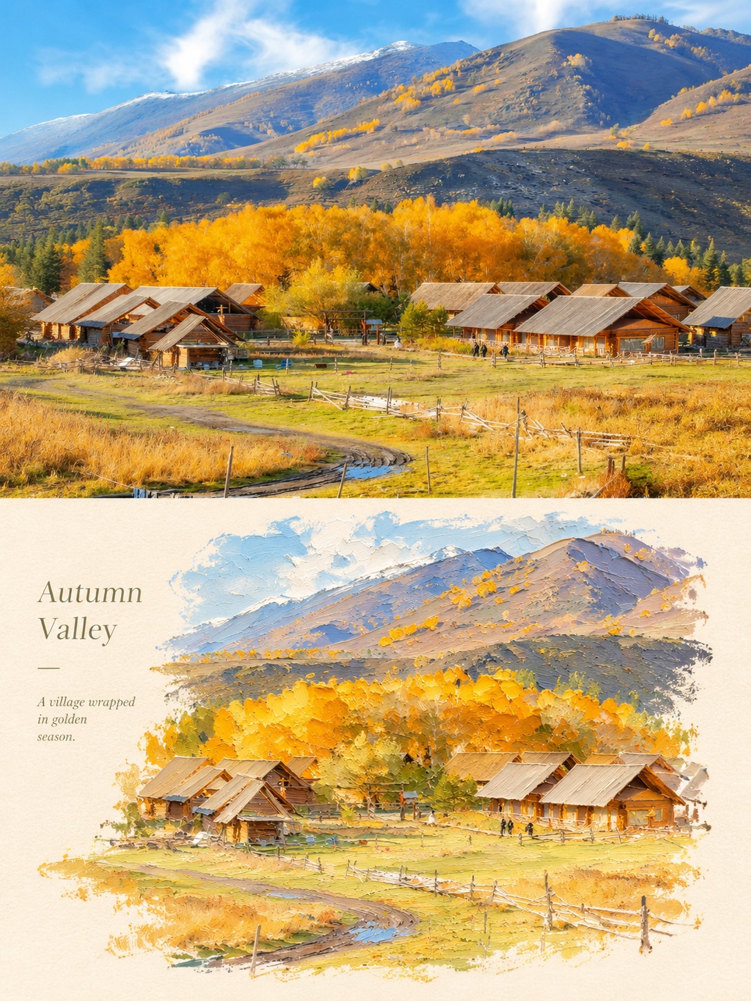
Prompt template
- Format
- Text
- Inputs
- Input_photo (image) · Required
- Outputs
- Comparison_poster (image)
Create a separate photography-and-design comparison poster for each input photo; do not combine photos. The prompt can apply to people, animals, plants, architecture, objects, and various scenes. Follow the source photograph rather than imposing a fixed subject or theme.

Canvas and layout
Use a vertical 3:4 canvas divided into two exactly equal horizontal halves, each occupying 50% of the canvas. The upper half is the photography section; the lower half is the design section. Place them directly against each other with a clear horizontal boundary and no gap, gradient, feathering, or overlap. Integrate all design elements and text into the lower half; do not add a separate title area.

Photography section
Preserve the original photograph’s authentic photographic quality, subject identity and number, silhouette, pose, proportions, key details, perspective, placement, natural lighting and shadows, and original colors. Apply only subtle, refined color grading. You may crop secondary surroundings or extend the background slightly, but do not crop out, stretch, distort, mirror, duplicate, move, or redraw the subject. Do not add text, borders, paper texture, or decoration to this section.

Design section
Use the subject, silhouette, pose, and spatial relationships in the same photograph as the basis for a reimagined miniature landscape with sculptural volume, rendered in thick impasto oil paint. Build up multiple layers of paint and use palette-knife texture, hand-shaped forms, and raised, irregular edges. Do not mechanically reproduce photographic details. Place the subject centrally or slightly off-center, leaving a generous area of warm-white paper visible. Support the subject with a single band of color drawn from the original photograph; this band may become ground, water, a path, or an abstract slice of space. You may retain a small amount of reflection, light spots, rain haze, or extended brushstrokes, but do not add unrelated elements.

Color and materials
Extract the main and supporting colors and the warm-cool relationships from the original photograph, then distill them into a harmonious, limited palette. Favor the subject’s original color character rather than applying a fixed palette. Make the design section moderately brighter and more luminous. Concentrate built-up paint on the color band, environmental slices, and highlights while keeping the subject’s structure refined. Give the paper a fine texture and matte finish; avoid a plastic appearance.

Text
Place a short English title and one line of smaller supporting text in the open space of the design section. Add only a very small number of issue numbers or tiny annotations if needed. Use a slender, restrained typeface and arrange the text along the subject’s axis or the edge of the open space. Generate text based on a subject or mood that can be reliably identified, and spell it correctly. If reliable information is unavailable, do not add a place name, date, coordinates, brand, byline, account name, or placeholder.

Mood
Keep the result quiet, restrained, and refined, with the order and collectible quality of an art publication. Establish visual hierarchy through material, negative space, volume, and the relationship between the subject and its surroundings.

Avoid
Do not combine different photographs; change the subject; make the upper and lower scenes unrelated; turn the photography section into an illustration; add cluttered decoration or an extra title bar; generate garbled or repeated text, logos, signatures, or watermarks; use cartoon styling, highly saturated clashing colors, muddy gray colors, fluorescent colors, candy-like filters, smooth plastic 3D, cheap CGI, or densely accumulated complex scenery.
What you'll create
Two equal sections place the source photograph directly above a thick-paint design treatment. Restrained color and a crisp midpoint keep the subject recognizable across media.
Frequently asked questions
Can the halves overlap or fade together?
No. They meet without overlap, gradient or feathering.
Where should new text appear?
Only in the lower design half.



Comments
Tried this prompt? Share what you made, compare results, or ask a question