Rubber-Stamp Print Comparison Poster
Create a vertical poster pairing an original photograph with a rubber-stamp print reinterpretation of the same scene.
Example outputs
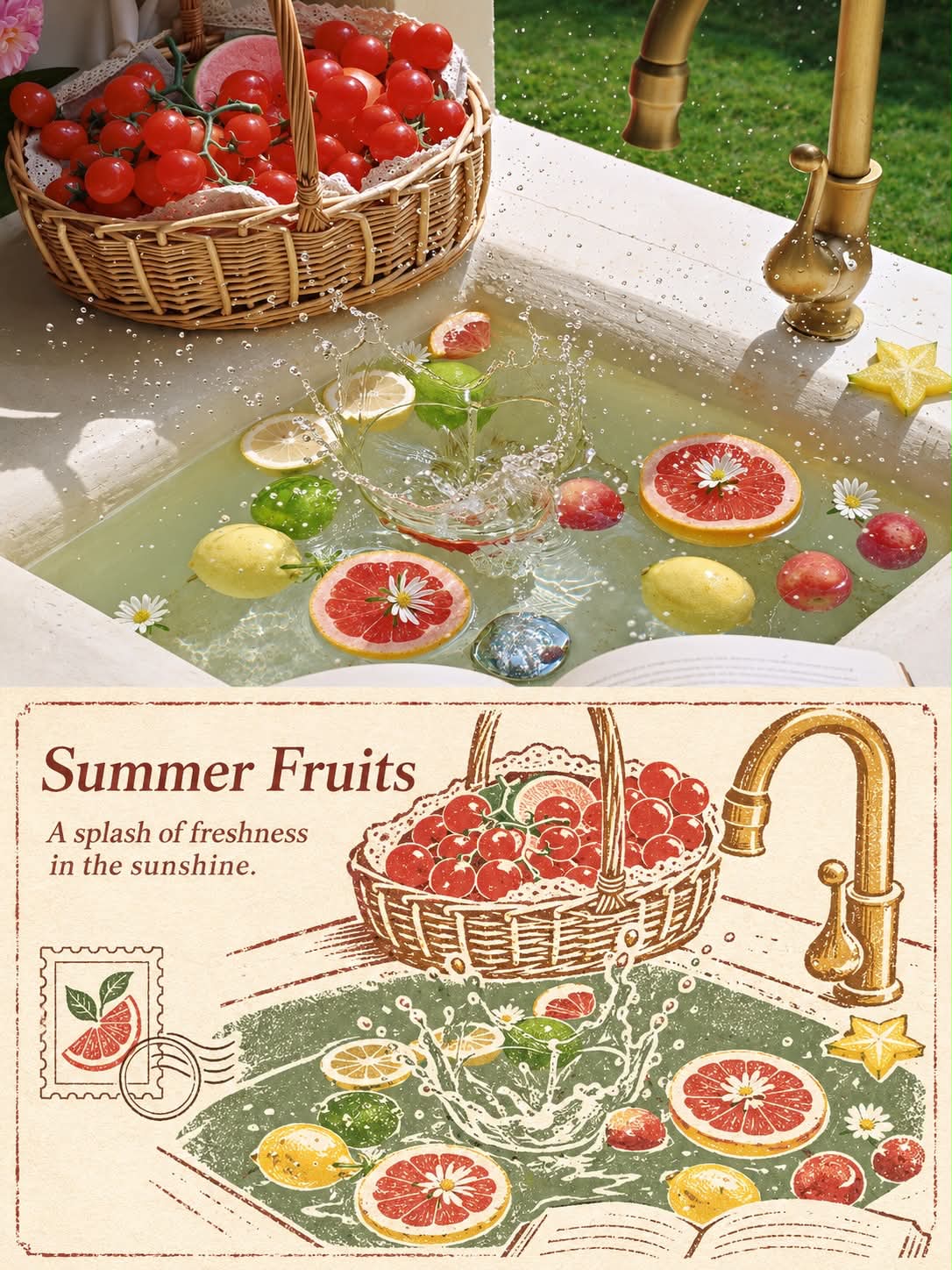
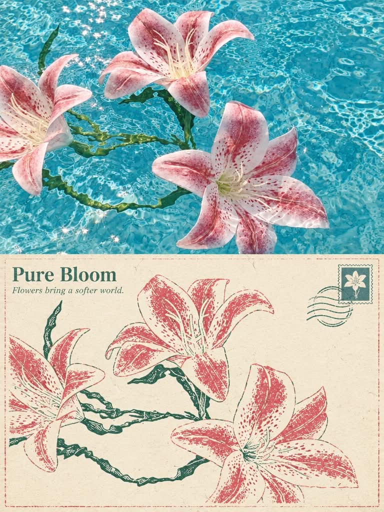
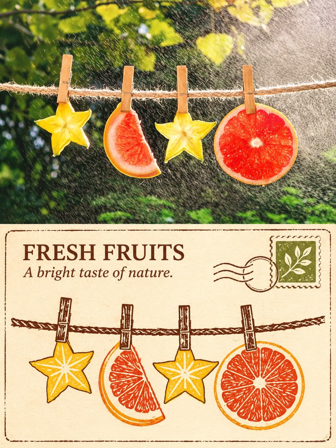
Prompt template
- Format
- Markdown
- Inputs
- Input_photo (image) · Required
- Outputs
- Comparison_poster (image)
Create a separate photography-and-design comparison poster for each input photo. Do not combine different photos. Adapt the treatment to each photo’s subjects and scene, faithfully reflecting the original rather than applying a fixed theme.

Canvas and layout:
Use a vertical 3:4 canvas, divided exactly in half horizontally, with each section occupying 50% of the total height. The upper section is the photography area; the lower section is the design area. Join the two sections directly along a clear horizontal boundary, with no gap, gradient, feathering, or overlap. Keep all design elements and text within the design area; do not add canvas space for a title. The recommended output size is 1200 × 1600 pixels, with the upper section at y=0–799 and the lower section at y=800–1599. For other sizes, maintain the same proportions.

Photographic area:
Preserve the original photograph’s realistic photographic quality; the identity and number of subjects; their silhouettes, poses, proportions, key details, perspective, relative positions, natural lighting and shadows, and original colors. Make only subtle color adjustments. You may naturally crop secondary surroundings or extend the background slightly, but do not crop out key subjects. Do not stretch, distort, mirror, duplicate, move, or redraw subjects. Include no text, borders, paper texture, or decoration in the photographic area.

Design-area reinterpretation:
Reinterpret the key subjects, silhouettes, and spatial relationships from the same photo as a rubber-stamp print. Express them anew using simplified carved lines, clear areas of solid ink, and considered negative space. Keep the subjects recognizable; do not simply apply a printmaking filter to the photo. Use light, warm-toned paper as the design area’s base. You may add a fine, slightly distressed border, one small printmaking-style postage stamp, and one postmark with a graphic but no words. Keep these restrained within the design area and do not let them obscure the subjects.

Color and material:
Extract distinctive dominant and secondary colors, as well as the warm-cool relationships, from the input photo; then distill them into a harmonious, limited palette suited to the printmaking process. Preserve the subjects’ color character; do not average the colors or impose a fixed palette unrelated to the photo. Use a single dark color drawn from the original photo’s shadows for the carved lines, and use the photo’s inherent colors for solid ink areas. Convey restrained ink depletion, slight printing irregularities, and fine paper fibers while maintaining a pure printmaking aesthetic.

Text and typography:
Place a brief English serif title in the upper-left internal negative space of the design area, with one short line beneath it. Do not create a separate title bar along the bottom. Base the copy on the identifiable subjects and mood; keep it concise, clear, and correctly spelled. If reliable information is unavailable, do not add a place name, date, or coordinates. Do not add a brand, byline, or account name; do not show placeholders or invent information.

Overall mood:
Quiet, restrained, and refined, with the order and collectible feel of an art publication. Establish visual hierarchy through material, negative space, and the relationship between subjects.

Avoid:
Combining different photos; changing subjects; making the upper and lower scenes unrelated; cluttered decoration; an extra title bar; garbled or repeated text; adding a logo, signature, or watermark; turning the original photo’s markings into anything other than preserved authentic details; creating a fake printmaking effect with a photo filter; turning the photographic area into an illustration; letting decoration cross the boundary; excessive distressing; or large areas of grime.
What you'll create
The original photograph fills the top half and a simplified carved-print interpretation occupies the bottom. Restrained ink irregularities and warm paper texture distinguish the lower design.
Frequently asked questions
Is the lower section merely a photo filter?
No. It reinterprets forms as carved lines and solid ink areas.
Can decorations spill into the photo?
No. Design elements remain below the boundary.




Comments
Tried this prompt? Share what you made, compare results, or ask a question